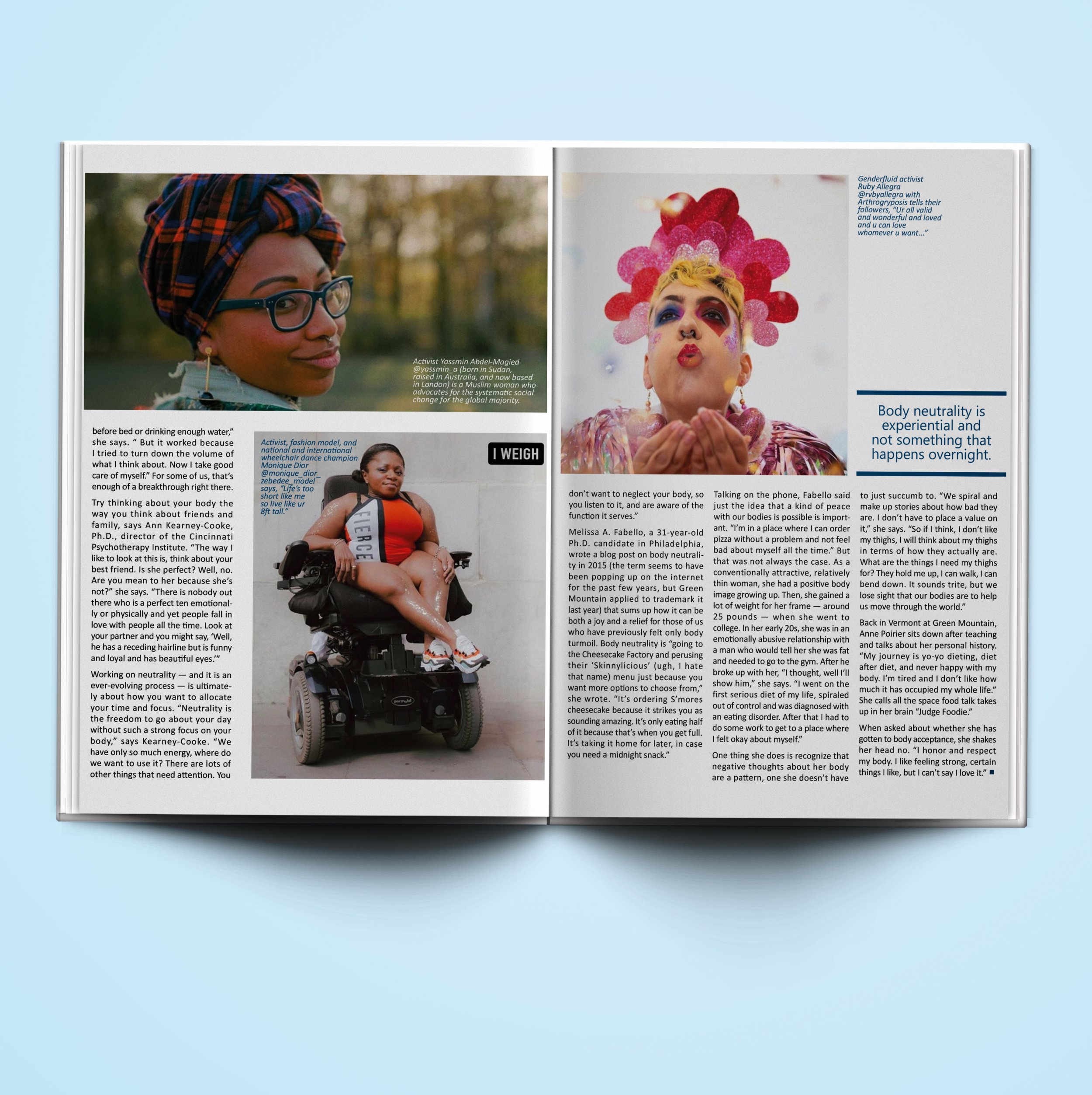
“Body Neutrality”:
magazine article layout
Body neutrality is something near and dear to my heart, and I was particularly excited to spotlight the people involved in this movement in this editorial design spread.
In the process of researching this topic online, I found the text from the article shown here and paired it with related images that I found in additional research. I challenged myself to use an article that had a lot of text. I played with the idea of varying the sizes and placement on the page of these images — and adding pull-out quotes — to break up the walls of text for the reader (who I imagine would see this in a magazine like Glamour, Cosmopolitan, Oprah’s O, etc.) and draw their eye through the piece to capture and hold their interest.
This clean design allows the content to truly shine.

(spread 1)

(spread 2)

(spread 3)

(spread 4)

