my dissertation
“An Invitation Addressed to Grief:
How Event Design Can Hold Space”
My dissertation for my Masters focused on event design and how because milestone events mark transitions, I contend that there is always some level of grief present. I suggest specifically inviting grief, since she’s bound to show up anyway, and incorporating her thoughtfully into the event design itself — without taking away from the celebratory focus.
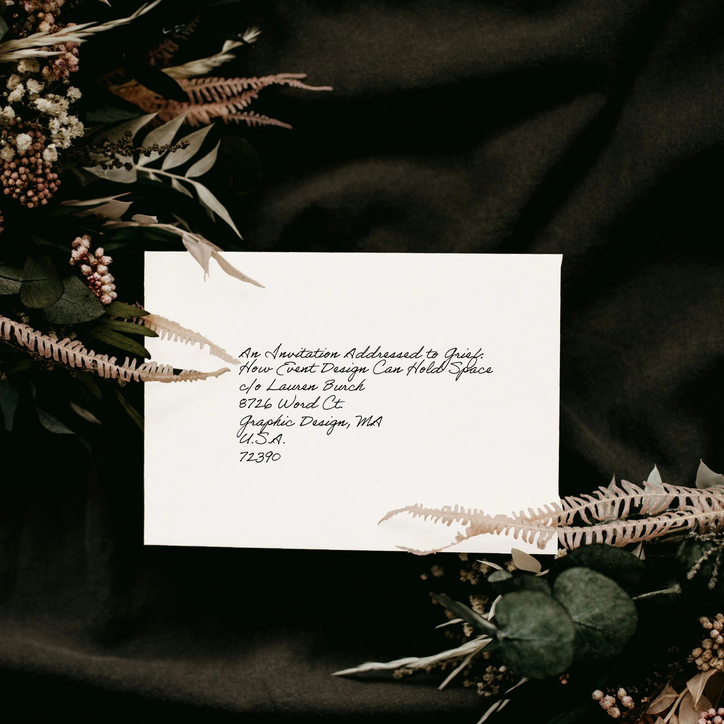
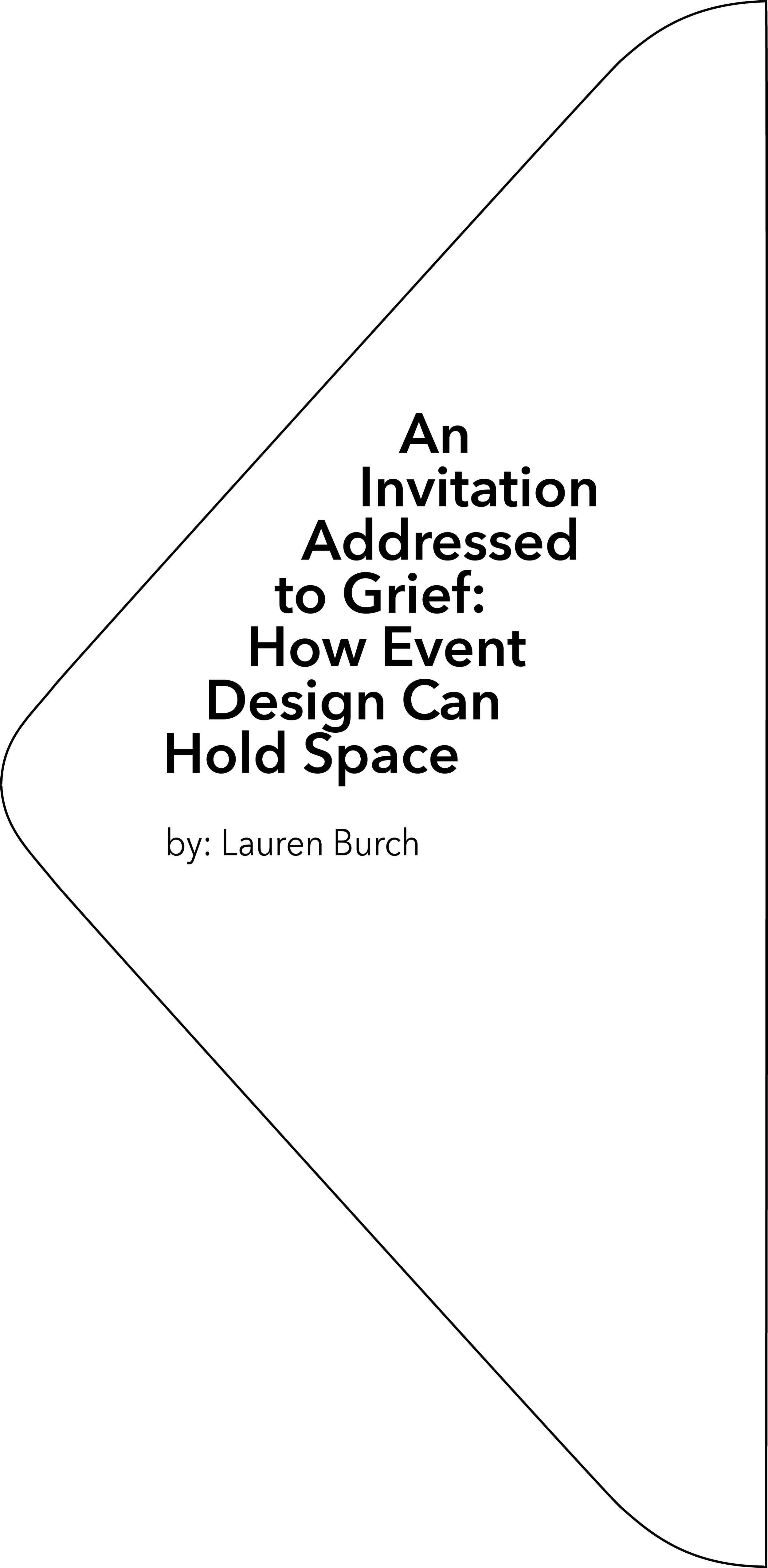
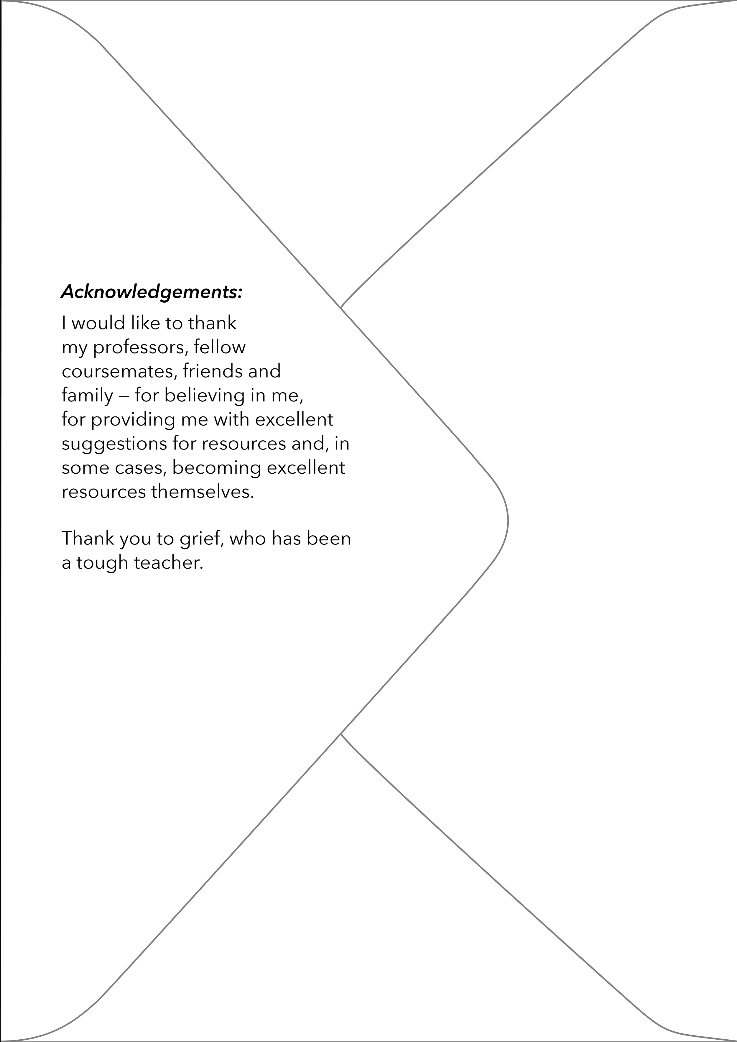
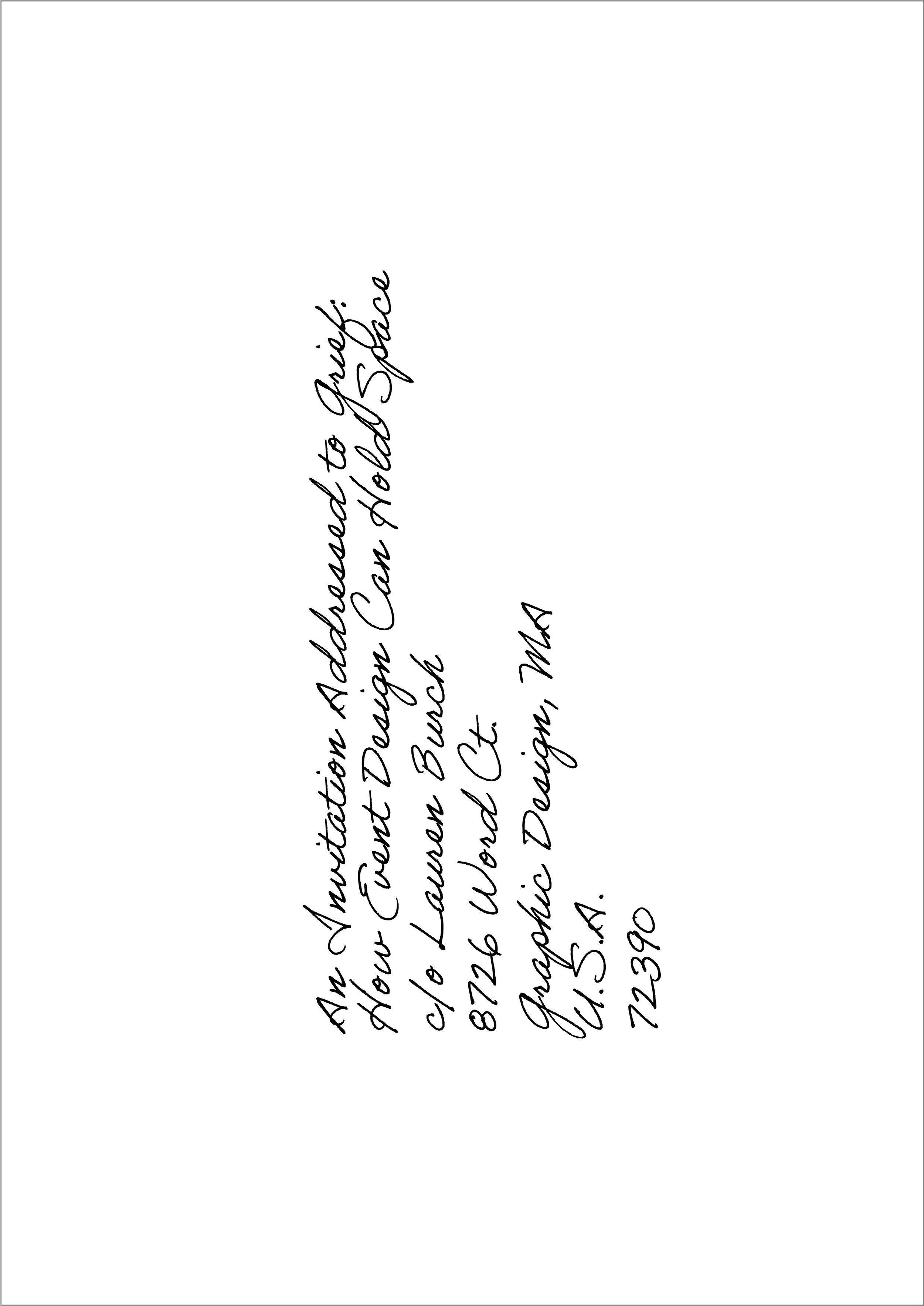
While the content is about event design, the format is presented through editorial design. The image here shows the back cover of the dissertation, which appears to be an addressed envelope. The other side of this “envelope” appears like any other blank white envelope … until the flap is lifted, revealing the title & author on the inside of the flap (on the left) and the acknowledgements on the area of the page that was covered by the flap (on the right).
The photo, under the handwritten typeface Adobe Handwriting Ernie, is by Annie Spratt on Unsplash.
Put another way, this dissertation would be bound and open like a normal book, with the envelope flap acting as a uniquely-shaped partial cover, and the first page designed to be read only once the cover had been lifted. Again, the back of the book would look like an addressed envelope.
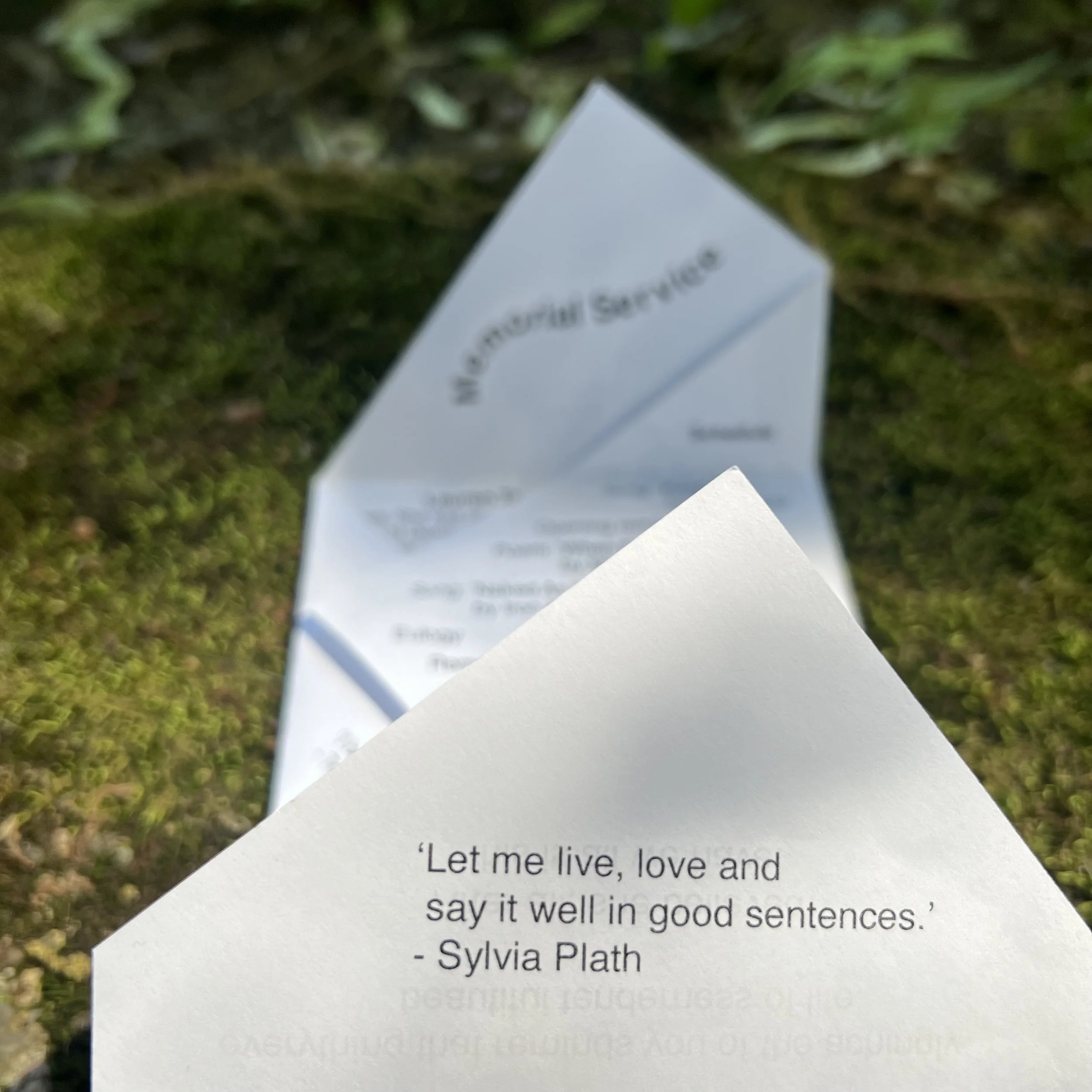
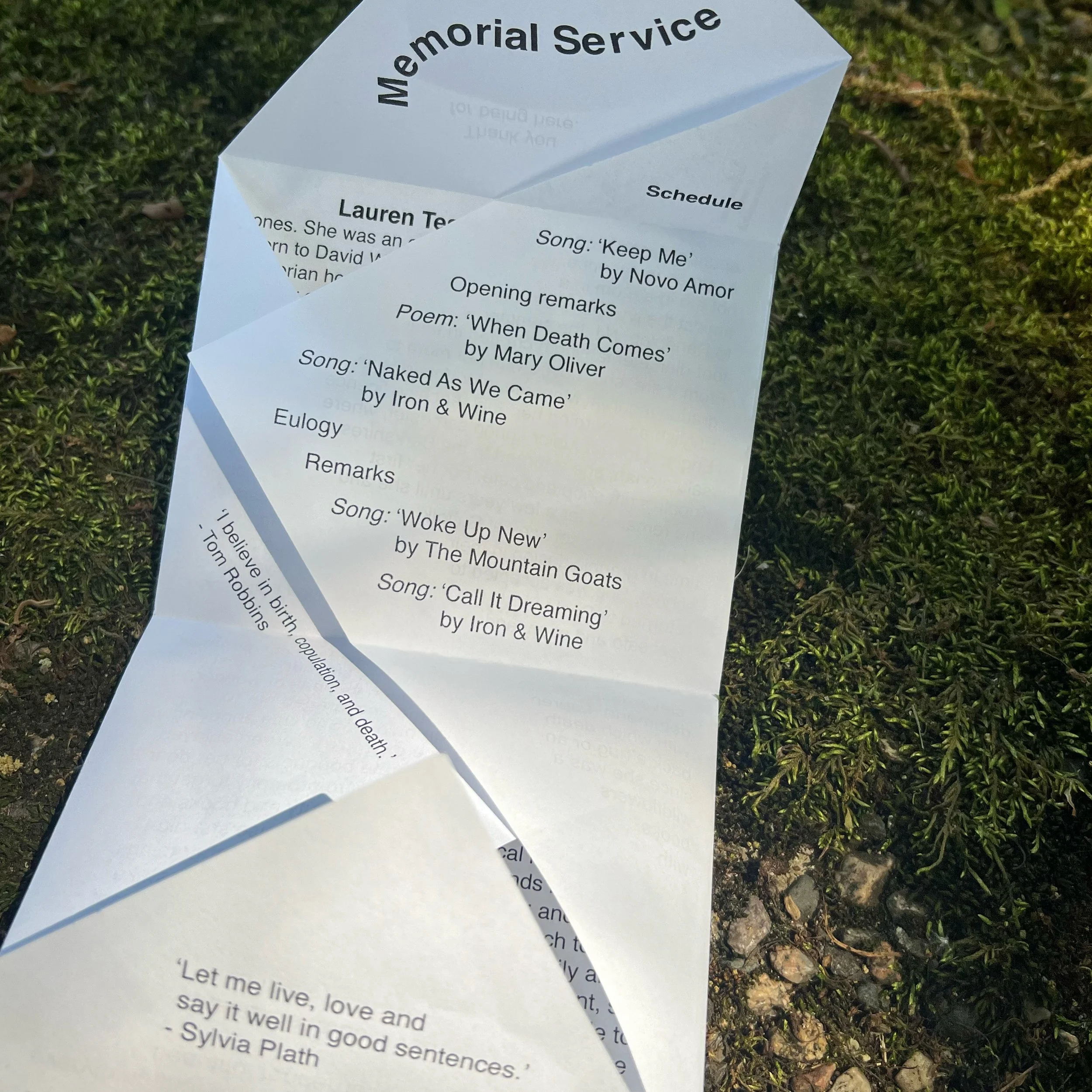
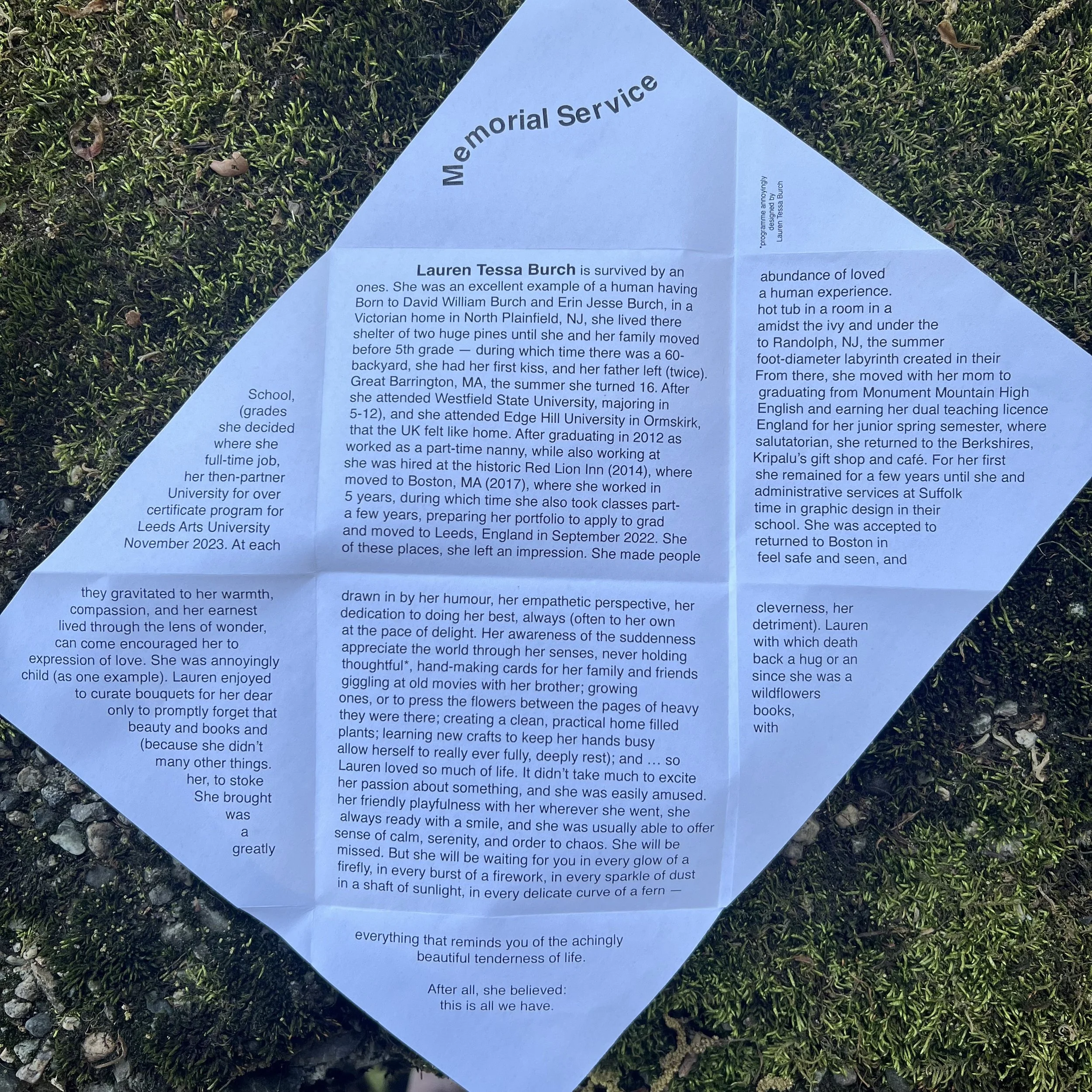
This editorial design contains another editorial design. Should you want to peruse my dissertation, please scroll down to the next section … but should you wish to skip all that and move onto the bit where I designed my own memorial pamphlet as part of this larger project, please scroll down to the bottom of the page.
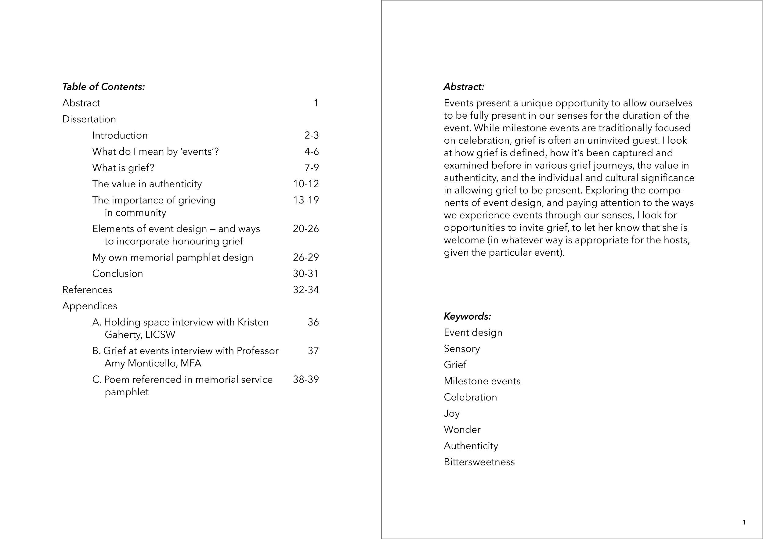
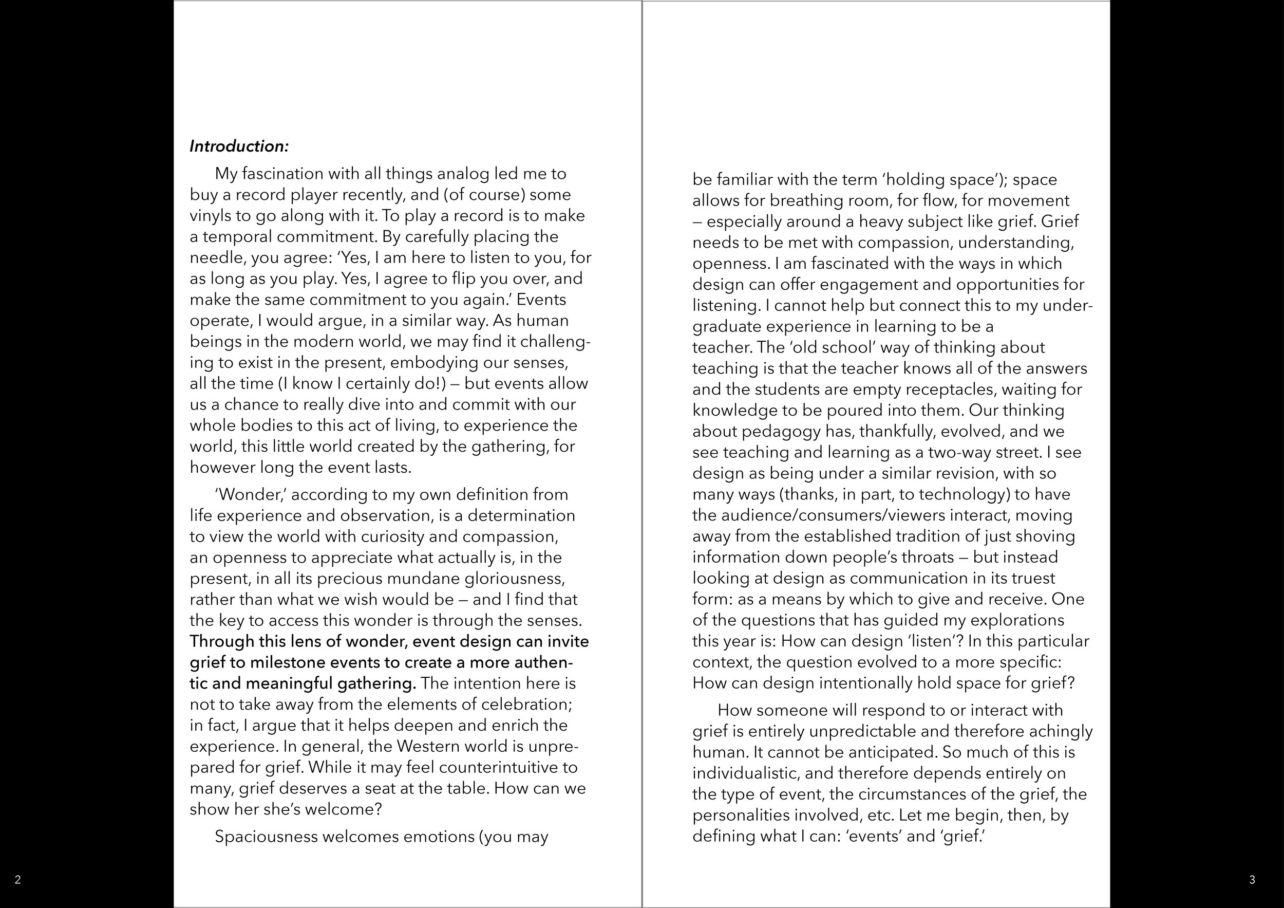
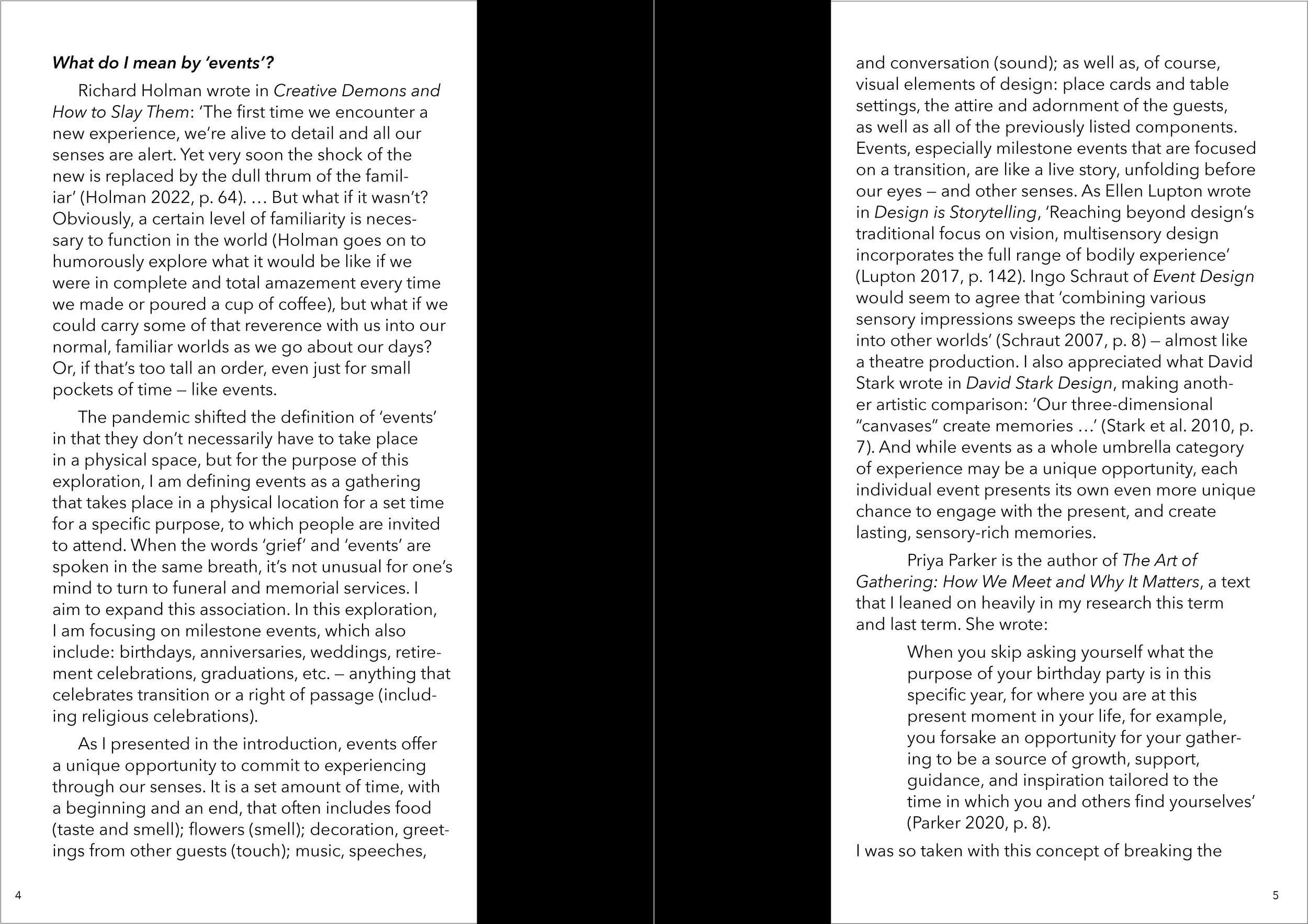
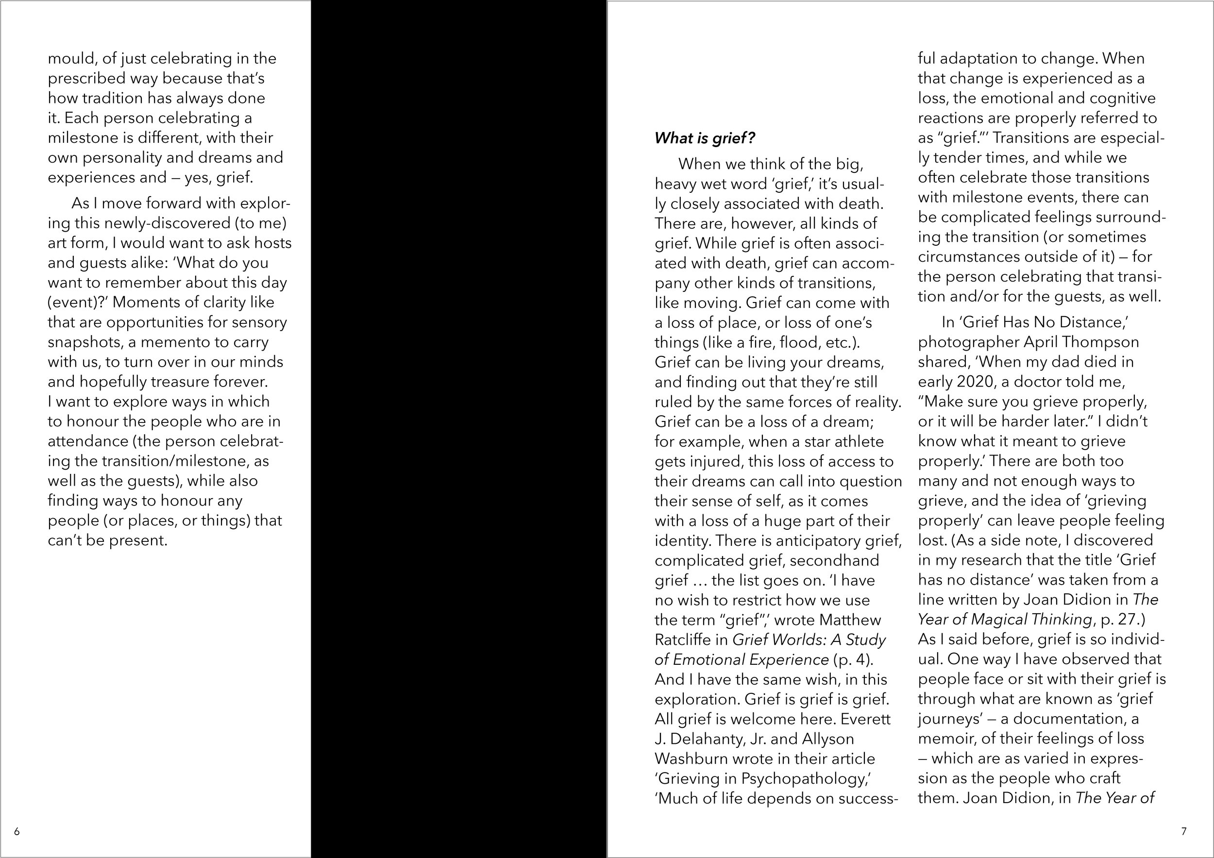
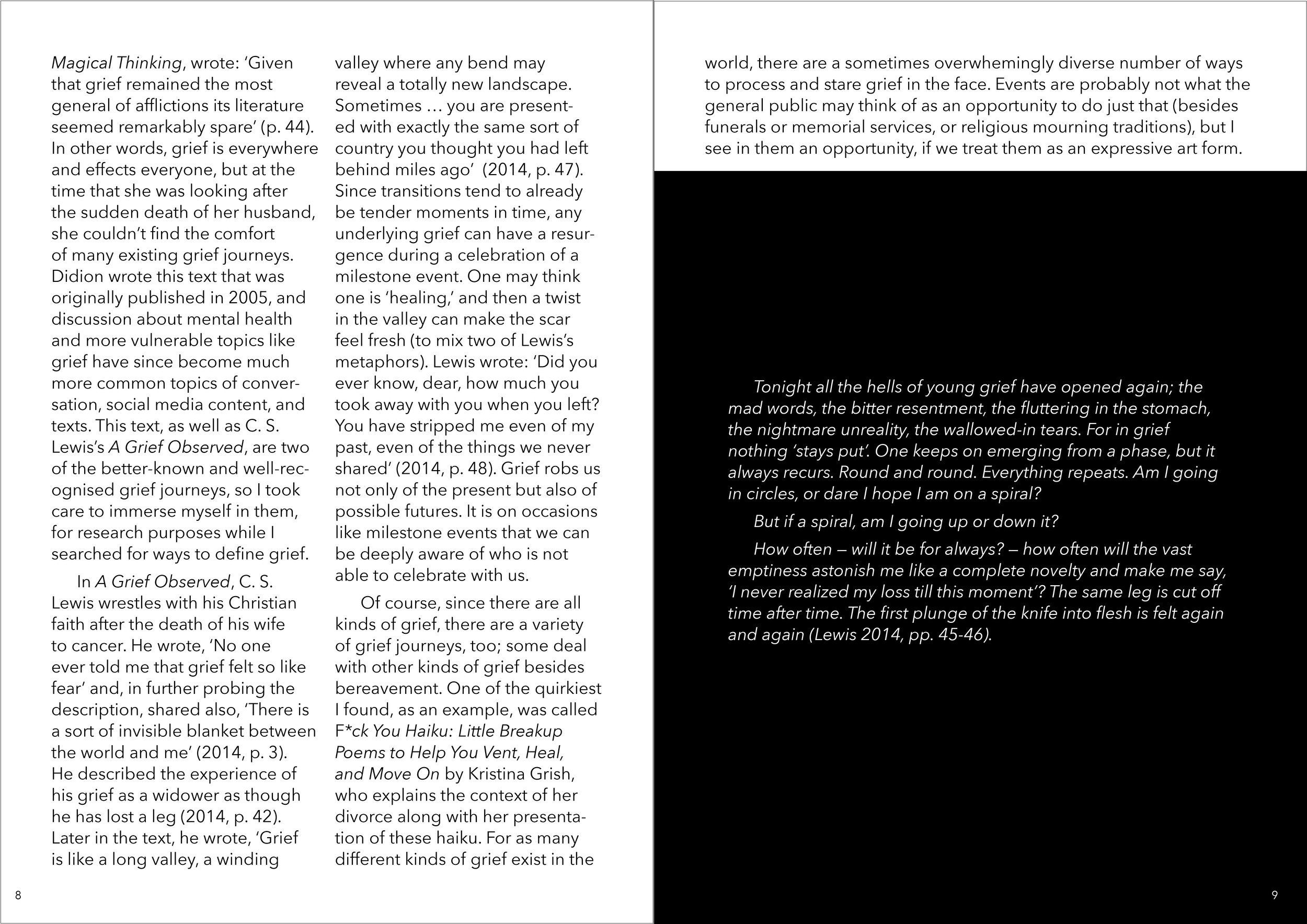
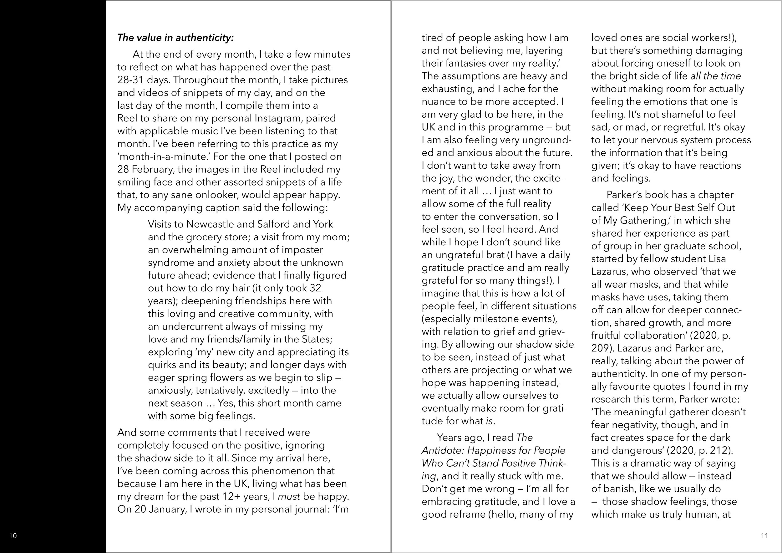
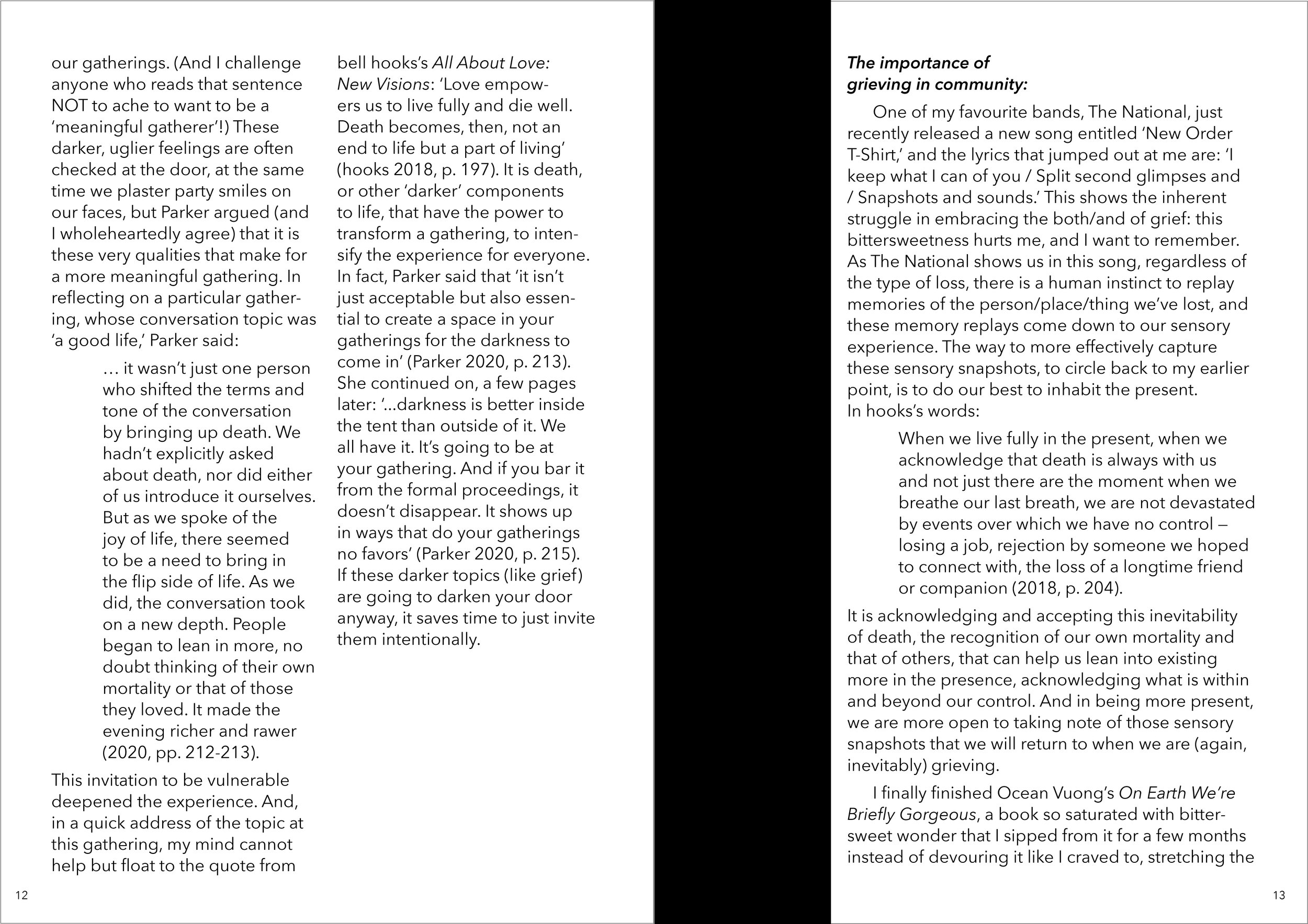
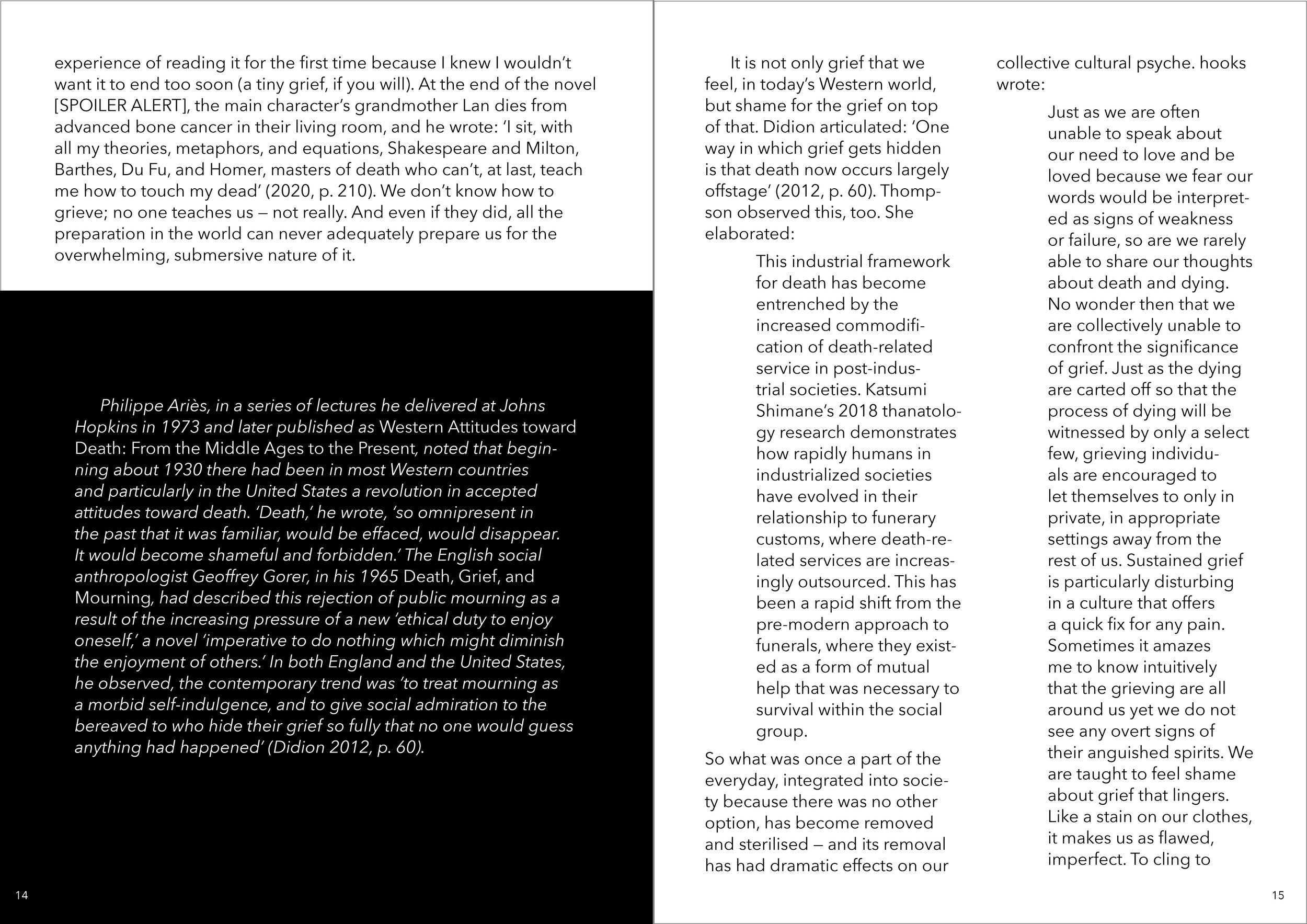
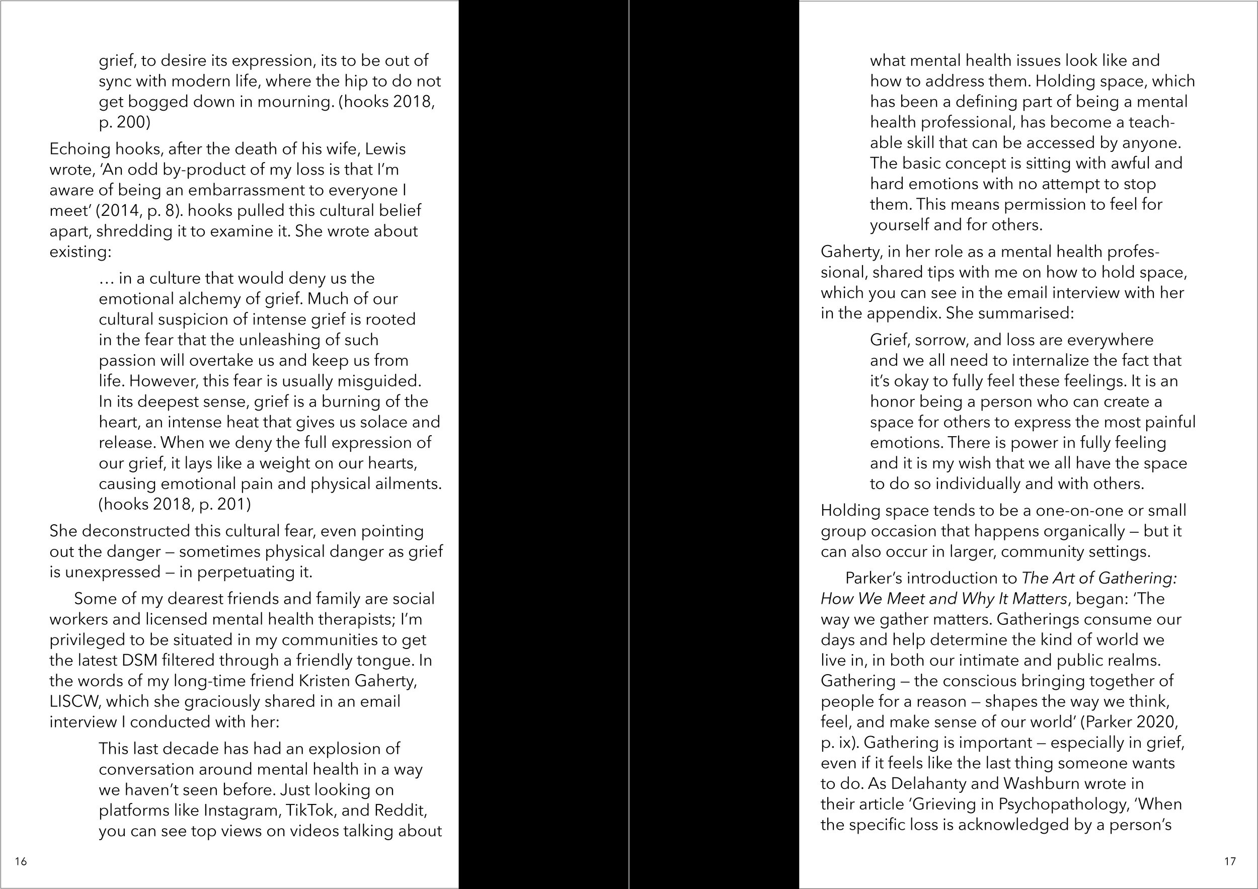
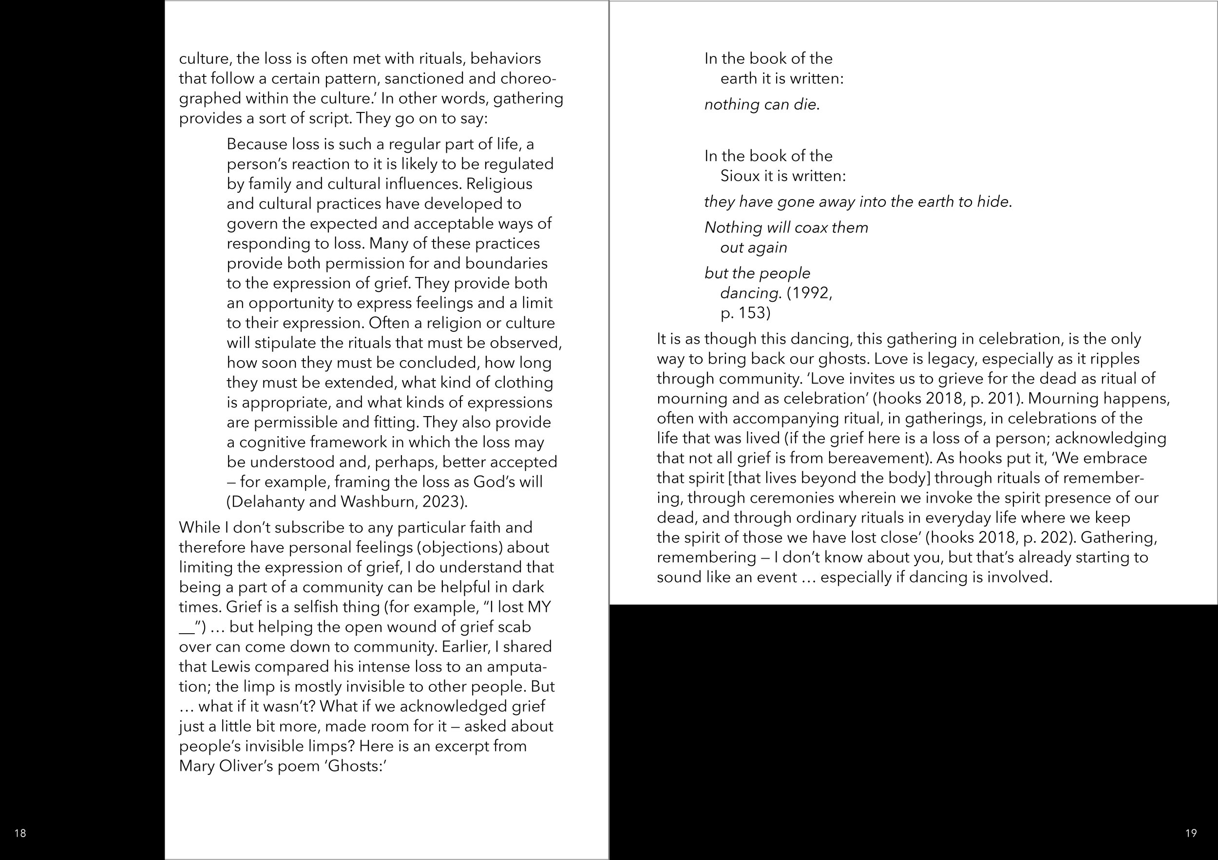
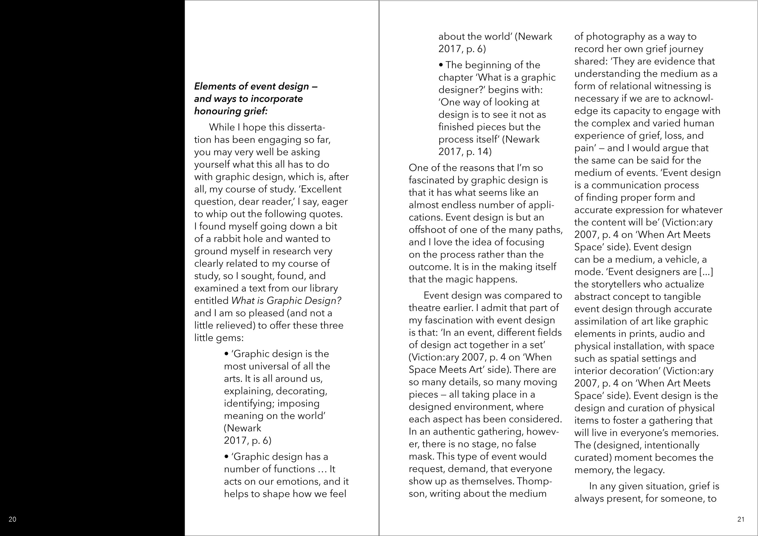
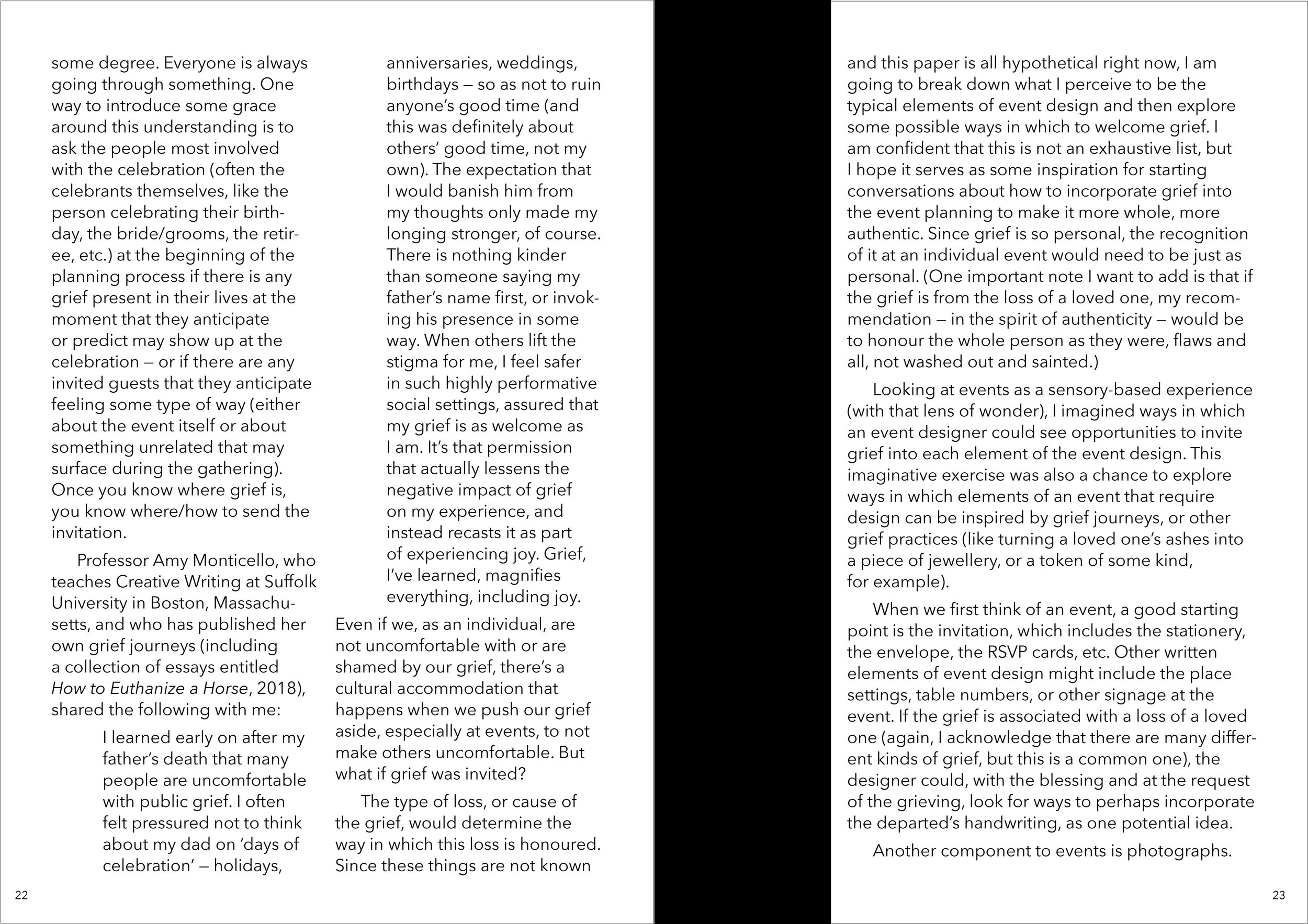
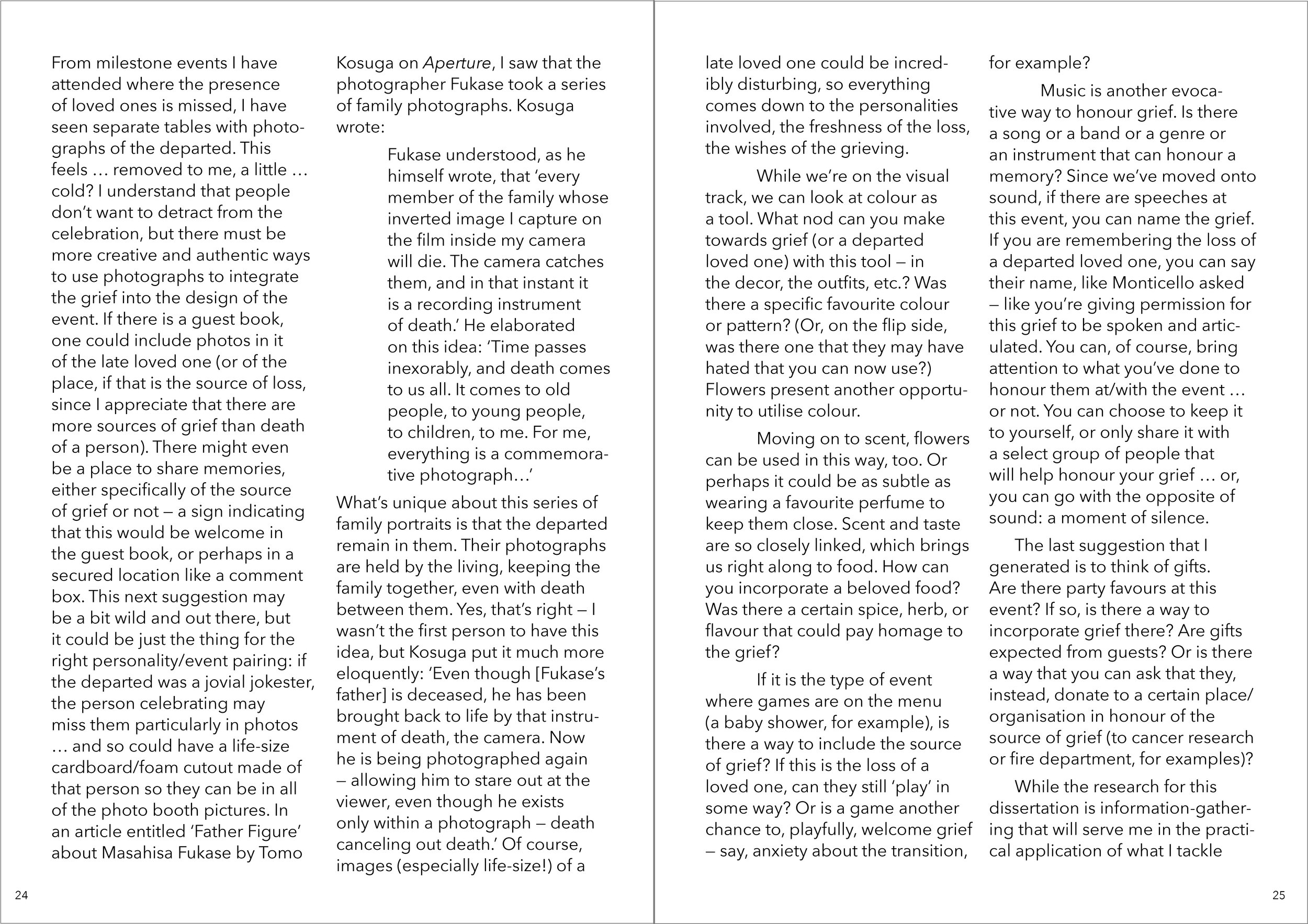
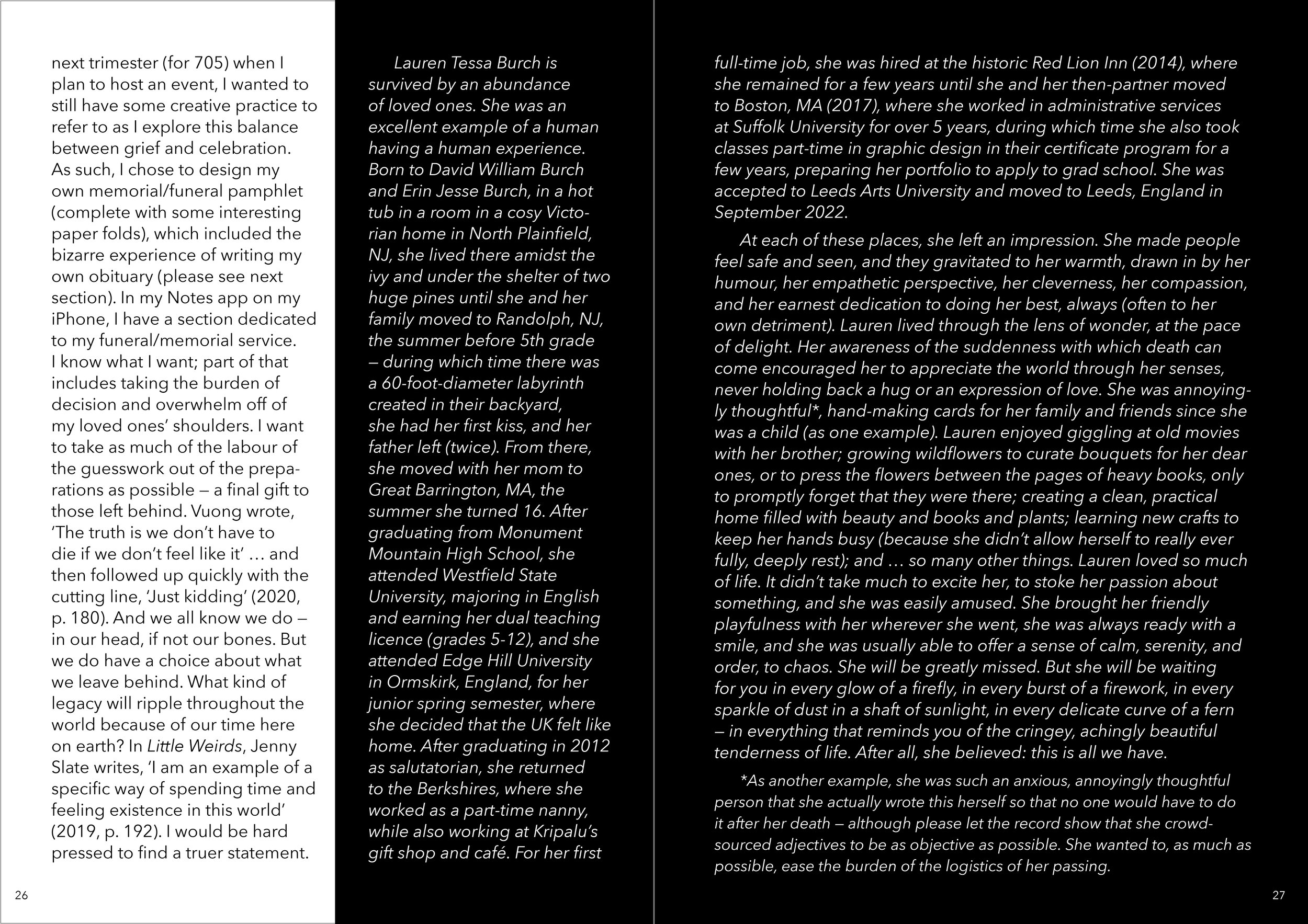
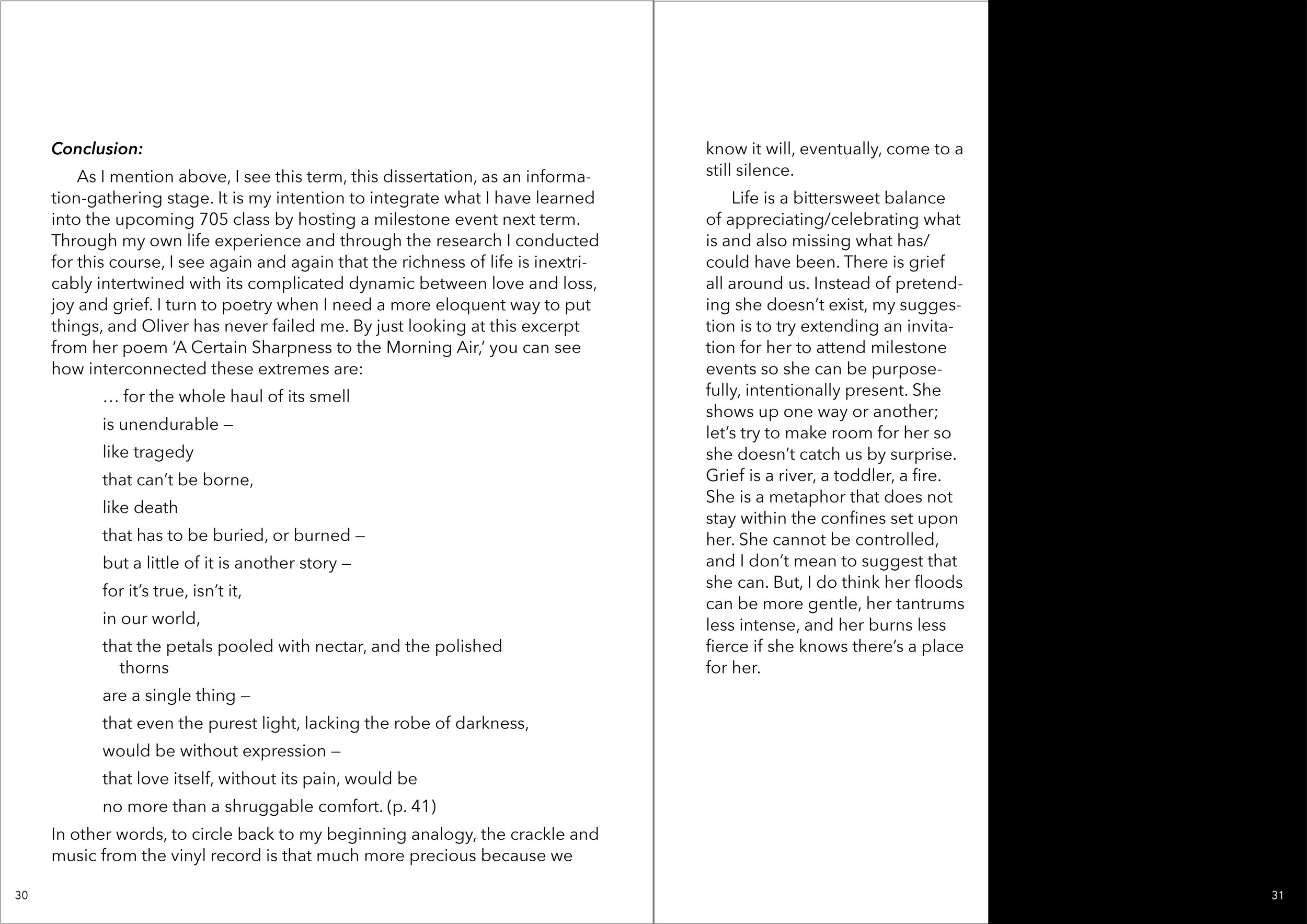
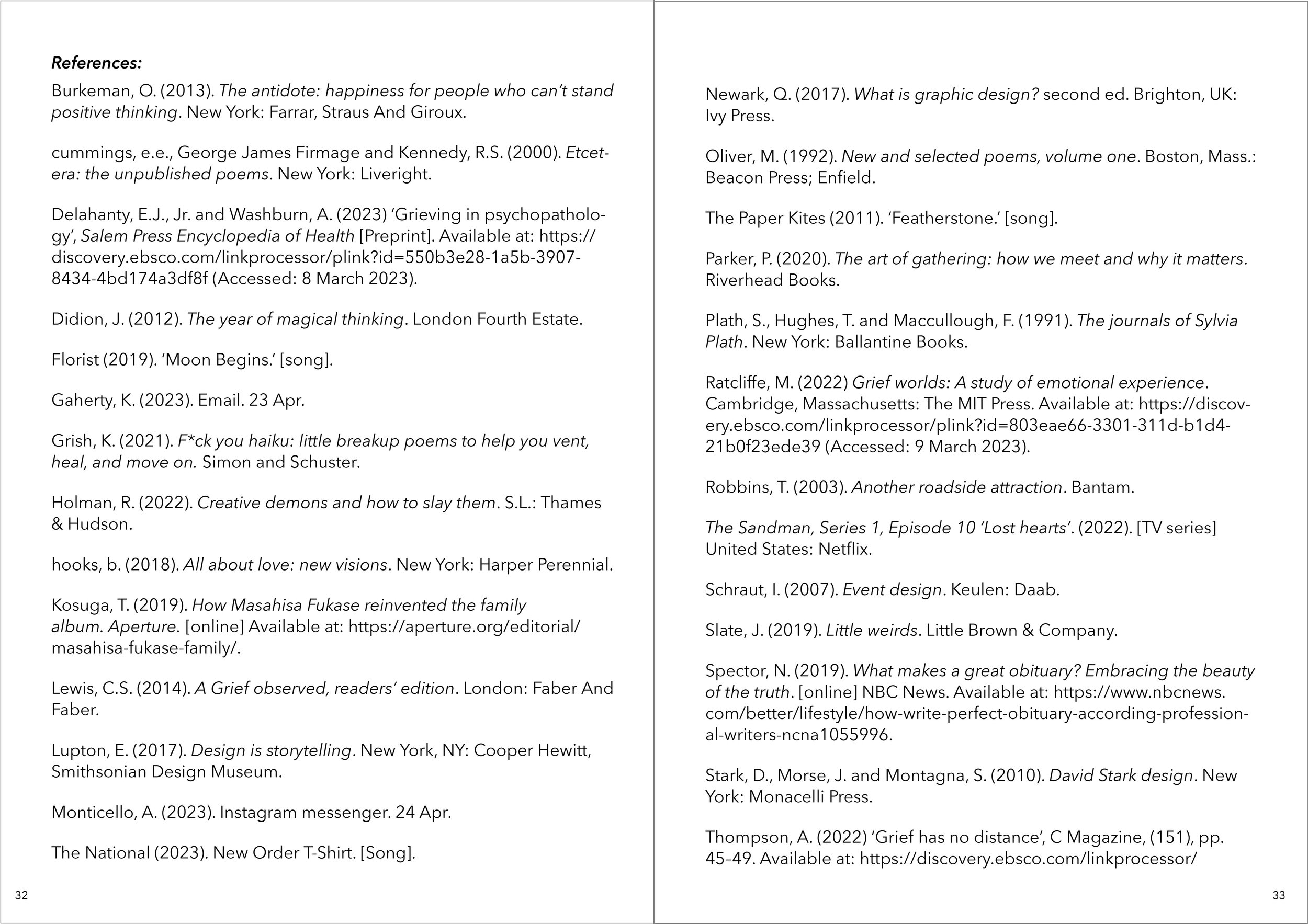
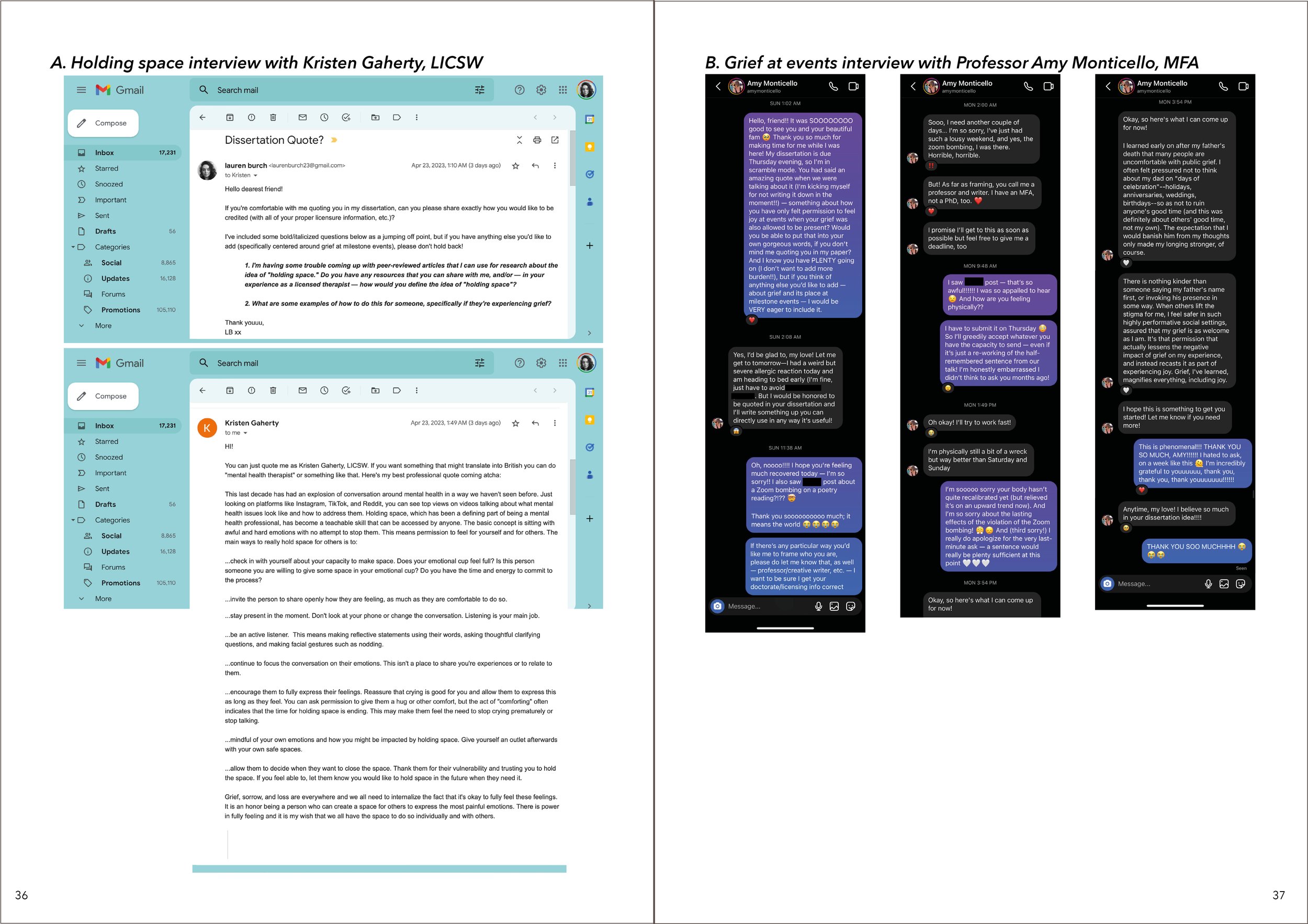
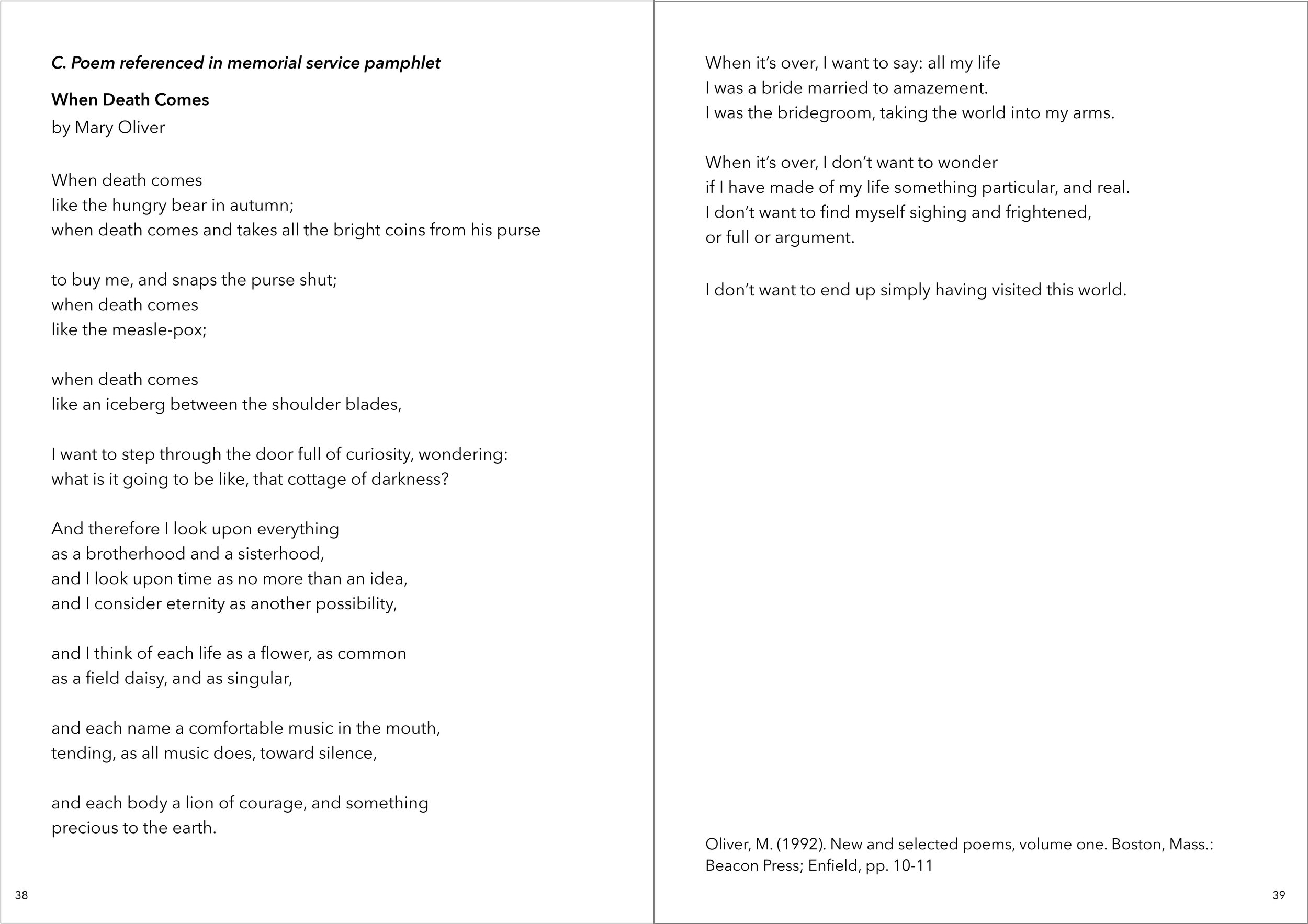
If you are interested in looking through my dissertation, you may swipe through the slides of my page spreads in the next section. Page numbers are on each slide to help orient you. While there are no images (I know, highly unusual in a creative’s dissertation!) other than the memorial pamphlet and appendices, I still wanted it to feel big, bold and graphic, so I kept it simple, elegant, using a stark black and white to keep the focus on the words. I use the blocks of black to break up the white pages, bringing the reader through the content.

Swipe through to see the editorial design of my dissertation.

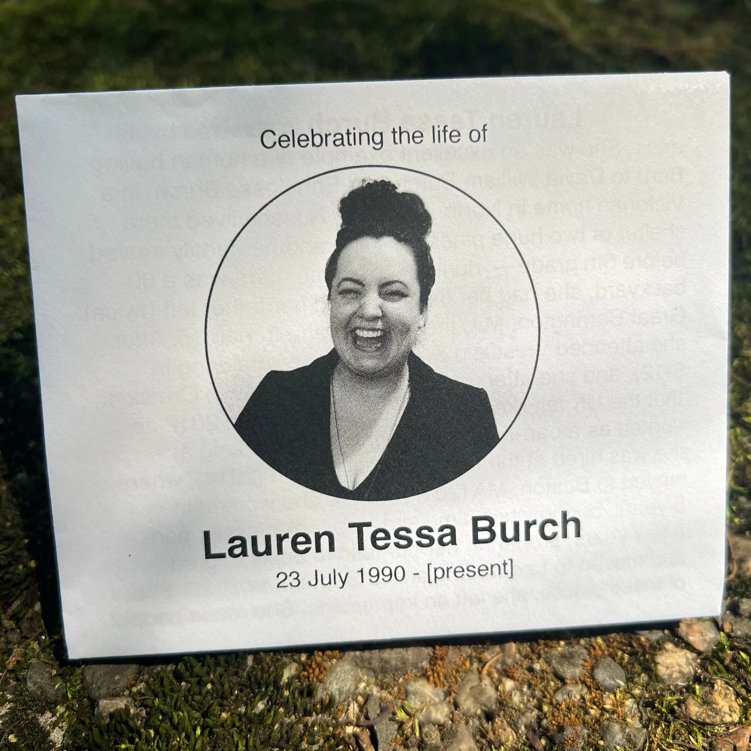
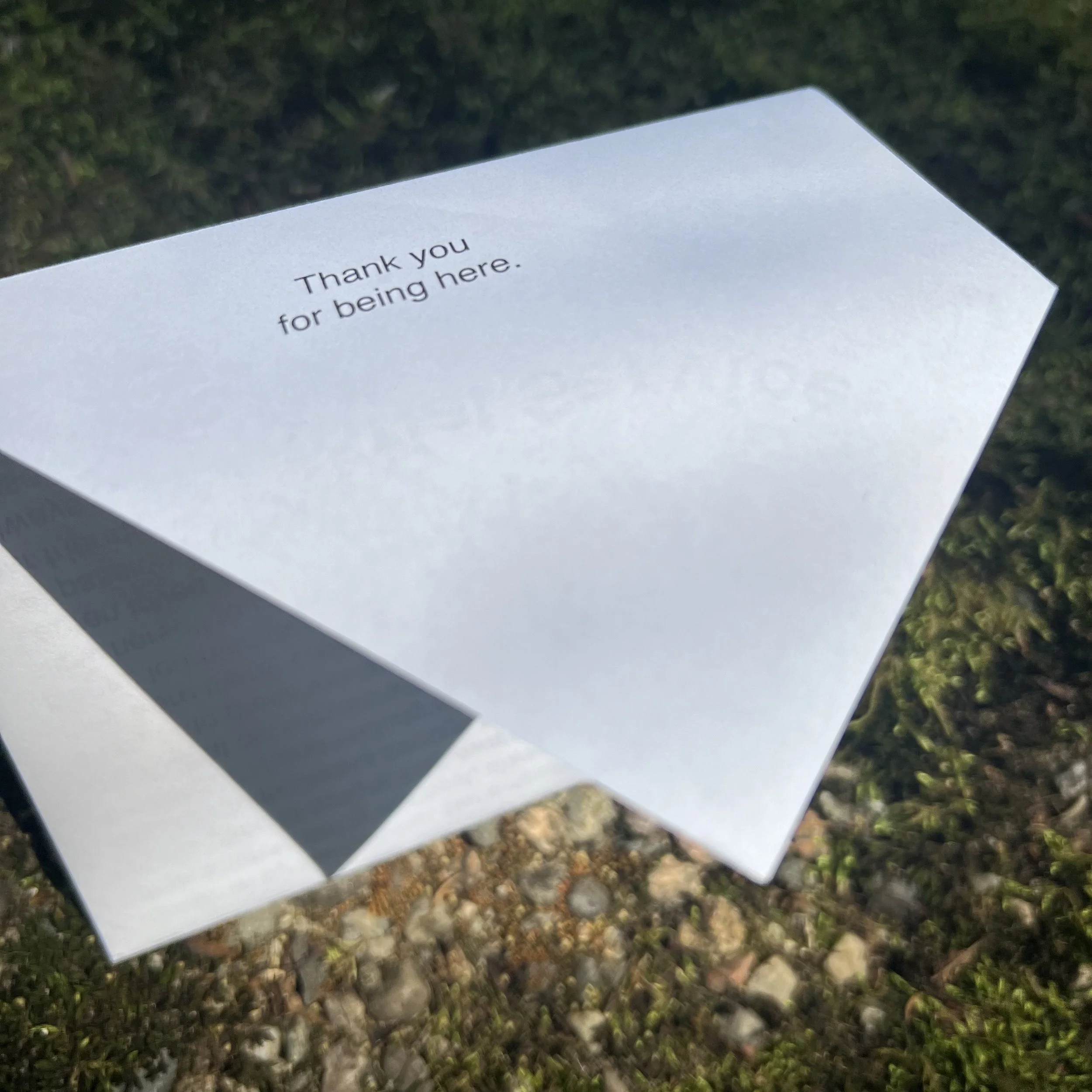
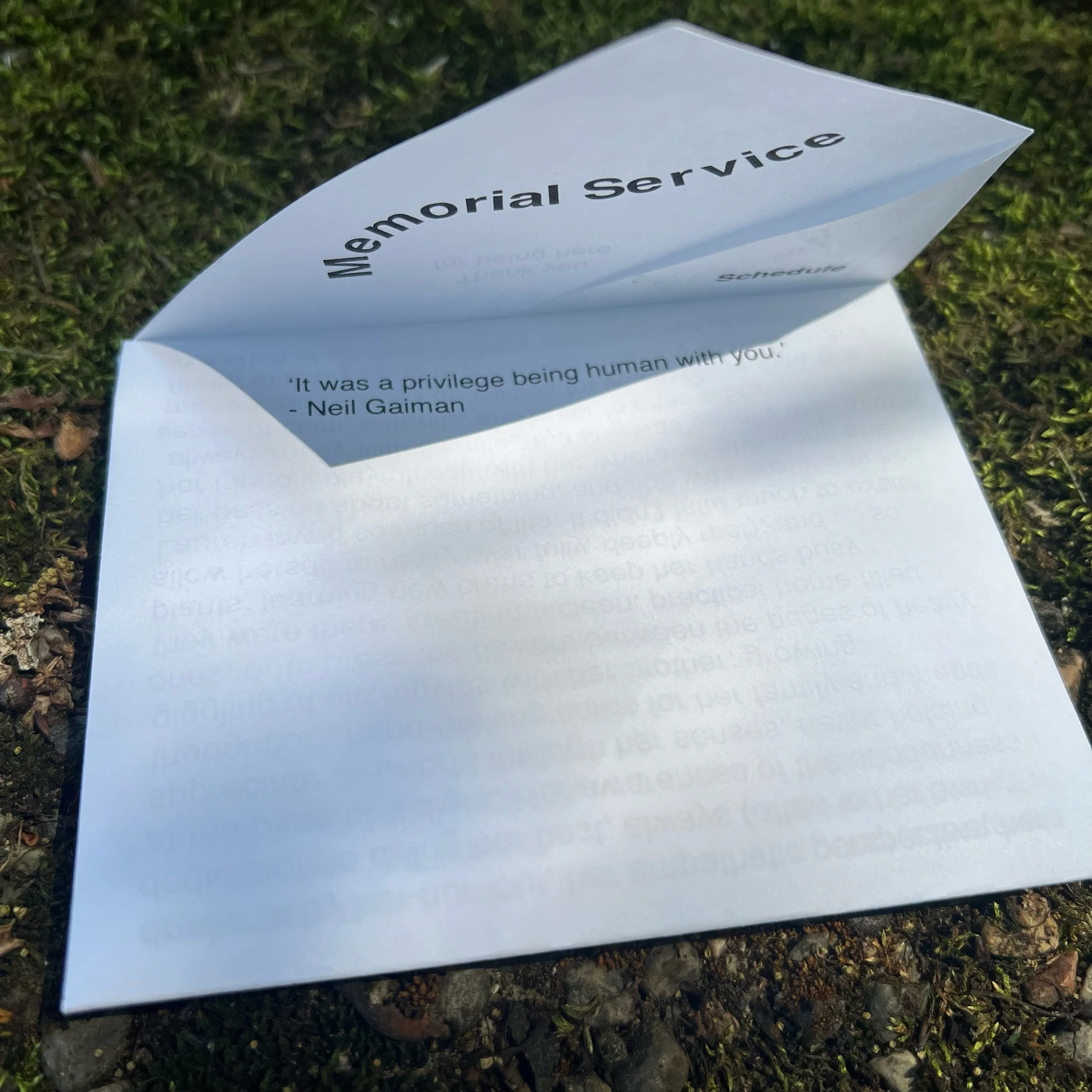
designing my own memorial pamphlet:

