“wonder” window:
classroom environmental design
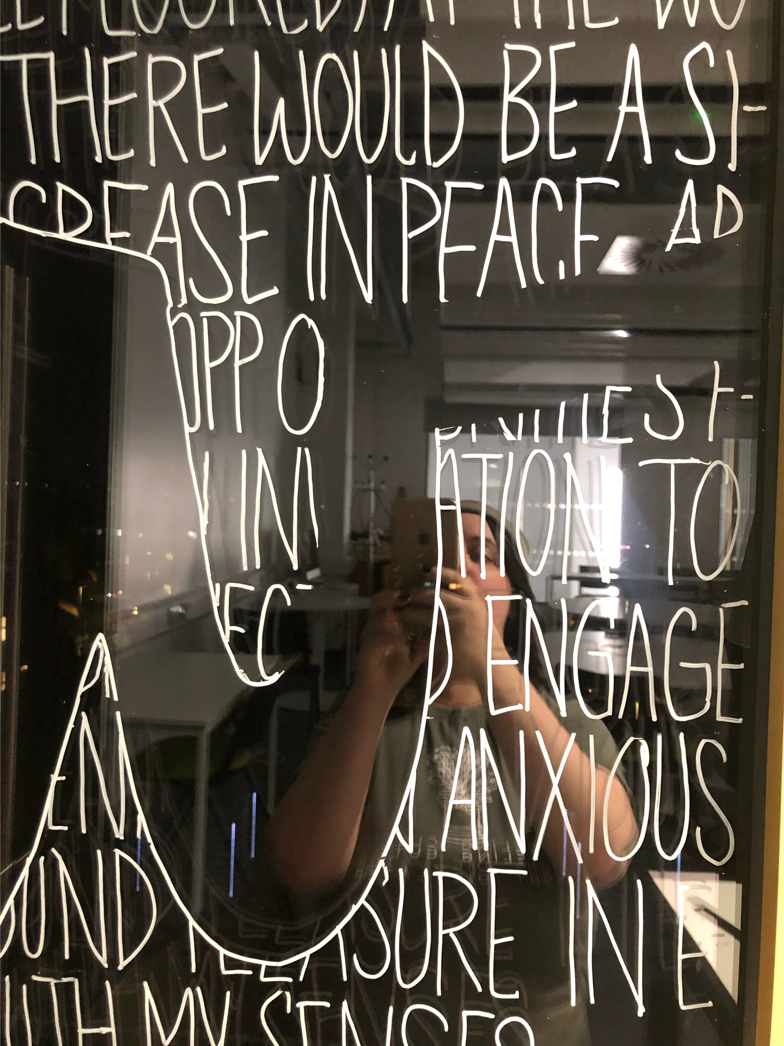
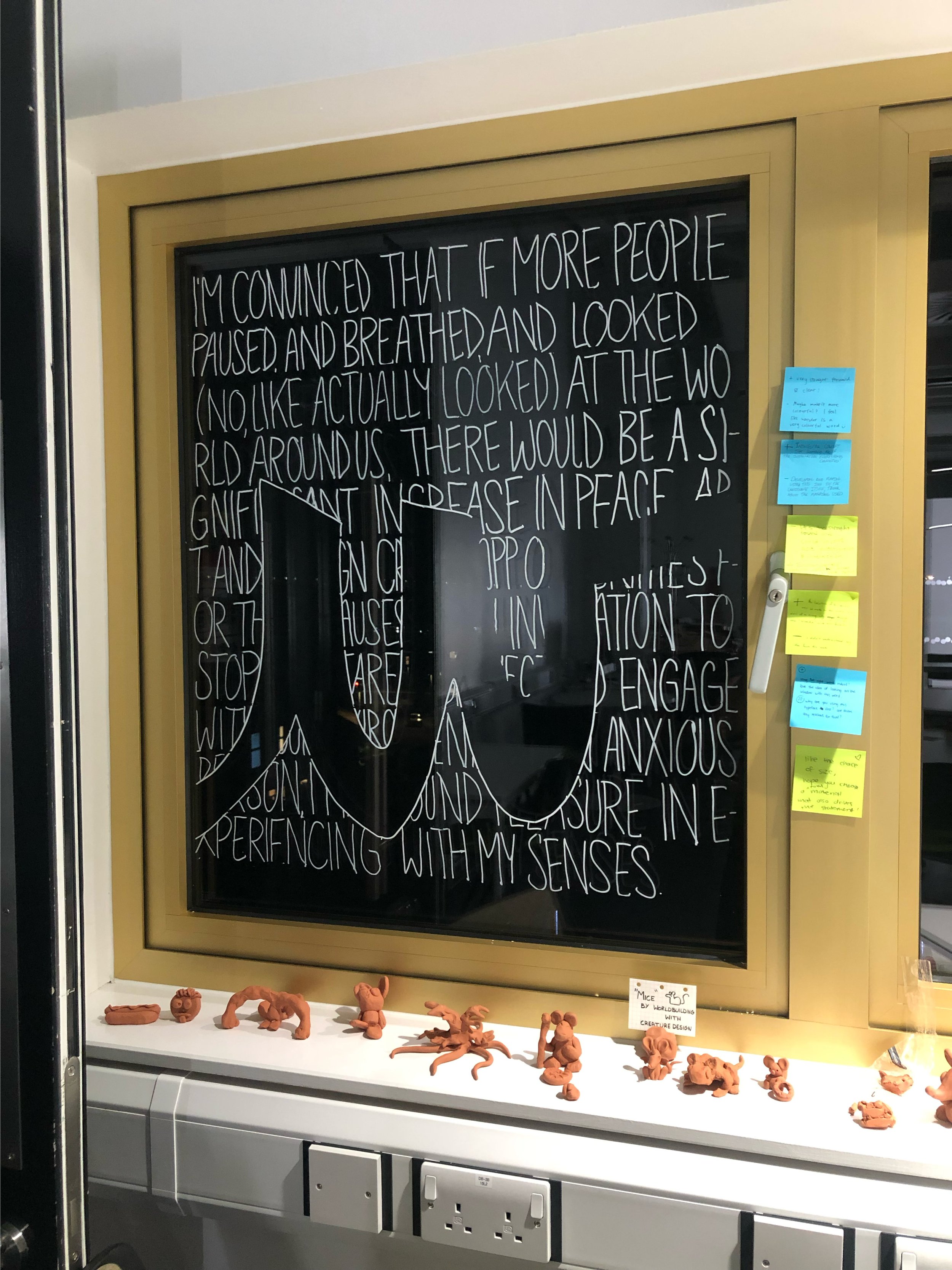
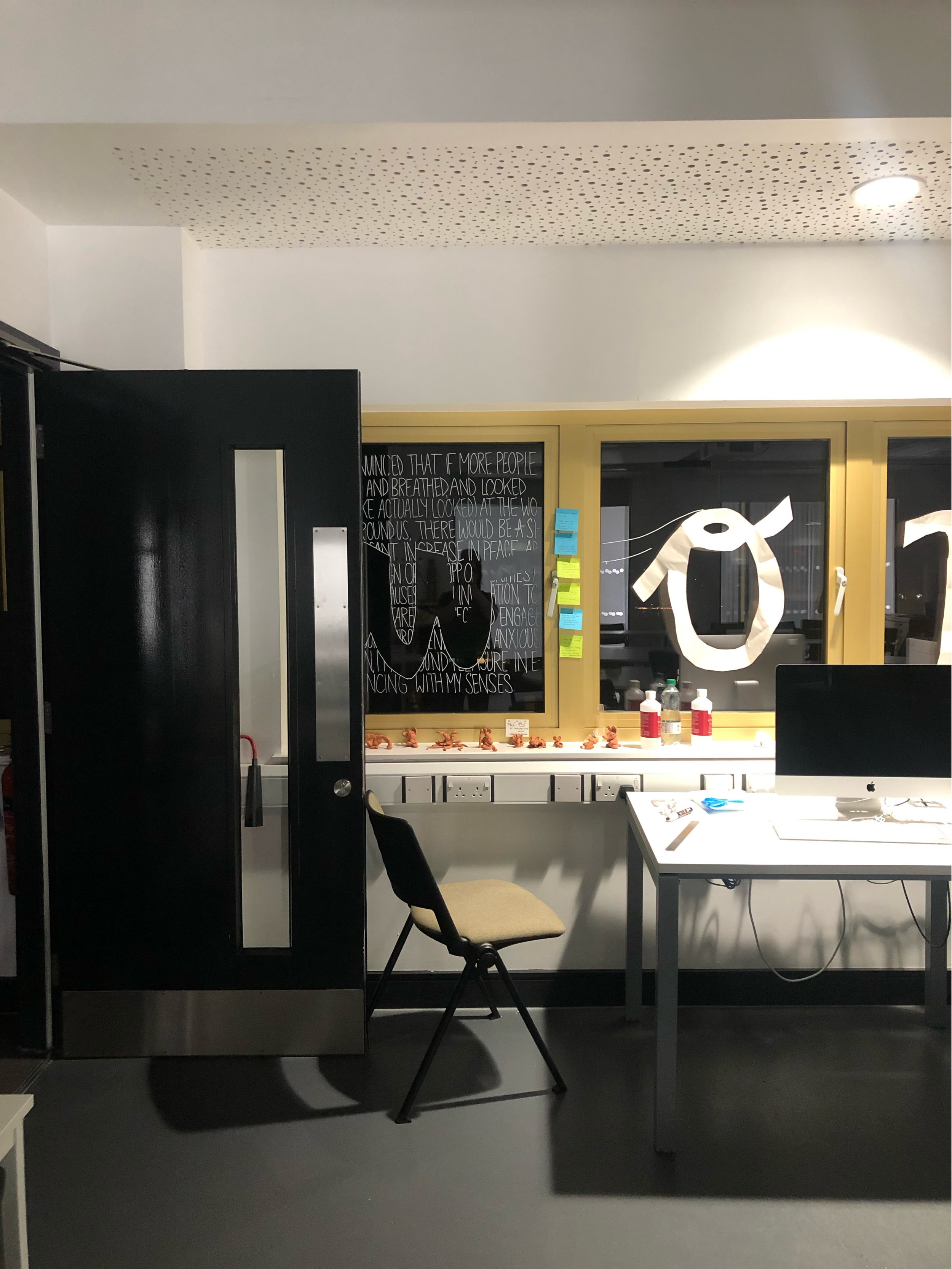
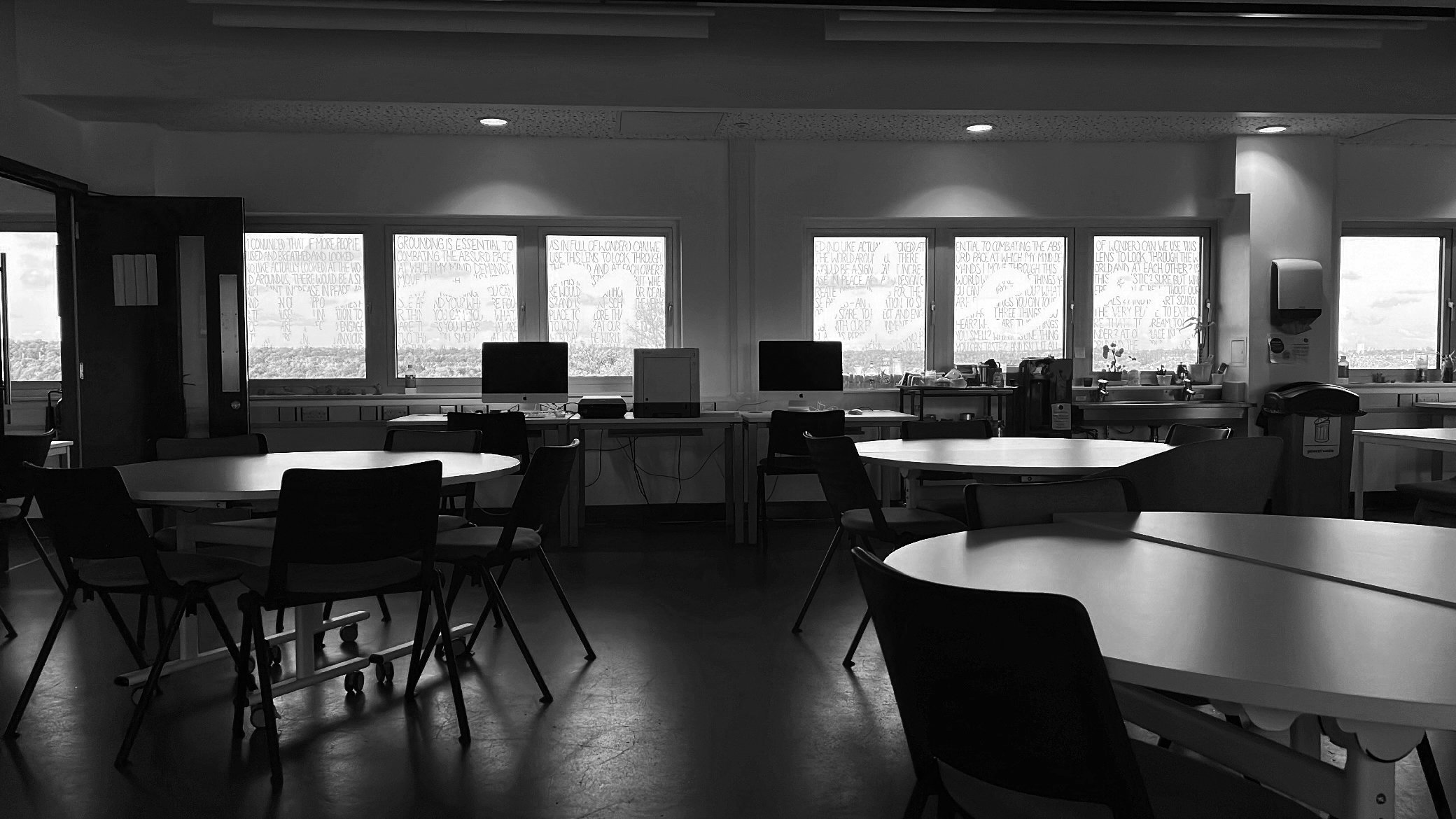
In the classroom where I earned my MA in Graphic Design, I designed and installed this hand-lettered window, devising an opportunity for my fellow creatives to see the world through the lens of wonder, literally. My handwriting creates texture (see what I did there??), and the content seeks to engage the viewer/user, begging them to interact, and therefore become a sort of part of the piece.
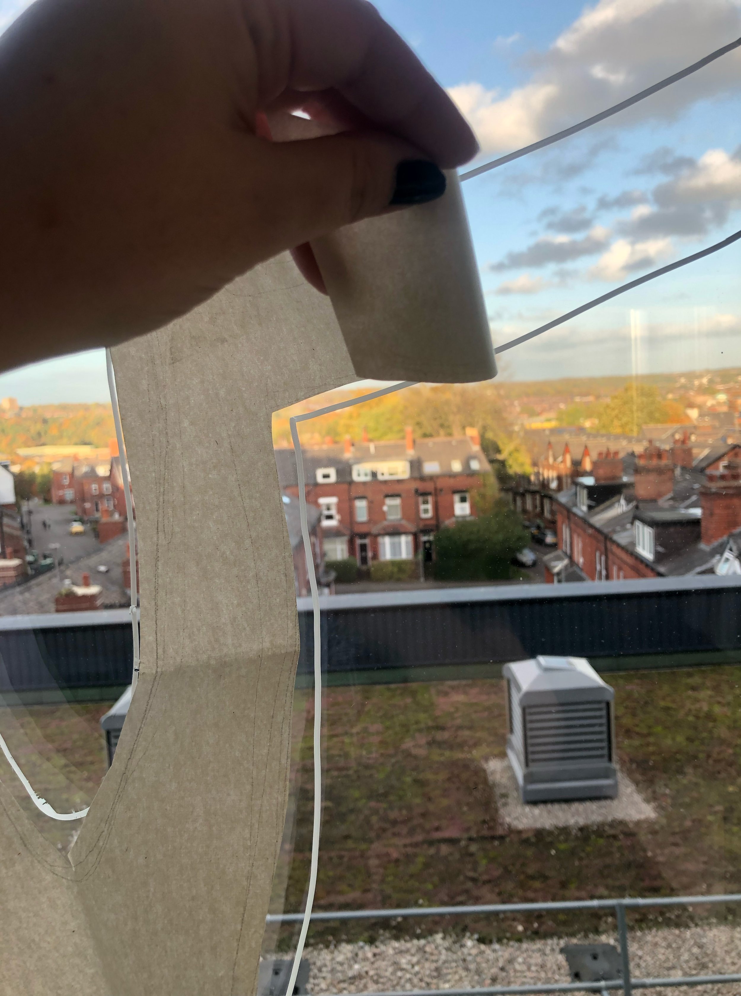
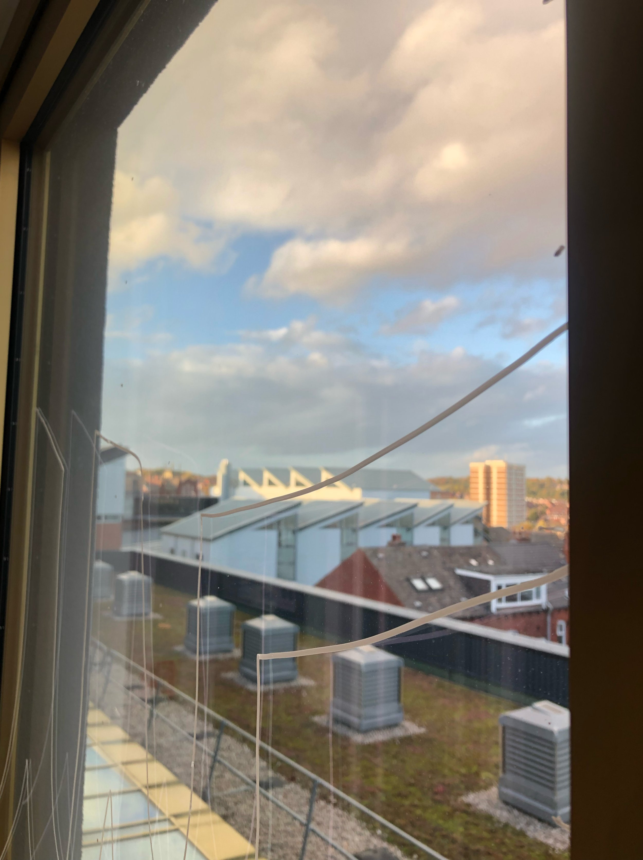
I traced the letterforms spelling out “wonder” onto large sheets of paper, taped them to the windows, traced the letterforms onto the windows, drew horizontal lines evenly across the windows, filled in the background with text, & then erased all of the lines other than the text. I challenged myself to take up space, and I was pleased when the teaching faculty requested that it stay up all year long.
I love how closely environmental and event design can overlap. (Since this installation was left up for the year, it features in the background of the inherently ephemeral event I produced.)
The text that creates the background to the letterforms that spell out “wonder” on the classroom windows reads as follows:
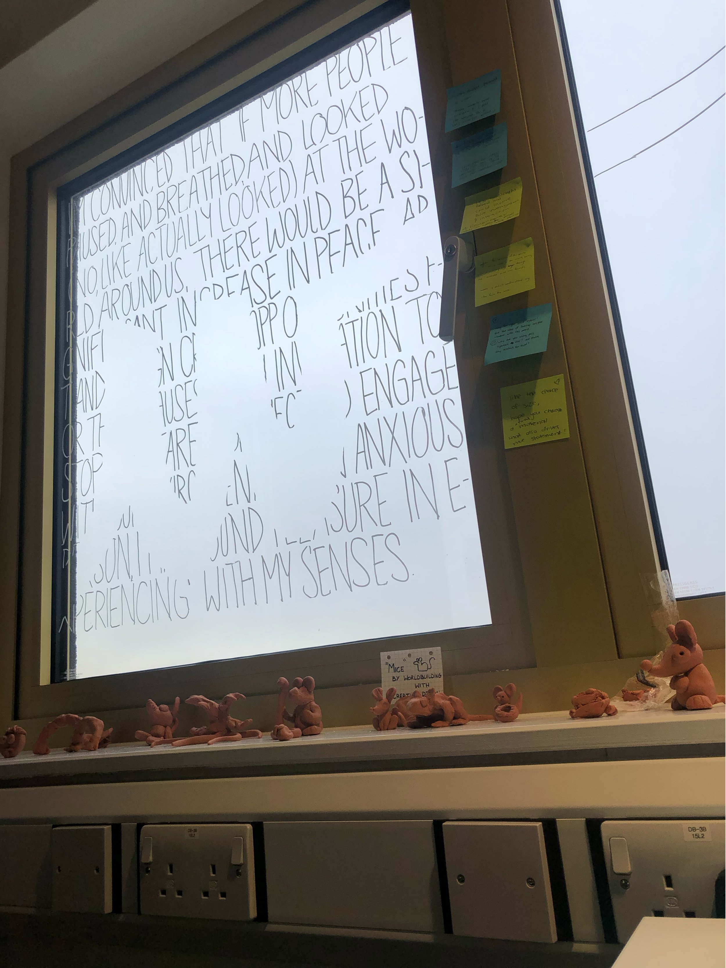
I’m convinced that if more people paused, and breathed, and looked (no, like, actually looked) at the world around us, there would be a significant increase in peace. Art and design create opportunities for these pauses — an invitation to stop and stare, to reflect and engage with our environment. As an anxious person, I have found pleasure in experiencing with my senses. Grounding is essential to combating the absurd pace at which my mind demands I move through this world. What are five things you can see around you? What are four things you can touch? What are three things you hear? What are two things you smell? What is one thing you can taste? … And isn’t it all wonderful? (I mean that as in full of wonder.) Can we use this lens to look through the world, and at each other? Is this idealistic? Sure, but where would we each be without our ideals? And isn’t art school the very place to explore that? To dream, to wonder? At our place in the world, and the world in our place.
I repeated the above text in the background of this installation until I ran out of windows and letters.
I was deciding between black and white for the handwritten text on the windows, and I’m ultimately satisfied with my decision to go with white. The texture that the text creates is stark against the dark night but delightfully subtle in the daytime. This experience changed with the seasons throughout the year, as the darkness falls shockingly early in the winter in the UK. I enjoy how, in order to see the lettering clearly against the blue (or, more often, grey) daytime sky, one has to move around, perhaps even crouching on the floor to look up, as the angle in some of these process photos show. The viewer is not a passive reader — they are invited to interact and engage with the installation in an effort to better see and comprehend it.

