Rooted:
the office of an environmentally-conscious skincare & cosmetics company
Fellow graphic design student Brianna Piazza and I co-created the company’s name and agreed on the overall vibe of the brand. The core value of Rooted is mitigating climate change, while offering affordable skincare & cosmetics. As such, this company uses plant-based materials and is conscientious to use packaging that reduces waste. I created the slogan: “in clear conscience.”
The office, located in Back Bay in Boston, MA, is comprised of the following areas that required design to bring the company’s personality, heart into their physical working space: 1) reception area; 2) conference room glass; 3) board room (two walls); and 4) interview room (two walls).
While the company name and sense of identity was co-created, my environmental design was entirely my own. I created a warm, welcoming space filled with earth tones, natural elements and textures, inspired by the centering word “grounded.”
environmental design breakdown:
-

reception area (view 1)
Here is the reception area, with a sneak peek at the conference room glass. The word “rooted.” behind the reception desk would be made up of moss, contained by metal shapes to form the letters, adding dimension, depth, and organic texture.
-

reception area (view 2)
Another angle is shown here, focusing on the texture of the brick wall and and the wood on the reception desk.
-

conference room glass
For the conference room glass, I designed a system of tree roots that allows a viewer to see if the space is occupied while also providing some level of privacy so the room occupants are not quite so exposed as they would be if the glass was left untouched.
-

conference room glass (detail)
The roots have a high transparency on them but are not completely clear, filled in with a gesture of texture. The hearty, earthy dark brown that frames the roots is not entirely opaque, and is filled with the same texture as the roots, so that general shapes could still be observed from the other side of the glass but expressions would be harder to differentiate.
-

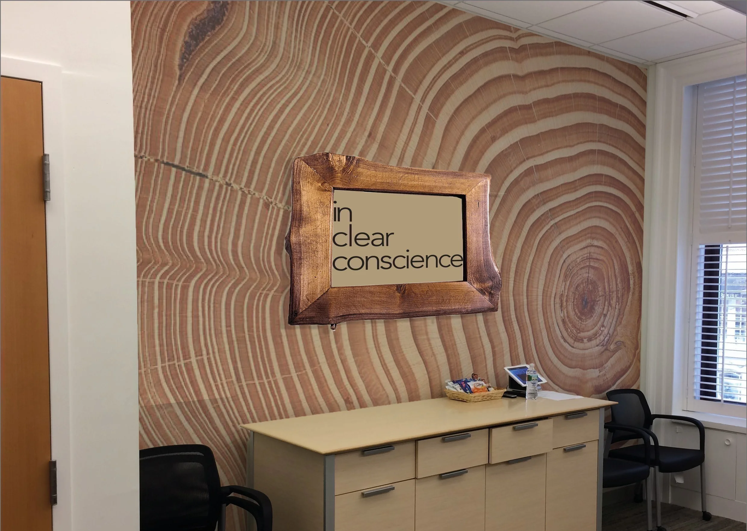
boardroom (wall 1)
On one wall of the boardroom, I chose a very large scale, intimate look at a cross-section of a tree (like photographic wallpaper), broken up by a live-edge wooden frame that states the company’s slogan, with the words stacked in a cascade.
-

boardroom (wall 2)
The other wall of the boardroom is shown here covered in cork, not only providing another natural (and sustainable!) texture - which communicates in a friendly way with the wallpaper I propose) - but also providing a practical surface to use during meetings or presentations (in addition to the existing white boards).
-

interview room (wall 1)
“Wall 1” of the interview room is the backdrop of virtual meetings or interviews (a now-familiar consideration). I chose to position the company name and slogan behind the interviewer at a level and angle where it would be visible over the shoulder to whomever is on screen.
-

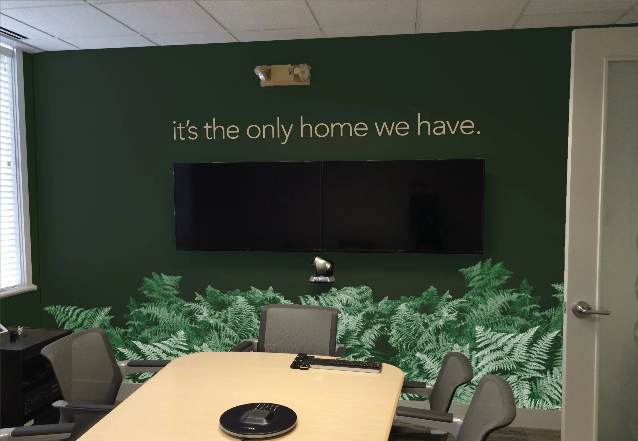
interview room (wall 2)
“Wall 2” is what the interviewer/attendee would face, behind the existing monitor screen. I have the phrase “it’s the only home we have,” a simple yet effective underscoring of the slogan and the company values, helping to direct each choice be made in support of those values. The whole room feels like a lush ferny forest, rich in the wonder of the natural world.
-

color palette
The color palette for rooted. takes clear inspiration from the natural world and feels grounded, fresh, and lush.
-

typography
Avenir (black) is used in the logotype, including the moss installation in the reception area.
Avenir (light) is the typeface used in the other places, like the framed typography in the boardroom (wall 1) and on wall 2 of the interview room.
Avenir (light oblique) is used for emphasis, like under the logotype in the interview room (wall 1).

