The Simple Things:
branding for a coffee shop food truck
I imagine this coffee shop food truck would be situated in the Back Bay of Boston, MA — perfect for the literary crowd that wanders by on their way to/from Trident Booksellers.
The Simple Things sounds like a title, perhaps a companion guide to accompany Thoreau’s or Emerson’s writings.
branding breakdown:
-
![]()
brandmark
The brandmark for The Simple Things is comprised of the logotype of the company name, almost entirely circled by a coffee ring, which forms the shape of a backwards “c.” I dipped the bottom of a mug in coffee and stamped it (many, many, many, many, many times), creating different drip patterns until I found the one that matched the image I had in mind.
The edges of the incomplete circle are placed so that the reader is invited through the text into the ring, as into a conversation. The organic feel and texture of the ring comes from stamping the bottom of my mug in coffee.
The company name paired with the brandmark bring to mind the intimacy of a fresh cup of coffee accompanied by an engrossing book.
Keep swiping to see more of the branding breakdown.
-
![]()
construction & placement
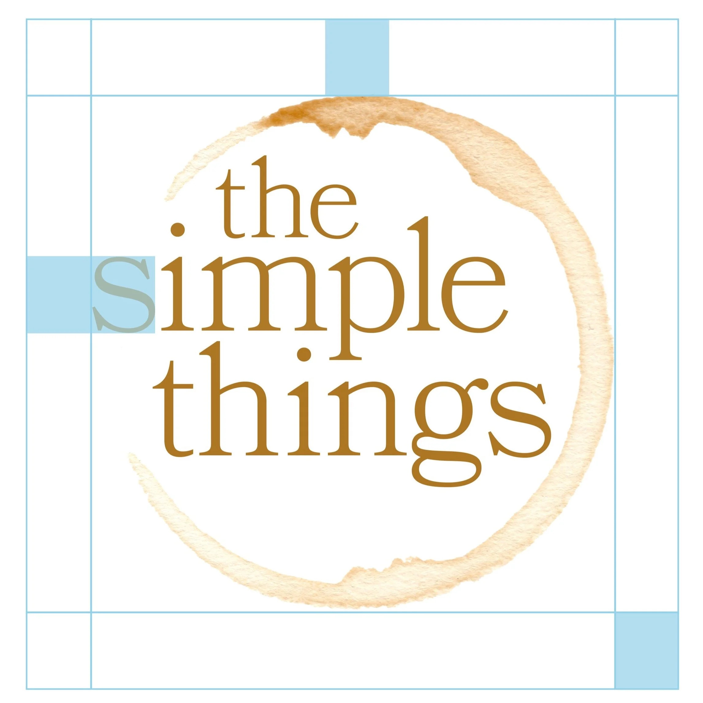
The logo for The Simple Things forms an almost complete circle, with the “s” in “simple” peeking out playfully in such a way that the type is stacked but optically aligned in the cascade of the letters. The way that the eye moves through invites the reader in.
A safety area should be maintained around the perimeter of the logo that is equivalent to the height and width of the letter “s” in the logotype. (The “s” in “simple” and in “things” is the same point size.)
-
![]()
typography
A company with the name The Simple Things demands an accessible yet comforting typeface for its brand, a typeface that would feel at home in a book, much like the target clientele.
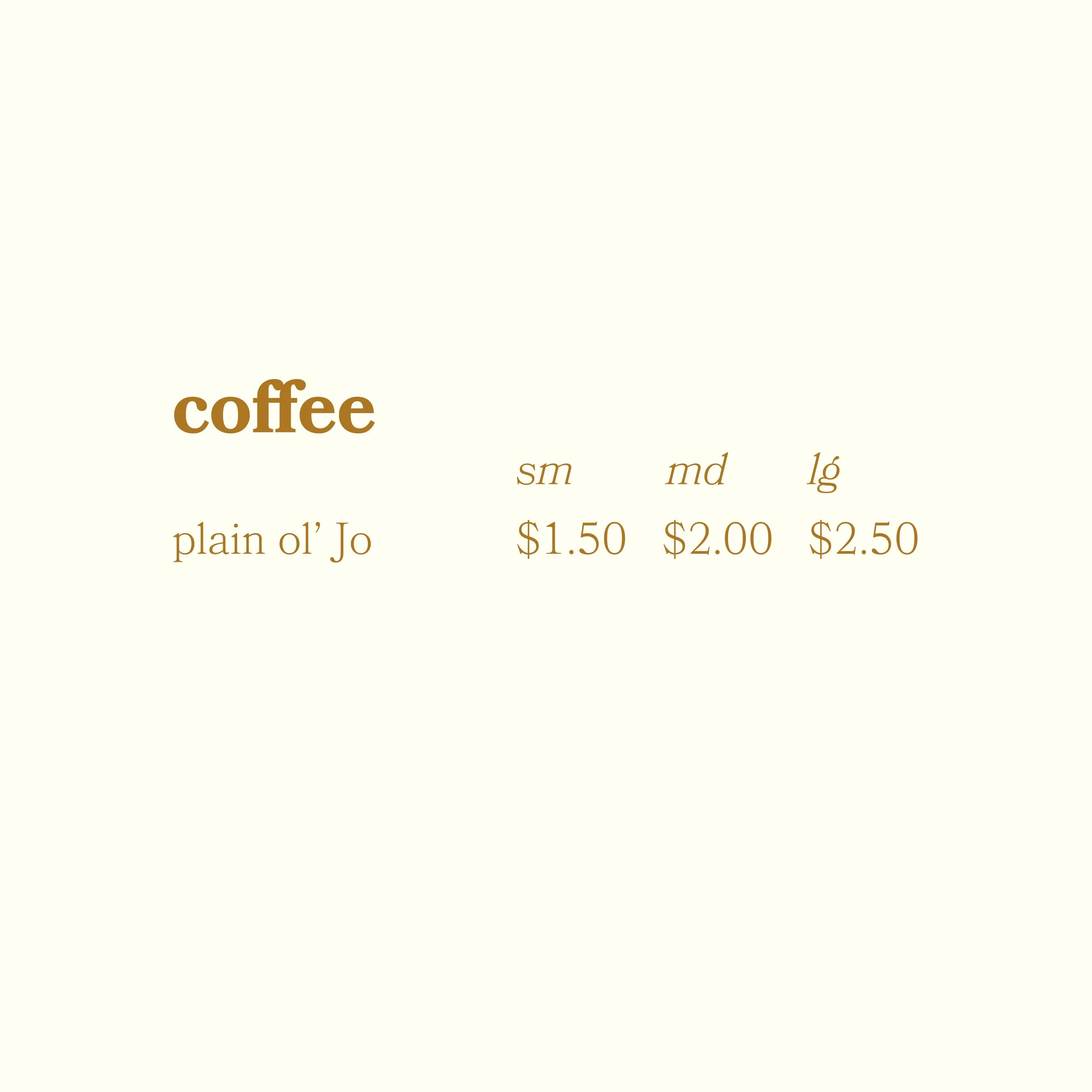
Bookmania (bold) is used as the heading on the menu, like “coffee” is shown here.
The text that helps organize the information presented in the menu and guide the reader through it (like “sm,” “md,” and “lg” shown here, and notes about allergies) is in Bookmania (light italic).
Bookmania (light) is the typeface used in the logotype, as well as the body text, like the “plain ol’ Jo” on the menu.
-
![]()
color palette
The color palette for The Simple Things strikes a balance between fresh and comforting.
While white is clean, it can also be sterile, so there is a slight hint of a warm yellow to the almost-white. Dark brown can be somber, traditional, and heavy, so there is a touch of a more modern ochre to this brown, while still not straying too far from an inviting cup of coffee. Green introduces a sense of freshness, promising fresh, local fruit for waffle toppings and brings to mind the idea of farm fresh, from your favorite food truck. The light creamy peach helps to soften the palette in a friendly, organic way.
-
![]()
abbreviated brandmark
The abbreviated logo for The Simple Things is the same iconic coffee mug ring encircling an enlarged version of the “s” from the logotype so that it fills the circle, reminiscent of a wax seal to give it that elegant, classic, literary feel. The coffee mug ring has been rotated slightly from the original brandmark to more gracefully accommodate the shape of the “s.”
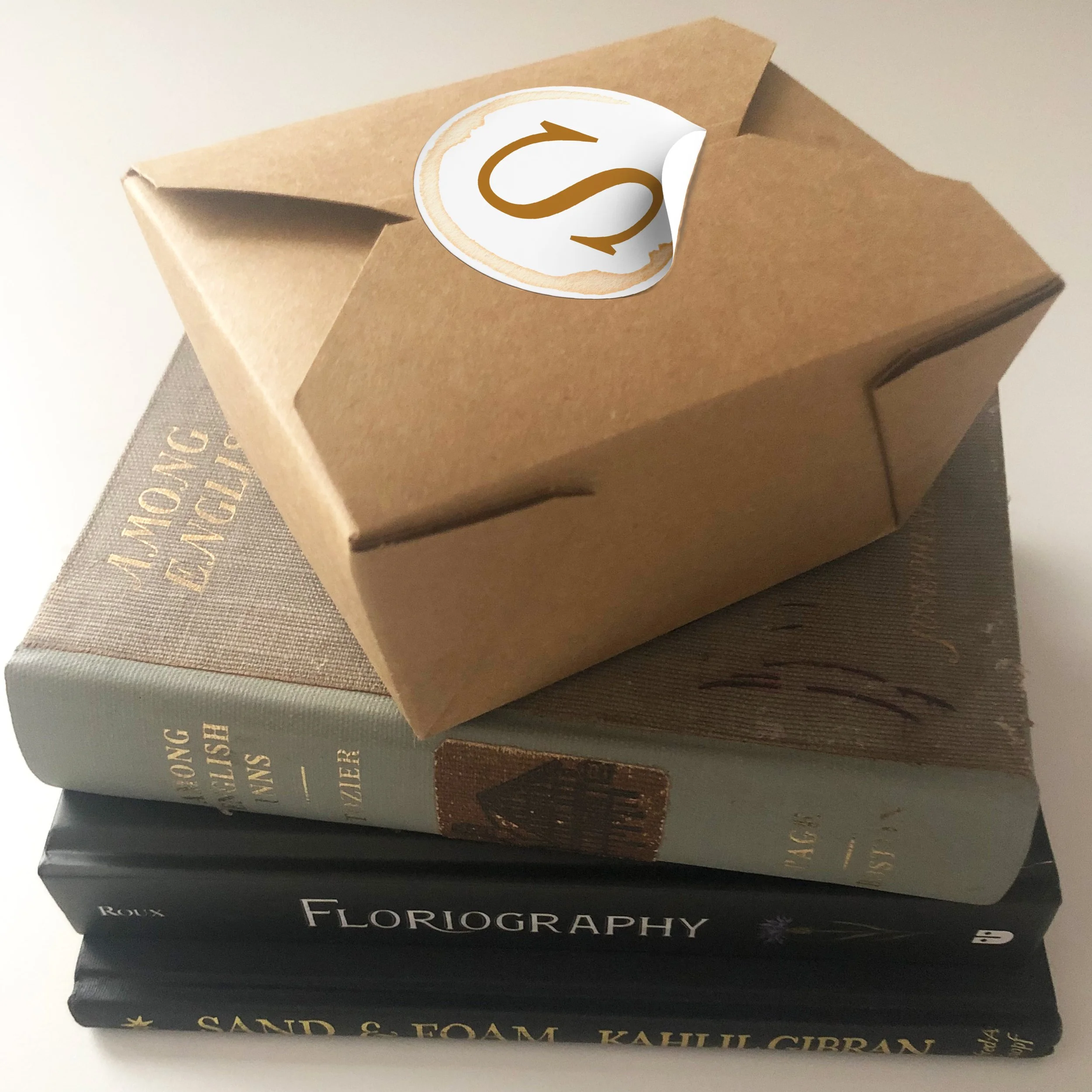
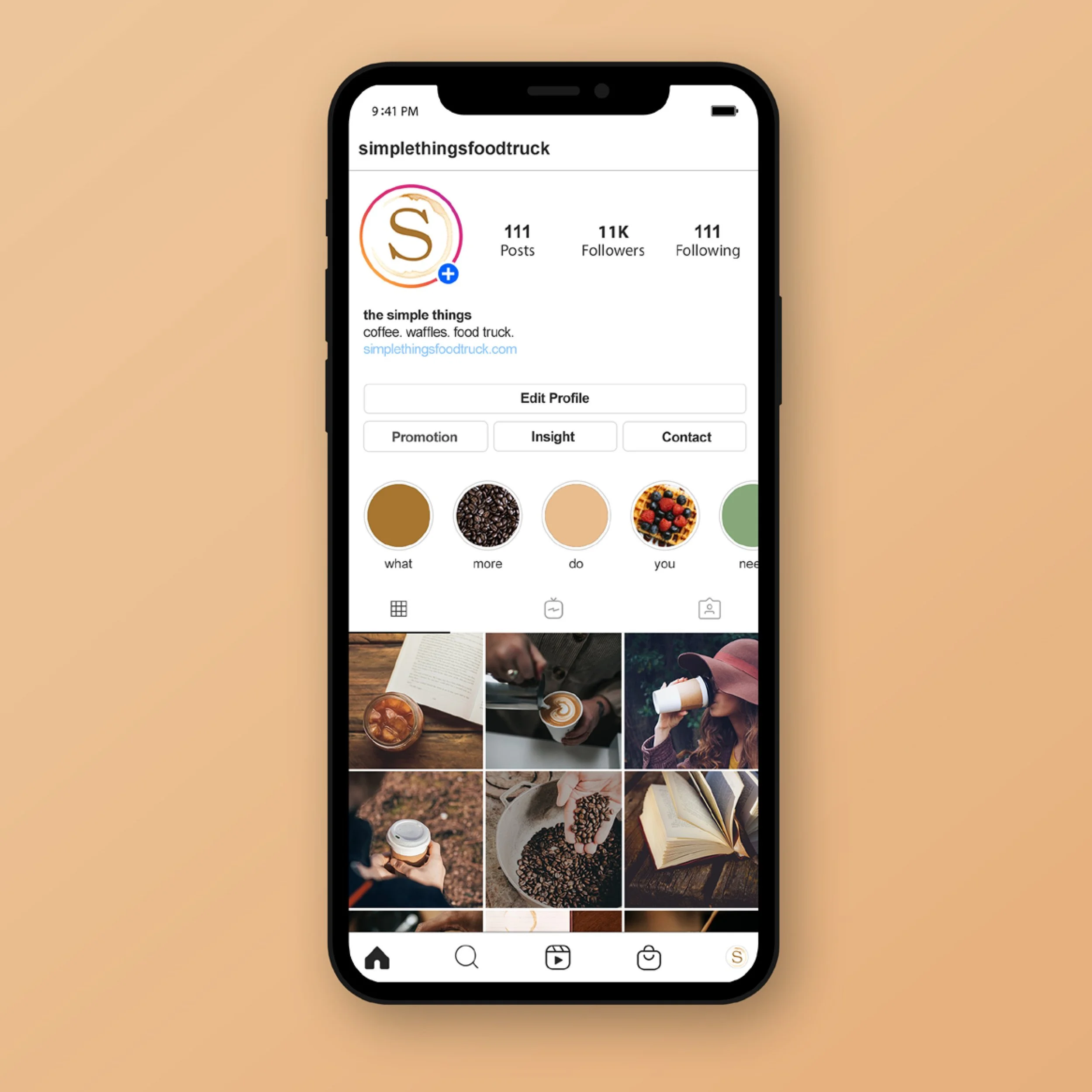
This abbreviated logo appears on collateral where the main logo would not be as clearly decipherable, like the stickers on the to-go boxes for the waffles, and the profile / favicon for social media.
-
![]()
menu
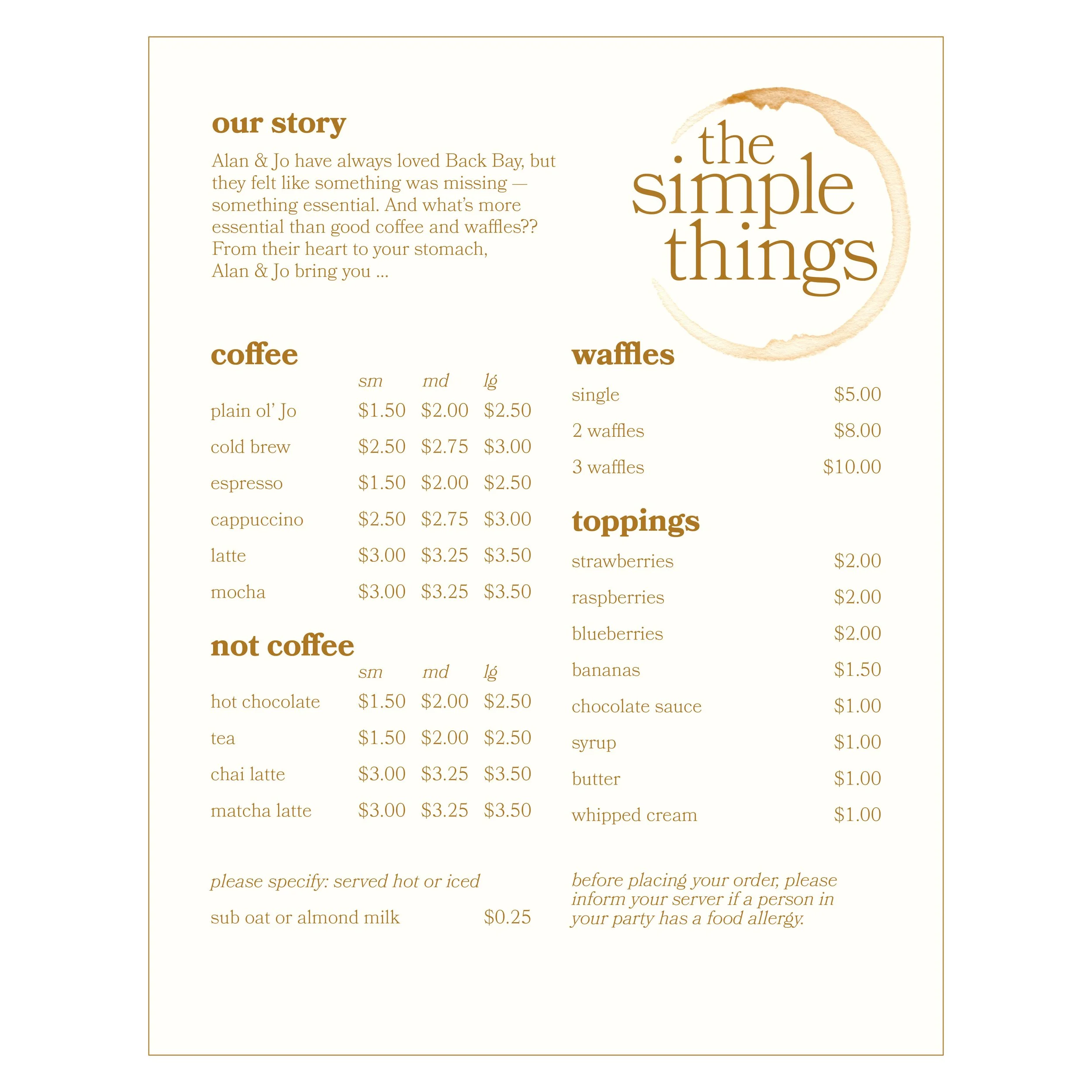
This would live on a large board outside of the food truck, on printed menus to pass out to the guests waiting in line — or both.
-
![]()
to-go mockup
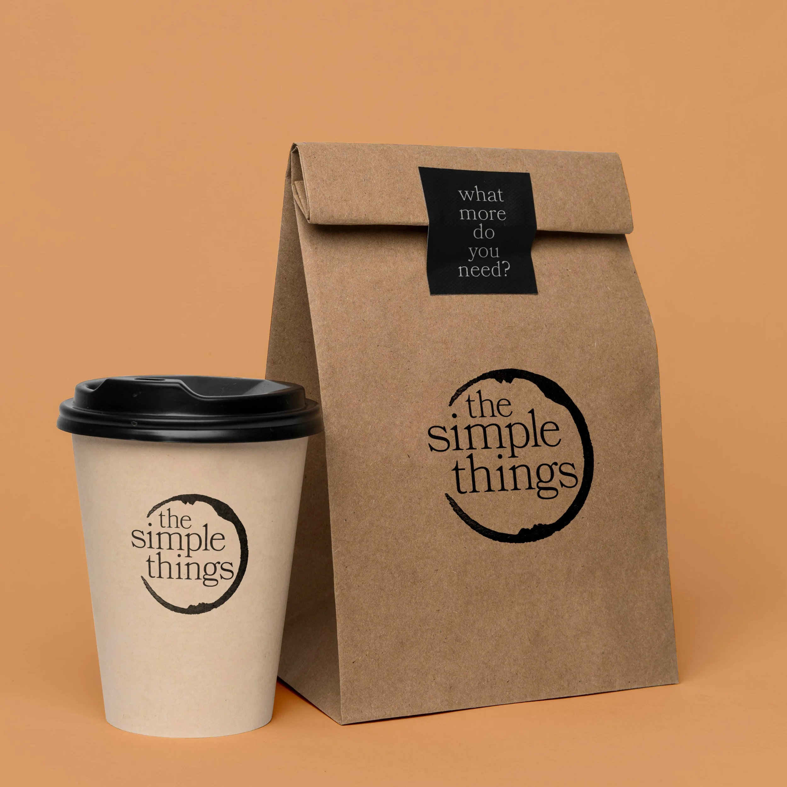
The simplified black version of the logo pops against the environmentally-friendly, recyclable, low-key and approachable to-go packaging.
-
![]()
to-go container sticker mockup
This is an example of how the abbreviated brandmark can be applied — as a sticker on an environmentally-friendly to-go container.
-
![]()
tote bag mockup
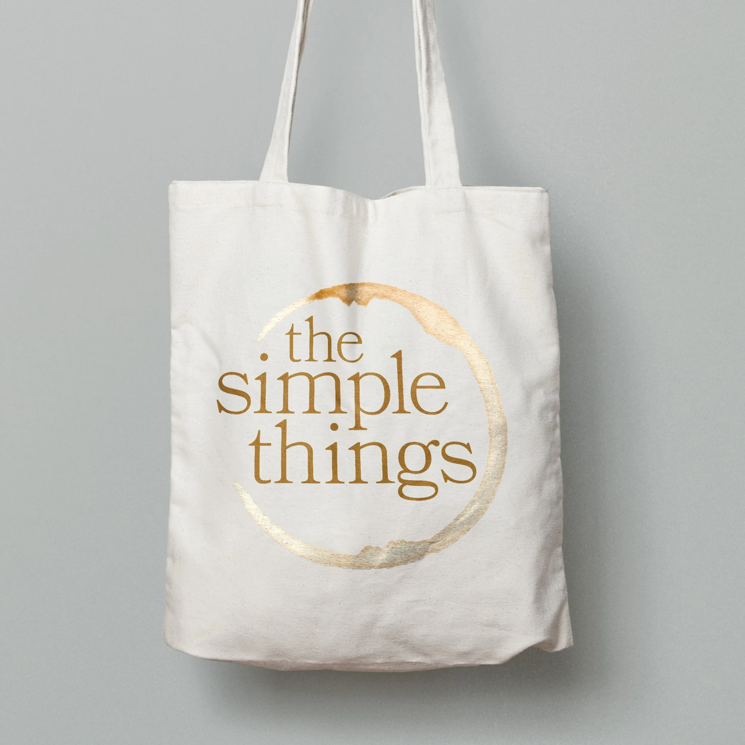
The branding isn’t restricted to only the menu, to-go items, social media, & ads — there are other application opportunities, too … a tote bag, for example!
-
![]()
The Simple Things food truck Instagram mockup
The grid shows warm, welcoming photos of freshly roasted coffee, with a hint of dark academia, literary vibes. The abbreviated logo shines here.
-
![]()
print ad
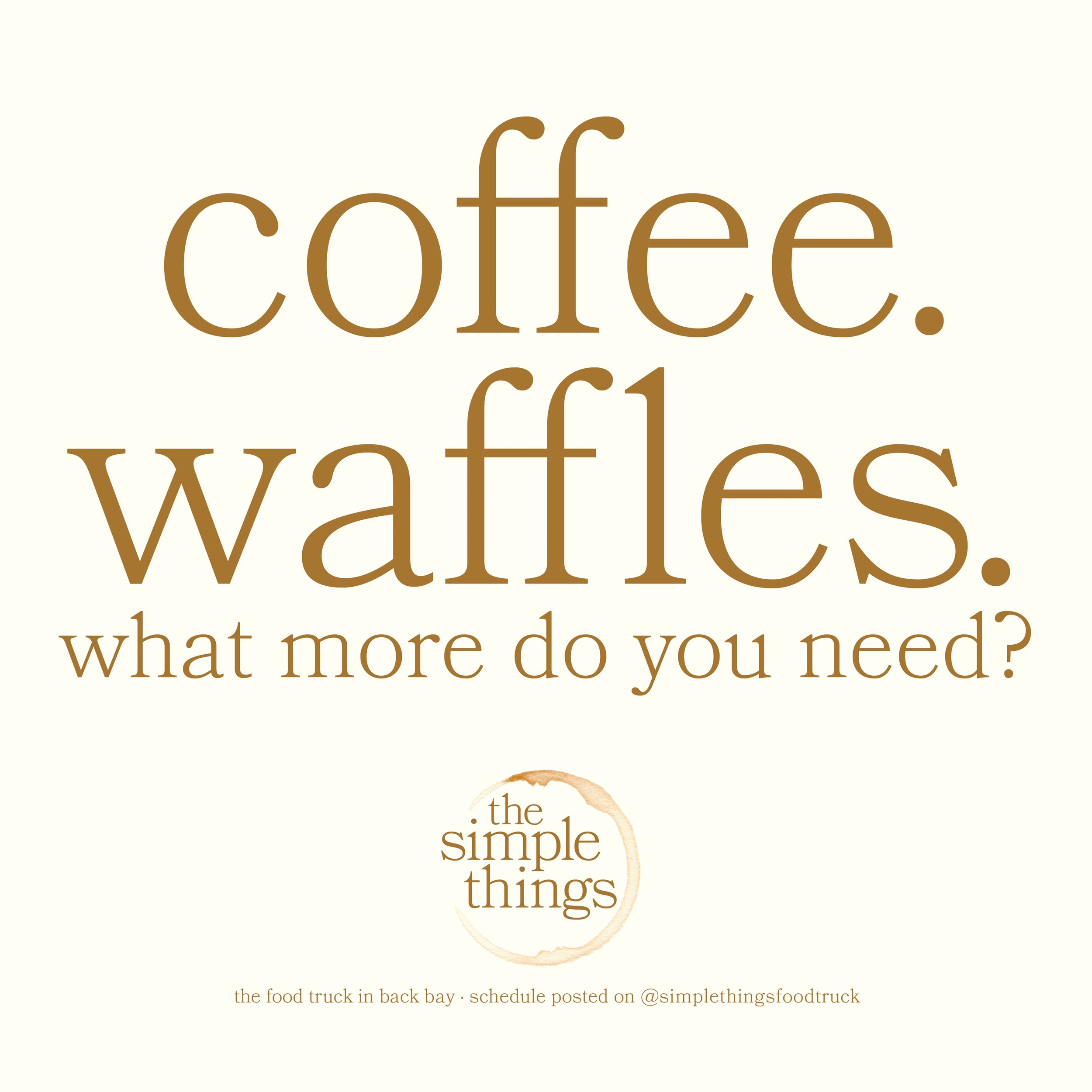
Here is a typographic-emphasized, simplified version of a possible print ad.
… What more do you need?
-
![]()
print ad
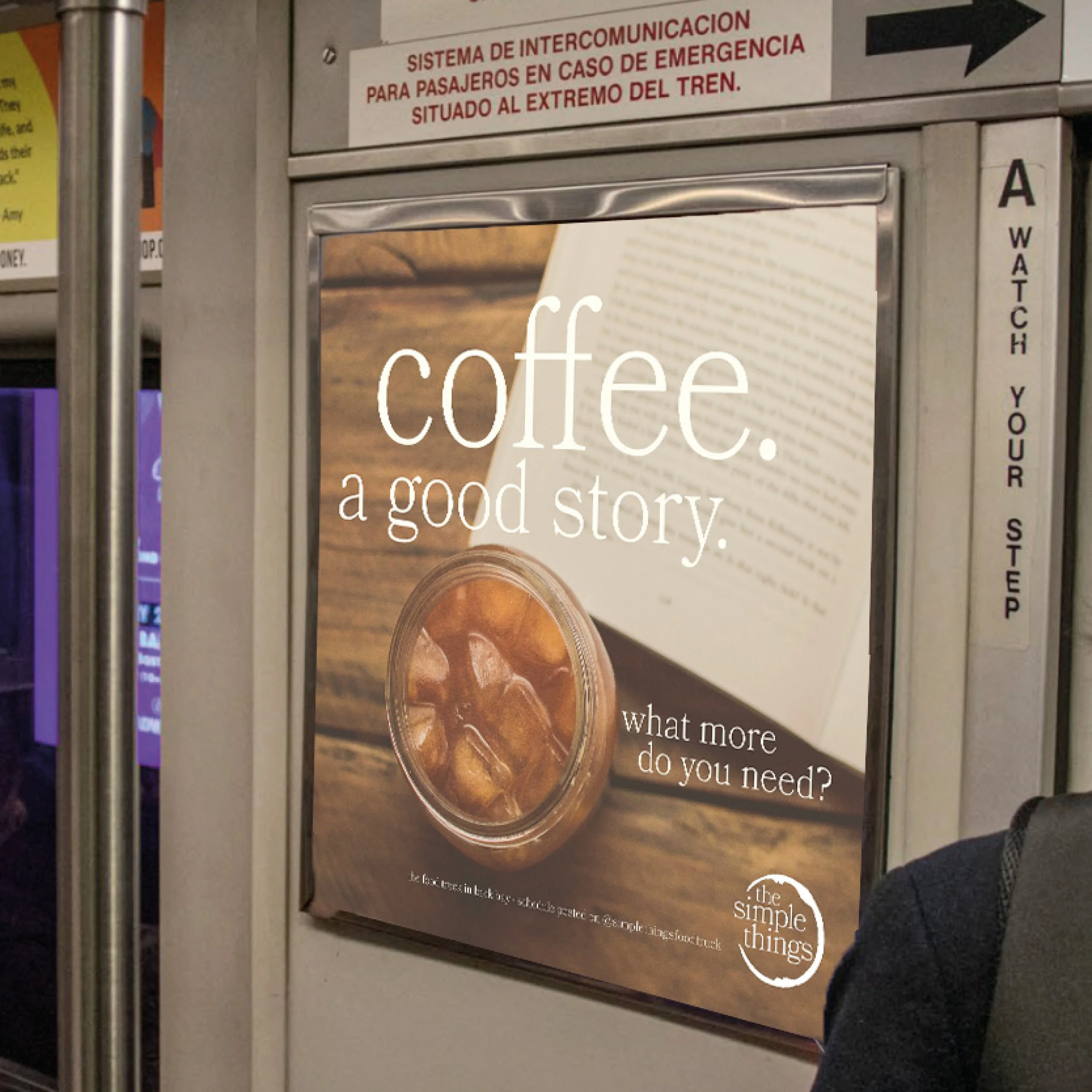
This is another version of a more photographic print ad, as it would be seen on the T.

