350.org:
South Station ad campaign
I worked with fellow graphic designers Ava Huggins and Meghann Jones to design this ad campaign for South Station in Boston, MA, which is a transit hub for commuter trains and also links travelers to the Massachusetts Bay Transportation Authority subway system (MBTA, locally known as the “T”) via the Red Line.
The client 350.org aims to build a global climate movement, specifically to “end the age of fossil fuels and build a world of community-led renewable energy for all,” according to their website. They have an established brand, including logo, type, color palette, and icons. As a team, we used their existing branding to imagine and design this ad campaign.
Since South Station is divided into the commuter rail portion and the Red Line subway, we made the choice to embrace this duality.
We also decided to design the campaign to feel as local as possible — not only to Boston in general, but to the station itself.
The grim reality is that with temperatures rising, ice caps melting and oceans rising, we will see an increase of more extreme weather, especially on the coasts. Data shows that South Station itself will be underwater by 2050 unless we do something.
The ads for the commuter rail hub of South Station show some optimism, despite these facts — the headlines that I was instrumental in co-designing (nothing but gratitude for my English degree!) show that if we “don’t delay,” “it’s not too late” to “keep the ocean at bay.” It was integral that the ad campaign feel grounded in the train station, and in that particular train station near Boston Harbor.
Meghann came up with the idea for a very visually striking campaign, and I took that concept to the next level by starting to integrate photographs into the heart of the campaign. Ava brought our ideas together in a cohesive way, incorporating the icons associated with the brand.



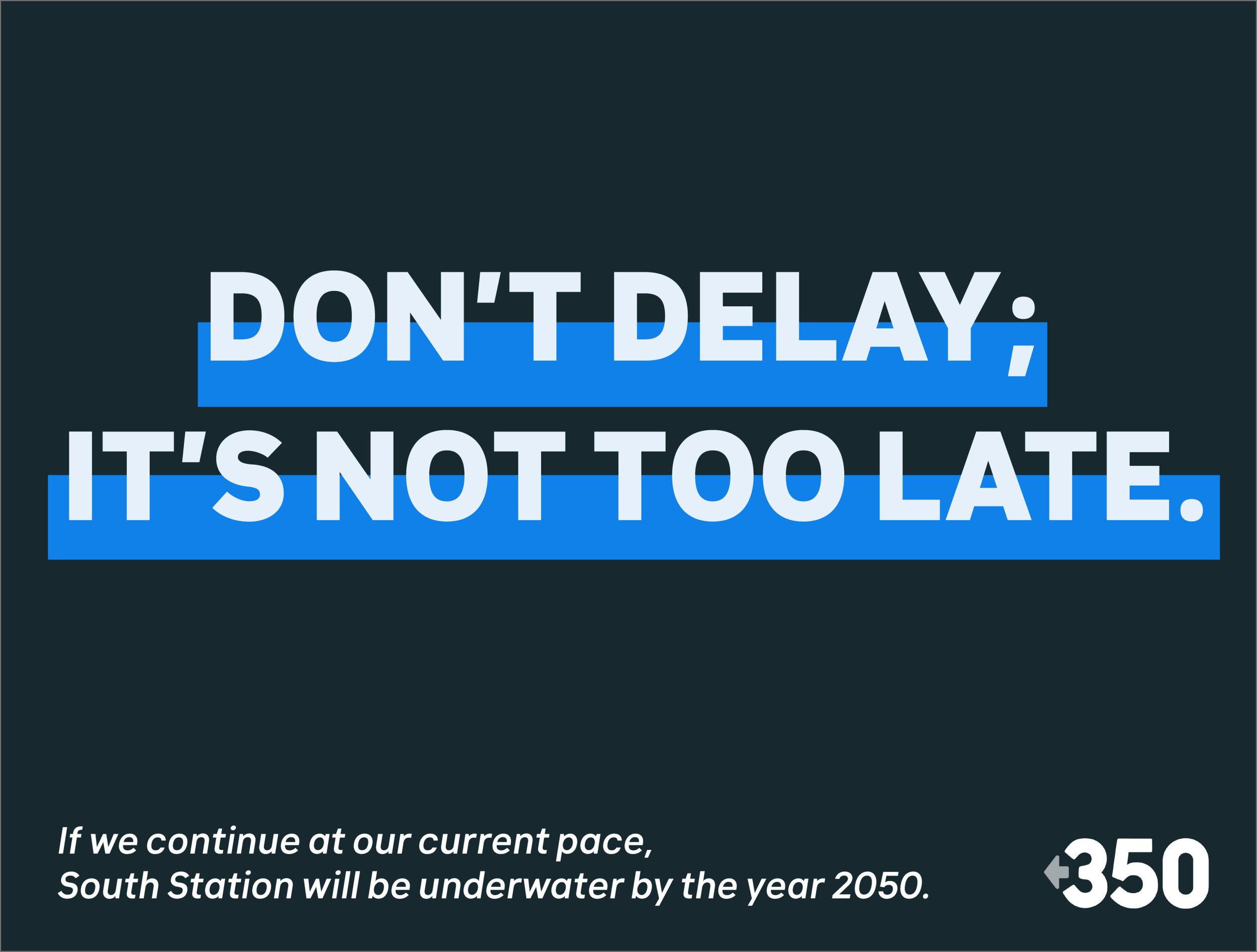

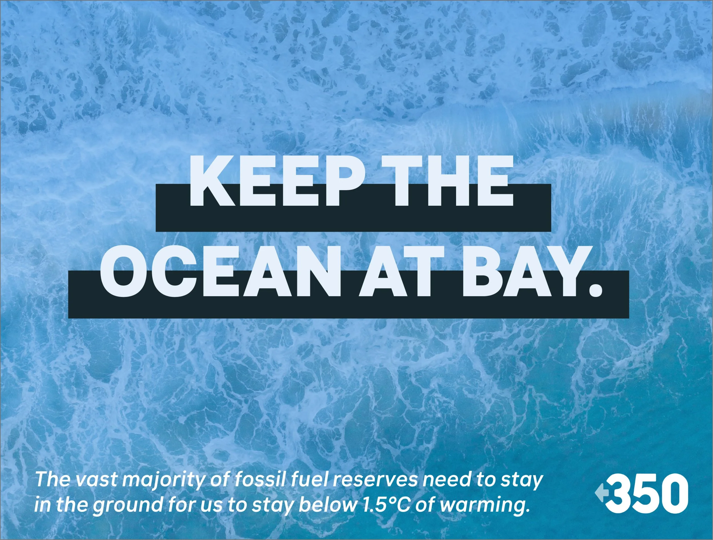


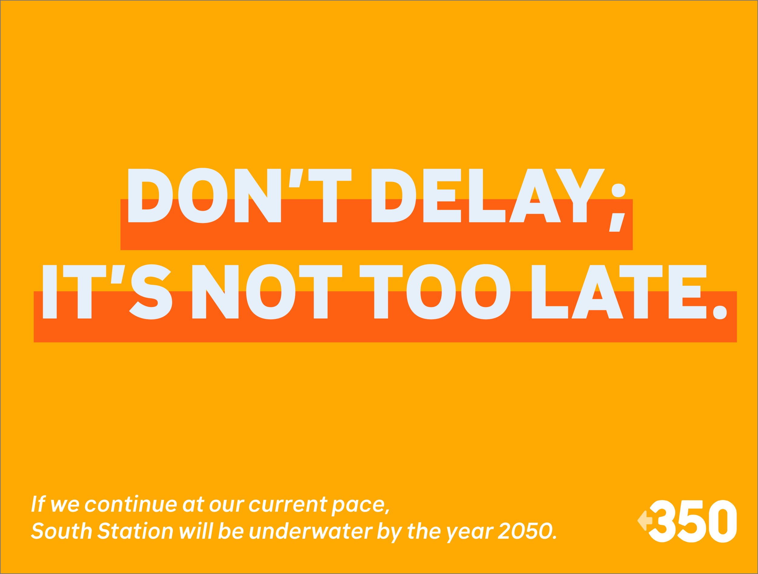


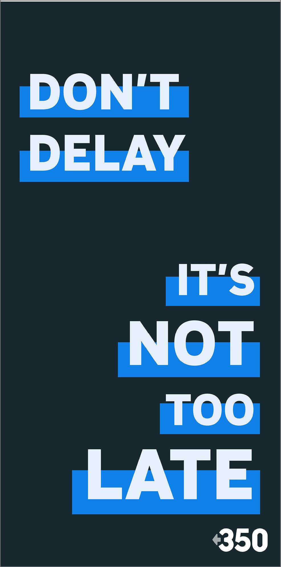
In these mockups that Ava put together of our designs, the South Station atrium is plunged into our ad campaign vision.


While we worked collaboratively as a team, checking in every week to provide feedback for each other, we divided up the project so that Ava and Meghann executed and implemented what we discussed together for the ad campaign in the atrium at the upper level. I helped by providing a lot of the wording (i.e. headlines) and giving feedback as the design developed and took shape.

We divided the project up so that my focus was primarily on the ads that would appear on the Red Line — on the Red Line platform in South Station and in the actual subway cars (as you will see below). While we wanted the overall brand to feel cohesive, we agreed to lean into the duality of the two spaces (the lightness & optimism of the sunshine-filled atrium versus the intensity & darkness of the underground platforms and cars) and create essentially a sub-brand for the Red Line - connected but different.
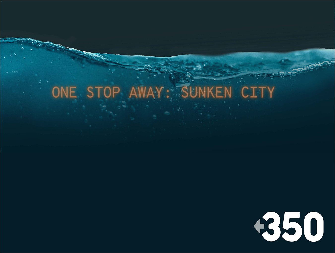
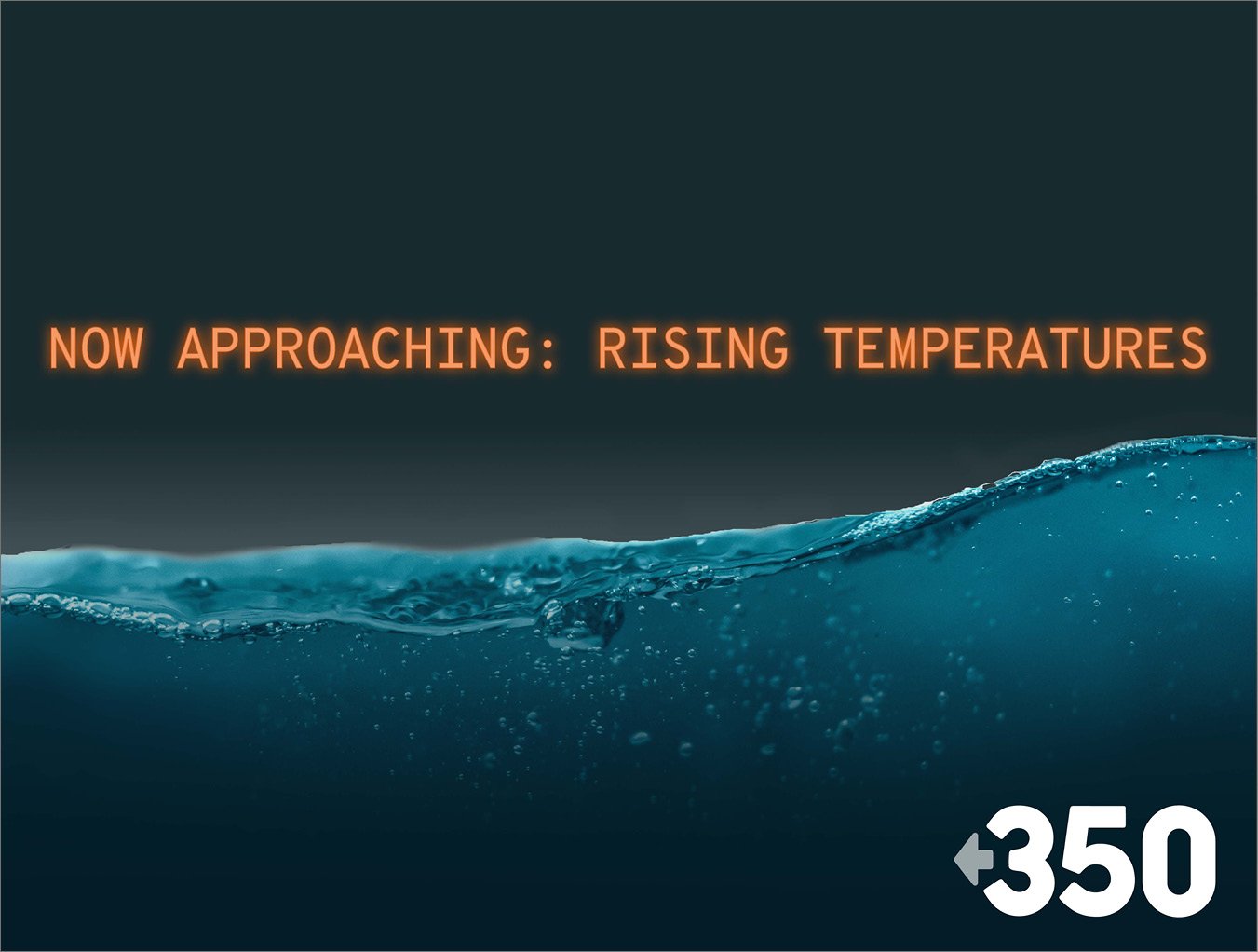
As ocean levels continue to rise, it is the Red Line that would be impacted the most since it’s underground, so we chose to emphasize this. In further positioning the campaign in the actual physical location, we took the lingo that is associated with subway travel and implemented it here in the context of climate change. The impact is calculated to be visceral, encouraging action NOW, before it’s too late, underlining the urgency of the campaign. Scroll down to see these three sequential images as they would appear across from the platform where people wait for their subway cars to arrive.

While there is some glimmer of hope in the ads in the atrium of South Station (near the commuter rail hub), we created a more intentionally oppressive atmosphere with the ads that would be on the Red Line.

We made note of where our audience would be captive (smushed together with fellow commuters on the T, desperate to look anywhere but in each other’s eyes) and designed and placed our artboards with this in mind.

I used the same information as the ads used above ground, and of course the brand had to still feel like it was part of the same campaign, but here we offered a glimpse at a gloomier reality, if nothing changes.

In this sub-campaign that I designed (with regular feedback from the others, just as I provided them with feedback every week), I introduced a new headline: “Sink or swim.” This simplifies the choice of the viewer — do something or deal with the dire consequences.

I wanted this portion of the campaign to feel murky, dark, dramatic, visceral. I wanted the viewer to care, maybe even to feel a little desperate. (Is it just me or is it a little hard to catch a full breath if you stare at this for too long?)

If no action is taken, where the commuter is standing or sitting could very well be underwater by 2050. The QR code leads them to the organization's website.


