typewriter:
image simplification
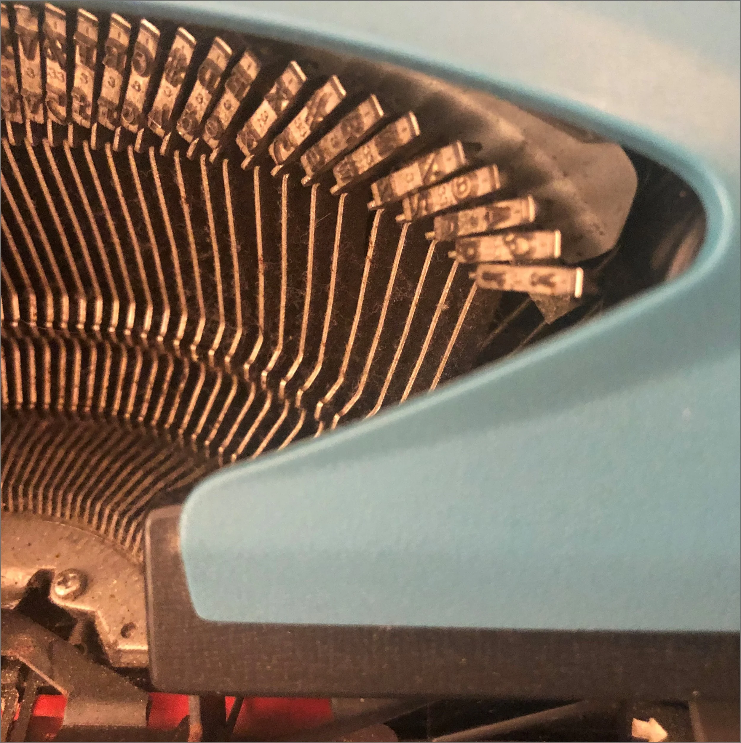
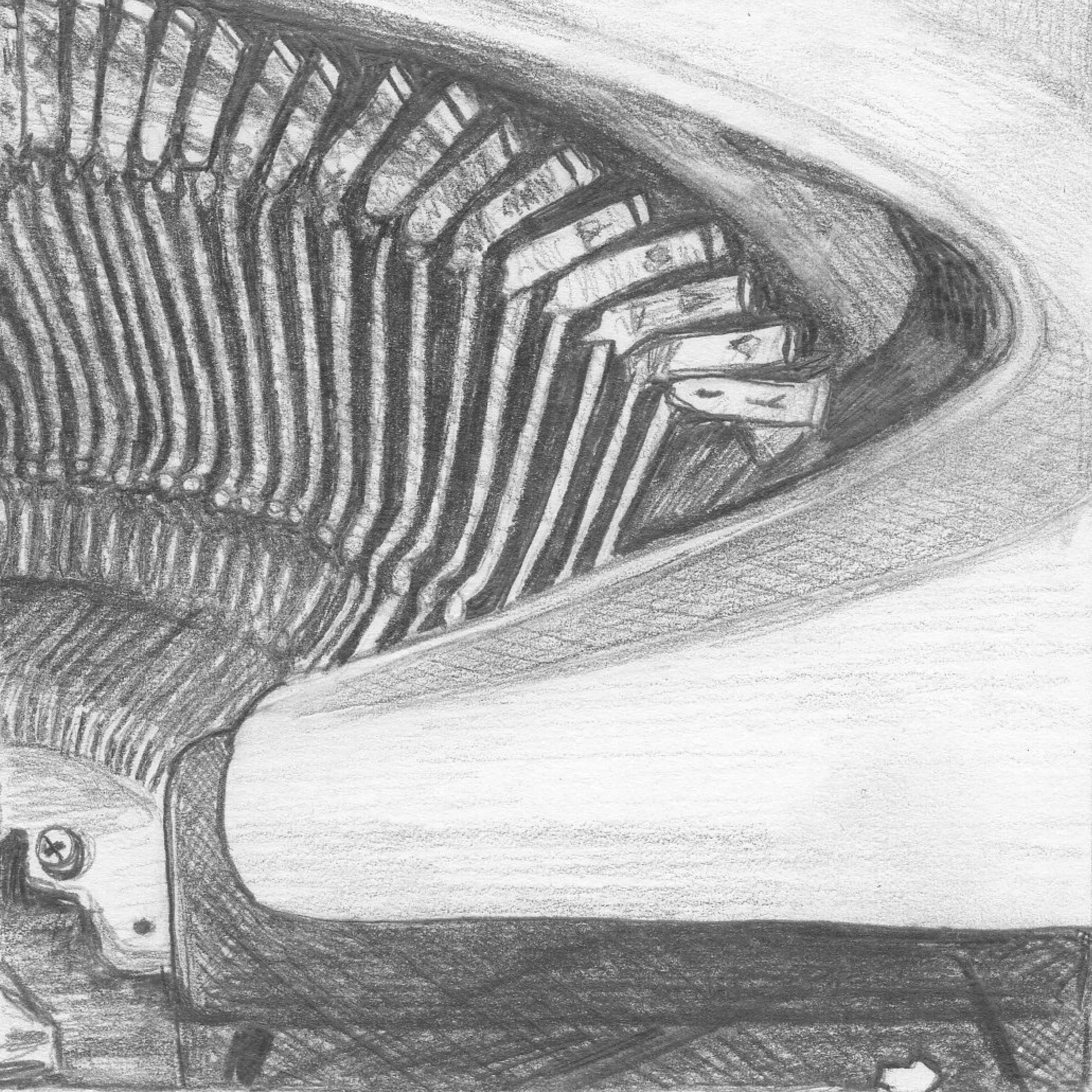
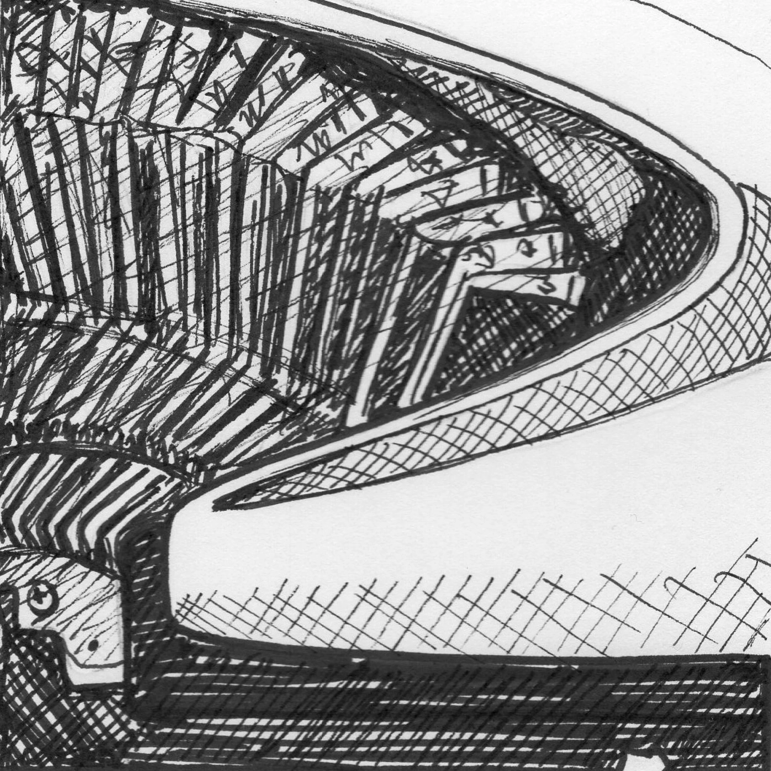
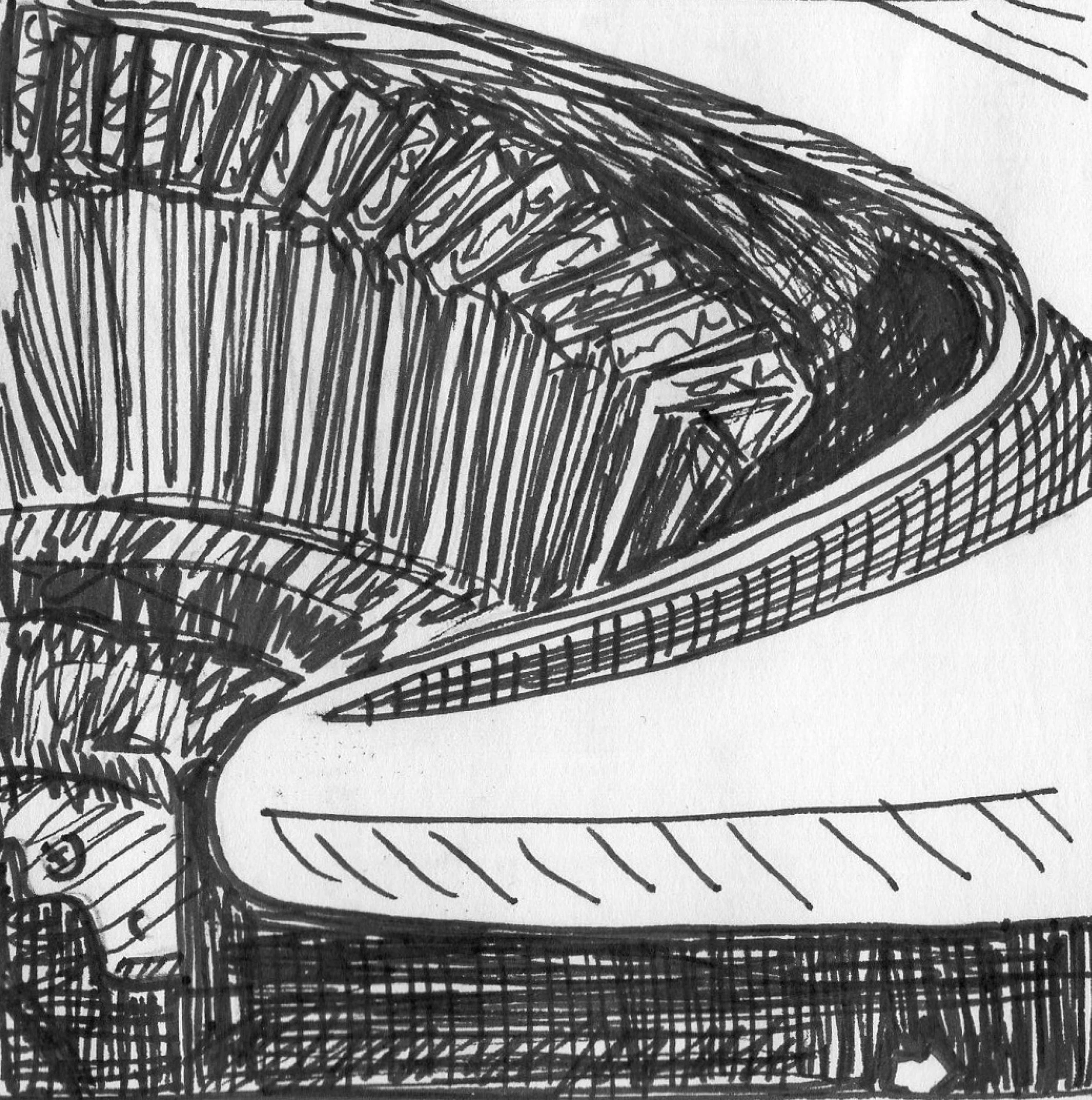
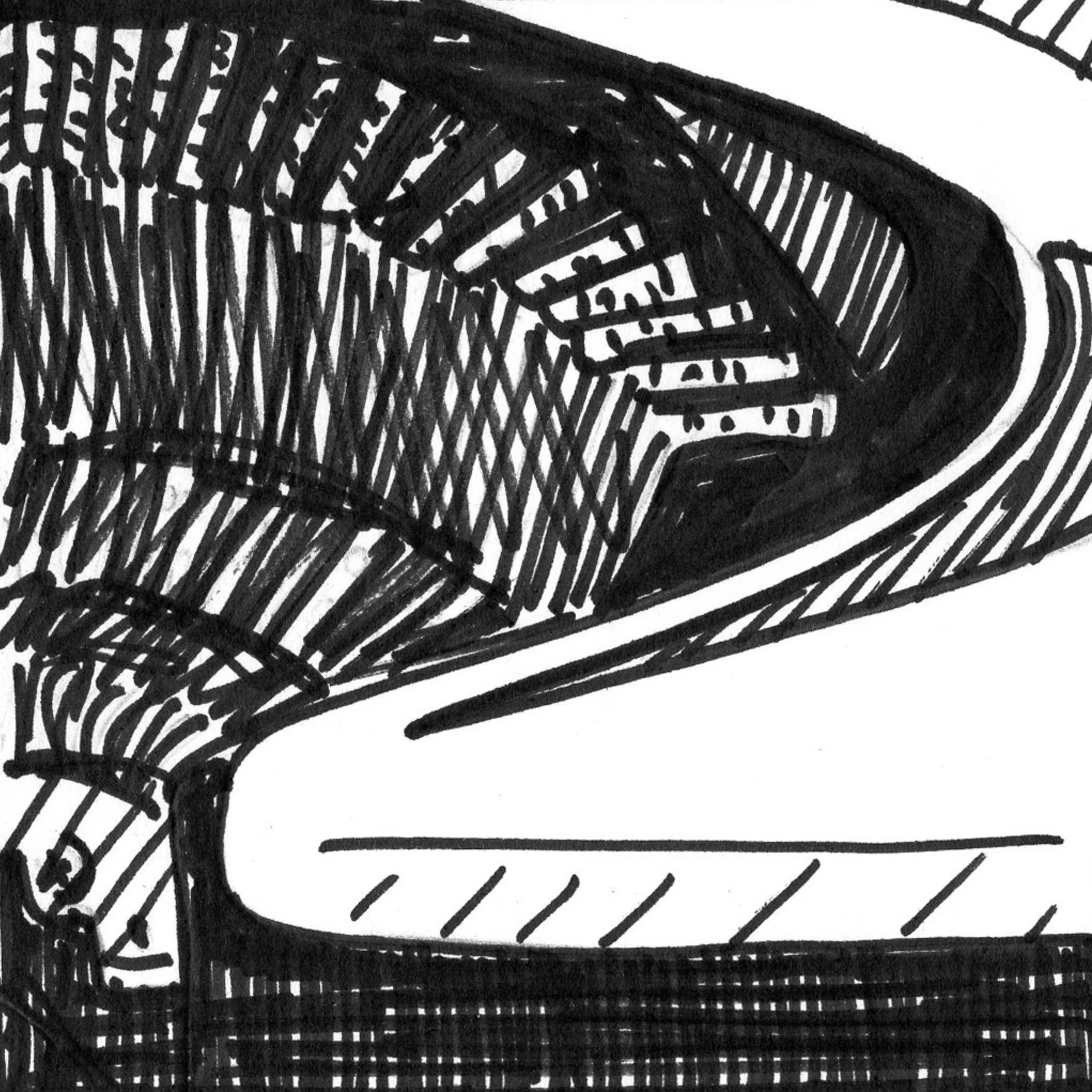
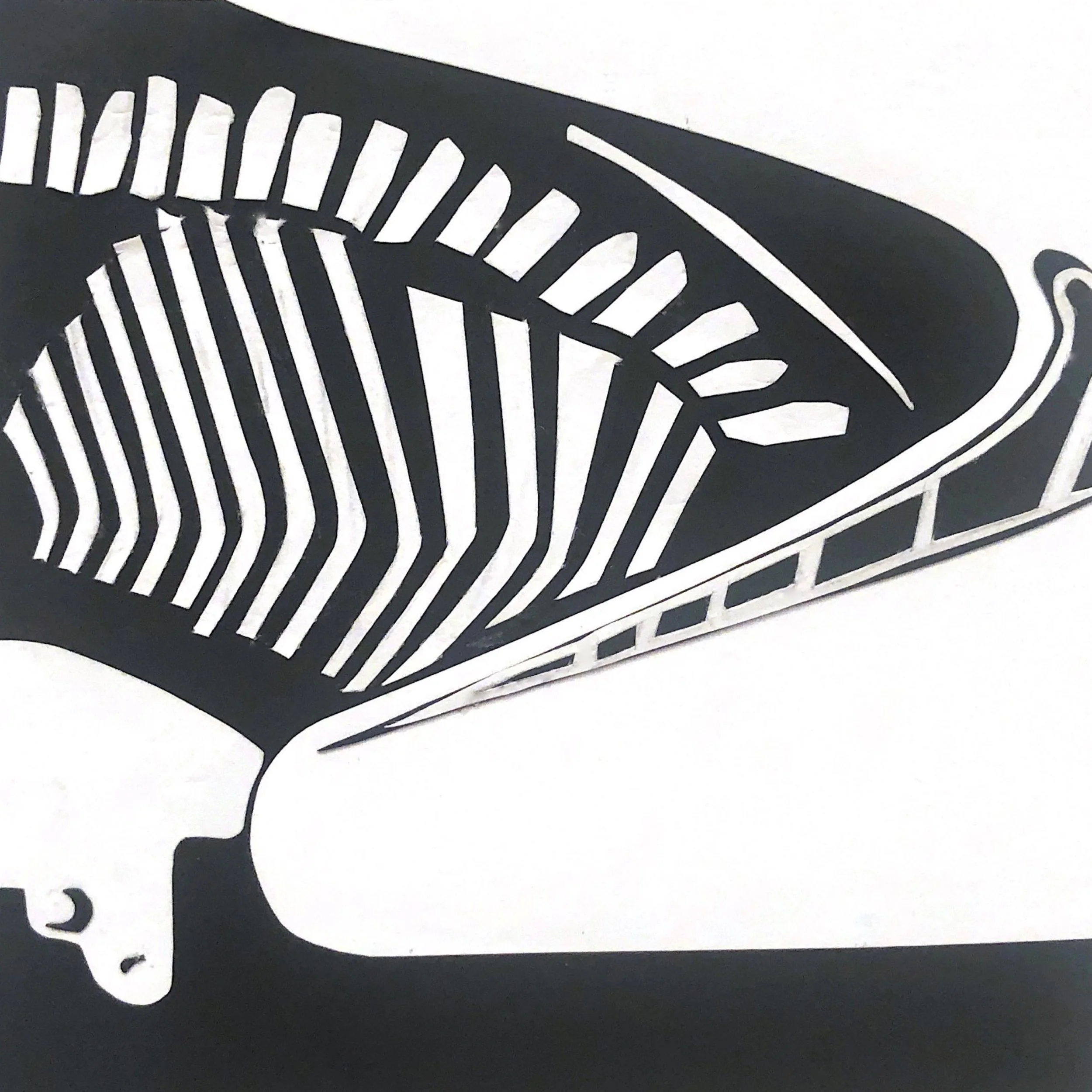
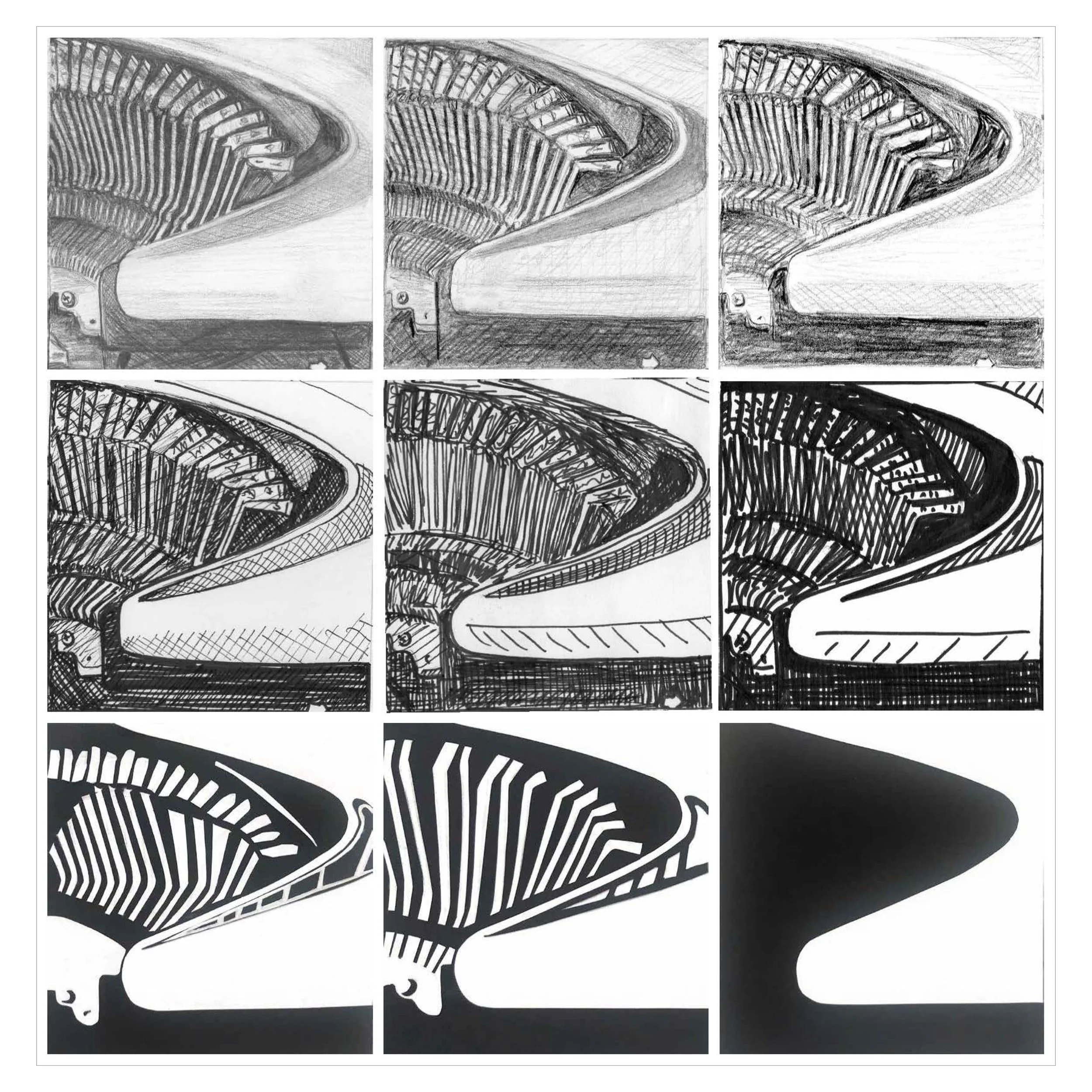
I took a lot of photos of my blue Brother typewriter from different angles, chose one photo that spoke to me (an intimate investigation into its mechanical innards), and cropped it to a square — shown as the “original photo” in the first slide in the section below.
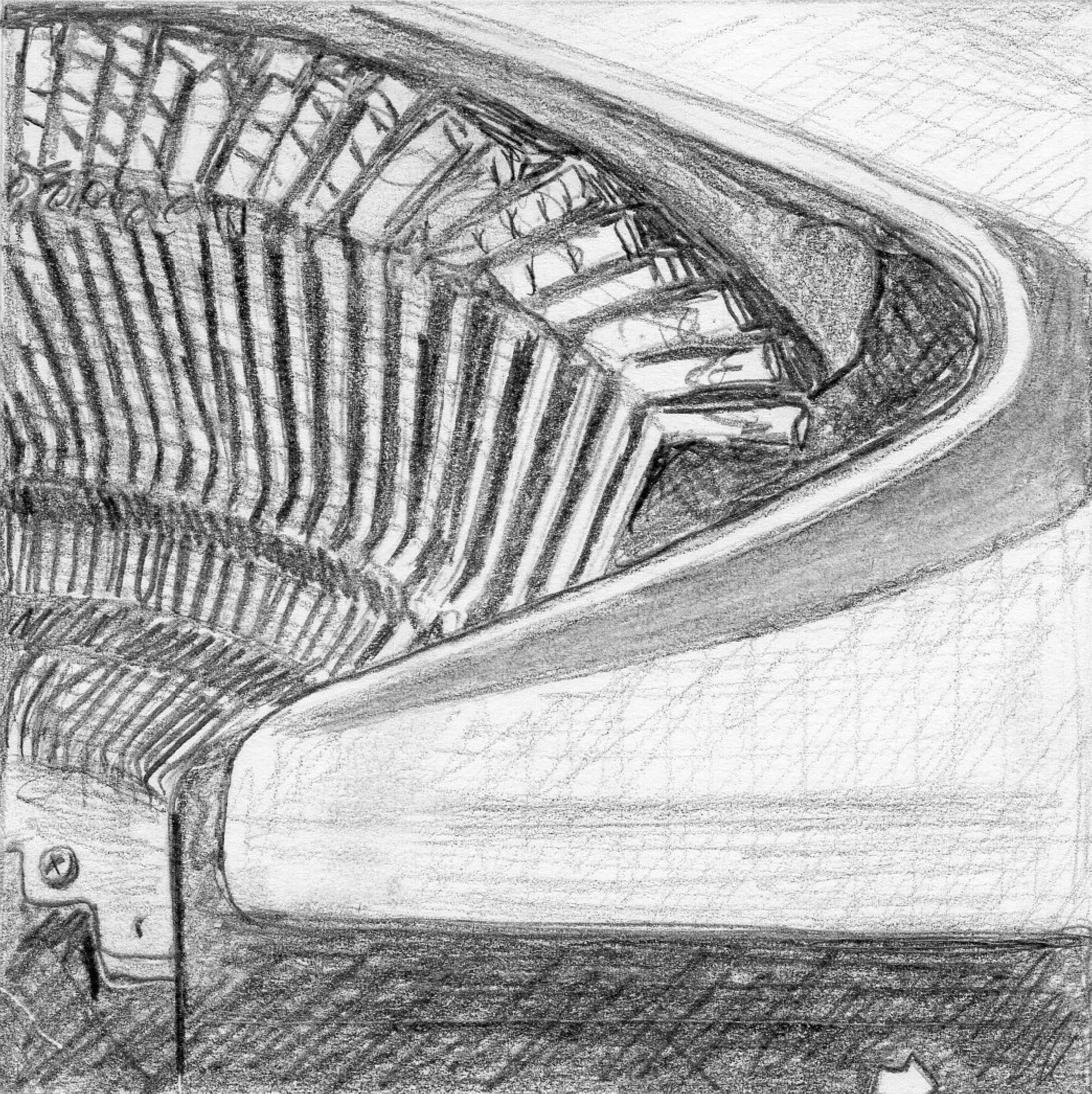
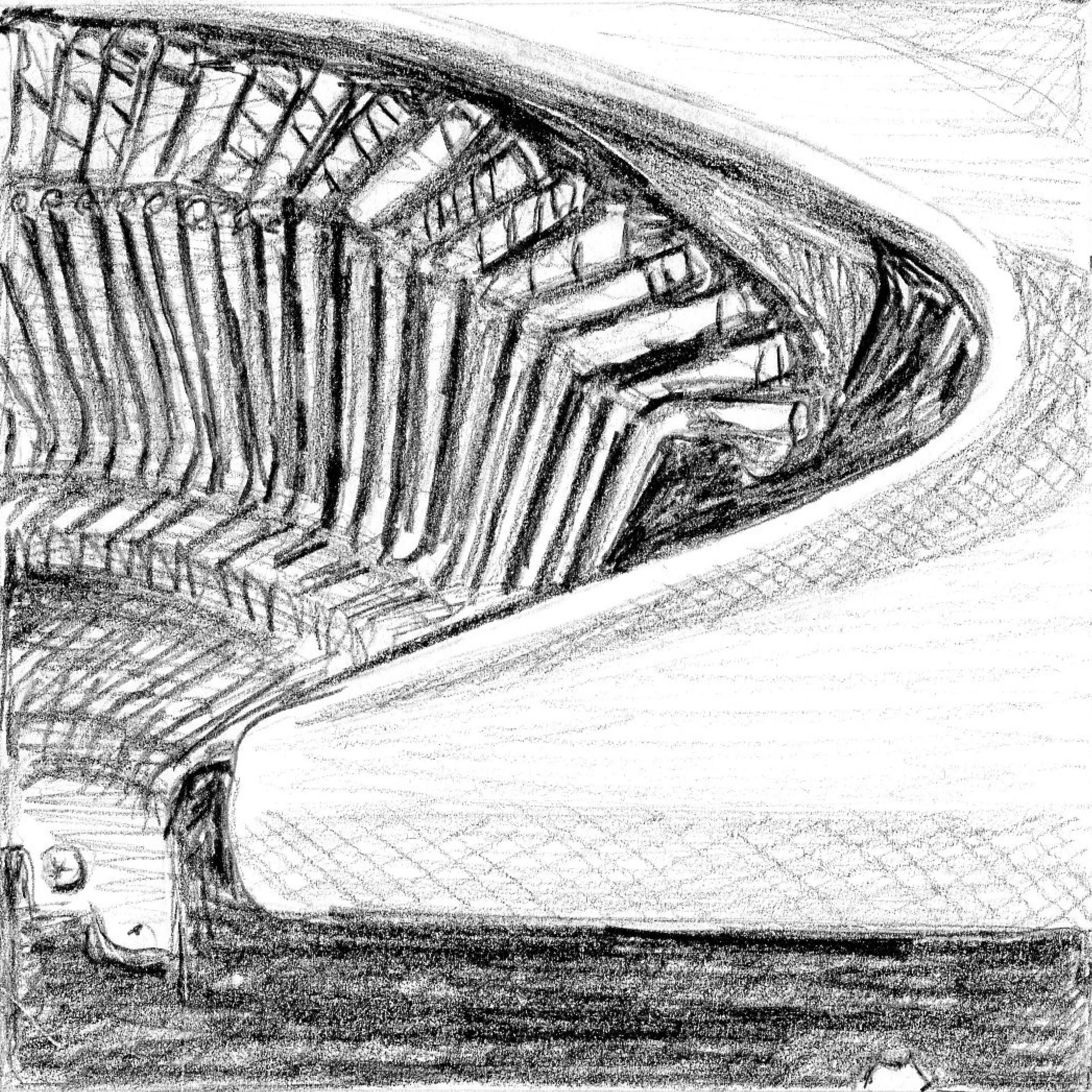
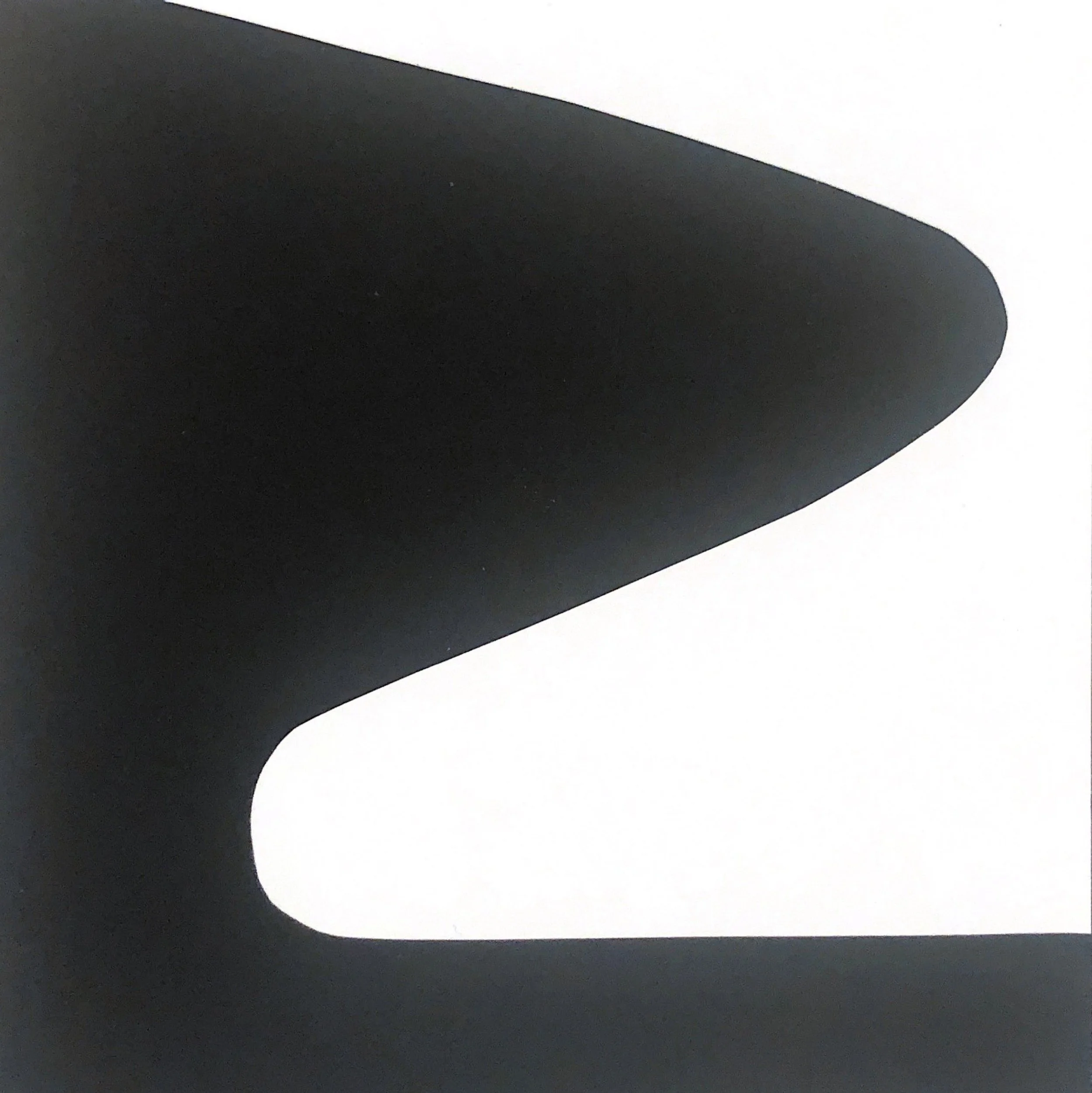
In the space of 9 squares, over the course of 3 rows in a variety of media, I explored how a rendering of an object can go from my detailed pencil representation (top leftmost square) to an abstracted cut paper design (bottom right). The brief required the first row to be rendered in pencil, the second row in black marker, and the last row in black and white cut paper, with each square becoming progressively more abstracted, urging me to actively decide at each new iteration, “What is essential here? What is important to keep? What is disposable to get to the heart of this design?”
I have found this kind of practice is useful in thinking about branding and logo design.
image simplification breakdown:


