
Stroke of Luck :
film prop & poster(s)
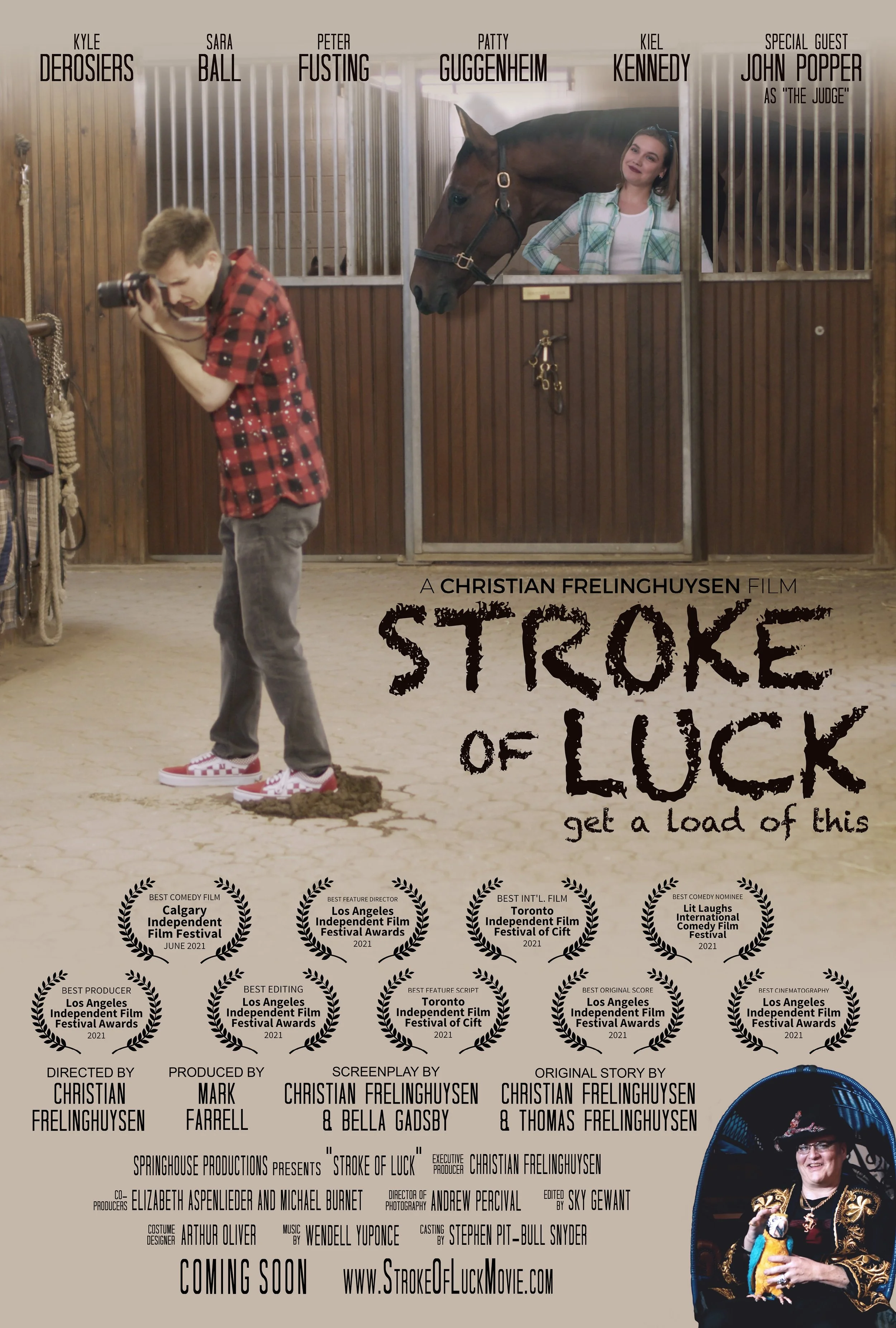
I was asked to design a prop and promotional movie poster for the film A Stroke of Luck (2022).
Stroke of Luck project breakdown:
-
film poster (1)
While the production company client wanted this particular scene, this scene does not actually exist in the film, so I had to re-create it through Photoshop. I watched the film several times, took screen captures, sent them to my contact at the company, and requested the high-resolution versions of the captures so I could dissect them to pull the components to reconstruct them in the desired tableau.
While I was under the deadline to submit the final version to the client, the film kept receiving more laurels at the independent film festivals it had entered, so I had to keep adjusting the layout to accommodate the growing collection (not a terrible problem to have!).
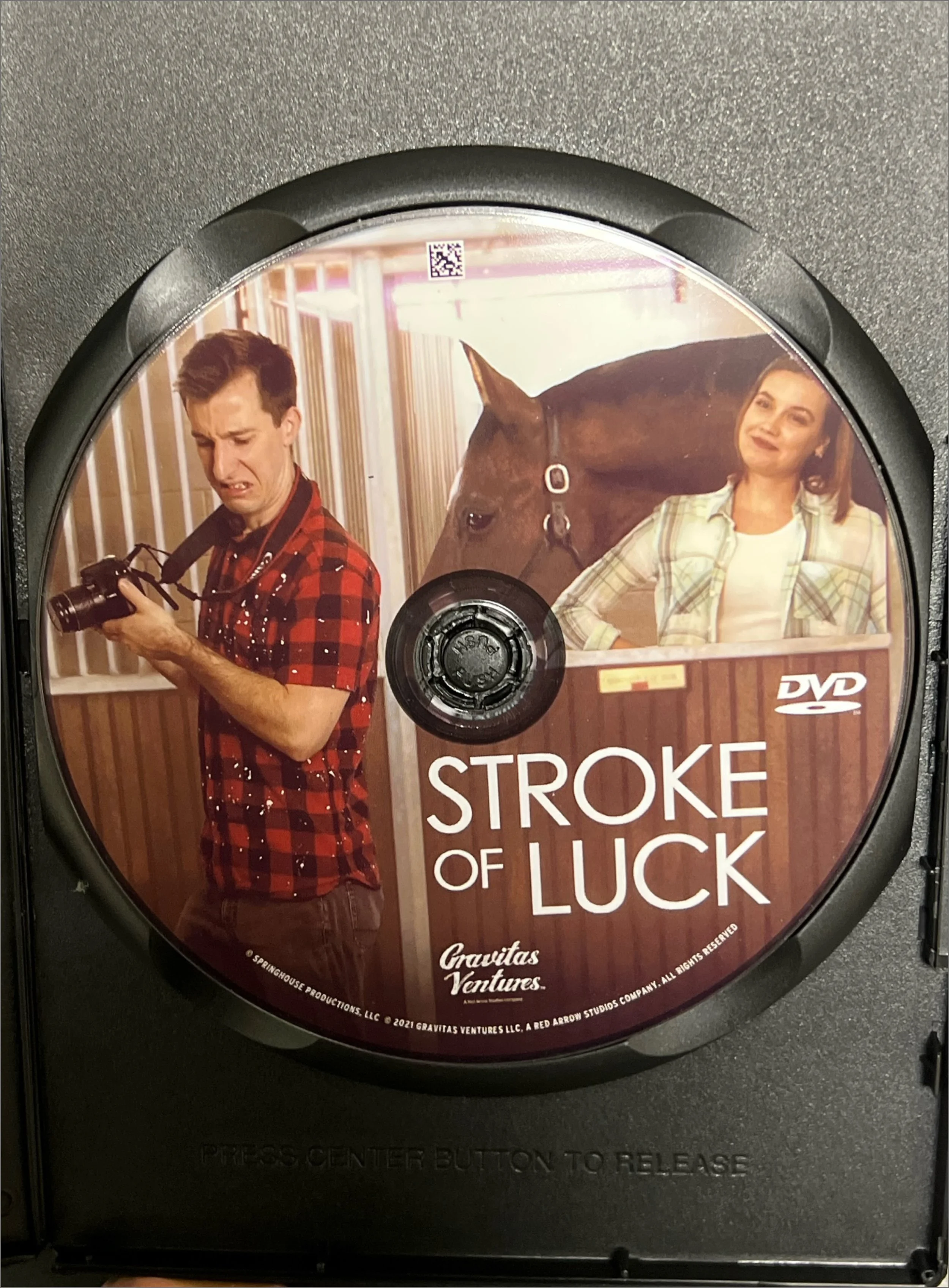
-
film poster at the Mahaiwe
For its intial release, this poster was printed and displayed underneath the marquee at The Mahaiwe Theater in Great Barrington, Massachusetts, as you can see from the image below. This original poster design is also what shows up on IMDB.
-
movie prop (mat)
Over the summer of 2020, I was asked to design a prop for the same film shown in the previous slides, A Stroke of Luck (2022). The brief was to create a game like the old classic Twister, but with fruit instead of plain colored circles. I called it “Smoothie” and created the logo of this name. With a clear nod to the original design, I chose high-resolution images of fruit that were roughly circular and were each as monotone to the desired color as possible. I Photoshopped each image of fruit so it had a more distinct and sharper outline, and then created a grid to encourage them all into alignment.
-
movie prop (board)
I also designed the feet and hands icons for the spinner board, again with a huge (intentional, requested) nod to the original Twister design.
-
movie props (in use)
You can see the mat here in use in the film, in some screengrabs from a scene featuring John Popper, frontman of the American band Blues Traveler.
-
film poster (2)
When the film was purchased by a distributor after its initial release in theatres and film festivals, I was asked to re-work the original poster design from the previous slide to a stripped back and visually simplified version − much like what one might see when scrolling through various streaming services.
I collaborated with a contact on the production crew, who clarified the vision they had in mind, and I rearranged the pieces in the desired way, submitting versions along the way to ensure I was translating the vision in the way they had imagined. They ended up liking the typeface I chose for this re-work of the poster so much (Century Gothic) that they changed the credits of the film to match.
-
film poster (2): DVD cover
My design was tweaked when the distributors submitted the design to print: they moved up the text up from my design, as you can see from the pictures of the DVD cover and actual DVD (shown on the next slide).
-
film poster (2): DVD