Taheetha Sacred Sprays:
branding, identity, & label design
[in progress]
Heather Drummond creates a series of sprays that are designed to help shift energy in an intentional way (the intention varies depending on the spray). She came to me to ask for help with her branding and identity, as well as designing the labels for the sprays themselves.
There are four existing sprays, but there are more in the works, so I had to keep that in mind when designing the guidelines and considering the colour palette.
We are in the final stages of wrapping up this project and getting ready to print the labels, business cards, and eventually Hev will use the branding guidelines to create a website and/or e-book with more fluid and/or specific information that wouldn’t fit on a label.

vision & mission statement:
These sprays invite the support of nature to create potent blends that will assist healing, personal & spiritual development with ease, joy, and thankfulness. This process can be fun; it doesn’t have to be hard work.
brand story:
audience:
These sprays are for energy-sensitive people (like energy work practitioners) who work with others around healing (1:1 and/or group settings), people who have a willingness to work through old behaviors that aren’t serving them.
These sprays go where they will be welcomed and invited in to support making a difference in somebody’s life. They are for the people who will give themselves the time, the space, the stillness, the respect to sit with the sprays and their effects.
values:
This brand values holding space for people to come home to themselves, to feel loved, to (re)discover their innate worthiness.
This brand values: authenticity, caring, celebrating people, compassion, creativity, curiosity, encouragement, enthusiasm, fun, generosity, healing, inspiration, openness, optimism, playfulness, respect, responsiveness, spirituality, supportiveness, tolerance, & visionariness.
personality (tone & voice):
Think of a big sister who’s got your back — not in an “I know better than you” way but more like a combination of playmate and guide.
branding breakdown:
-
![]()
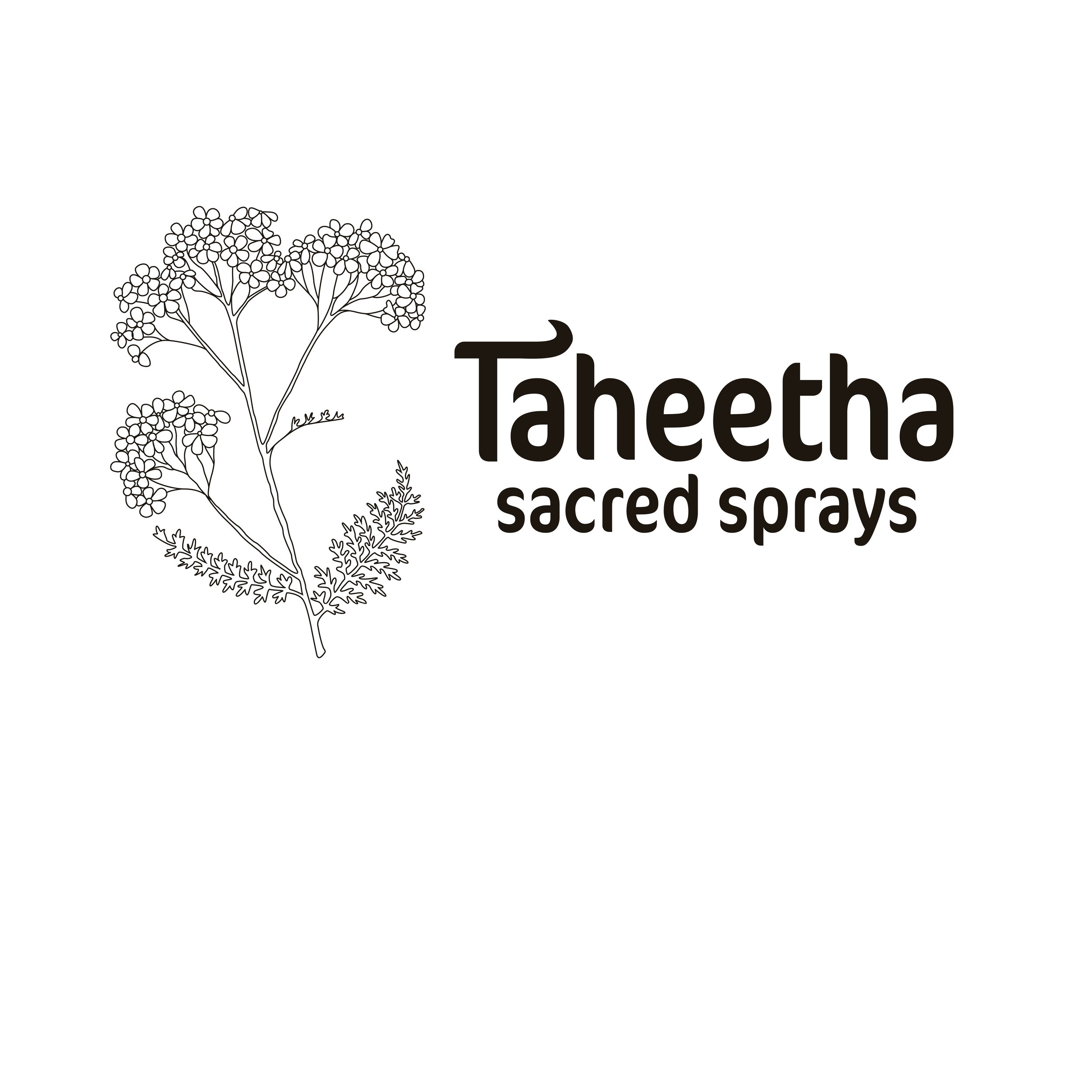
brandmark
This is the primary brandmark for Taheetha Sacred Sprays and the one that appears on the actual labels themselves.
The stacked words “Taheetha” (first line) “sacred sprays” (second line) are in the typeface CoconPro. The “T” in this typeface seemed a little flat, so I added a swoop that would match the swoop in the letterform of the lowercase “a,” make it more playful and inviting, as well as add some distinct personality to the brand.
Maybe we leaned into the phrase “garden variety” a little too hard [plant puns … haha ha … ha], but I also provided alternatives for the horizontal and square logos. There is a favicon logo, too.
Swipe through to see more of the branding breakdown.
-
![]()
construction & placement
The left edge of the ‘s’ in ‘sacred’ is in line with the right edge of the ‘T’ in ‘Taheetha.’ The right edge of the last ‘s’ in ‘sprays’ is in line with the left edge of the counter in the last ‘a’ in ‘Taheetha.’ The leading (space between) the ‘Taheetha’ and ‘sacred sprays’ is equivalent to one ‘s’ (from ‘sprays’), sideways at 90°. The top curve of the “T” echoes the curve in the “a,” creating a sense of flow & cohesion, and adding some flair of personality.
There is a safety margin around the logo that is the equivalent of the size of the ‘s’ in ‘sacred sprays.’ This allows the logo to breathe.
-
![]()
typography
CoconPro (RegularCond) is the main typeface chosen to represent this brand. This is what people will primarily think of when they think of Taheetha Sacred Sprays. The curves of its letterforms suggest flow and playfulness and its boldness proclaims that it means business.
PSL Ornanong Pro is the typeface that I chose for the subheading (demibold), accent (italic), and body (regular).
The heading, subheading, accent, & body type all prioritize lowercase whenever the meaning of the content can be retained. When using complete sentences, normal case is to be used — but never all caps.
-
![]()
colour palette
We referred to the hero colour of this brand as “sun-warmed earth.” This is the colour of the primary logo, the colour of the text on the label, and the colour of the outline of any of the illustrations. This hero colour, paired against a pure white, keeps the contrast high and, logistically, the printing costs down.
For the four existing sprays, we settled on these rich, saturated hues, which are easily distinguishable from each other, making each label unique.
(Hev is located in the UK, so I was careful to use “colour” instead of “color.”
-
![]()
range of transparency levels
Introducing a range of transparency levels for these palette colours allows us a little more freedom to play while still adhering to a clearly established colour palette and paying attention to high-contrast pairs for ease of accessibility.
-
![]()
approved high-contrast pairs
To maximise accessibility and readability, approved colour pairs must have a contrast score of 4.5 or higher.
-
![]()
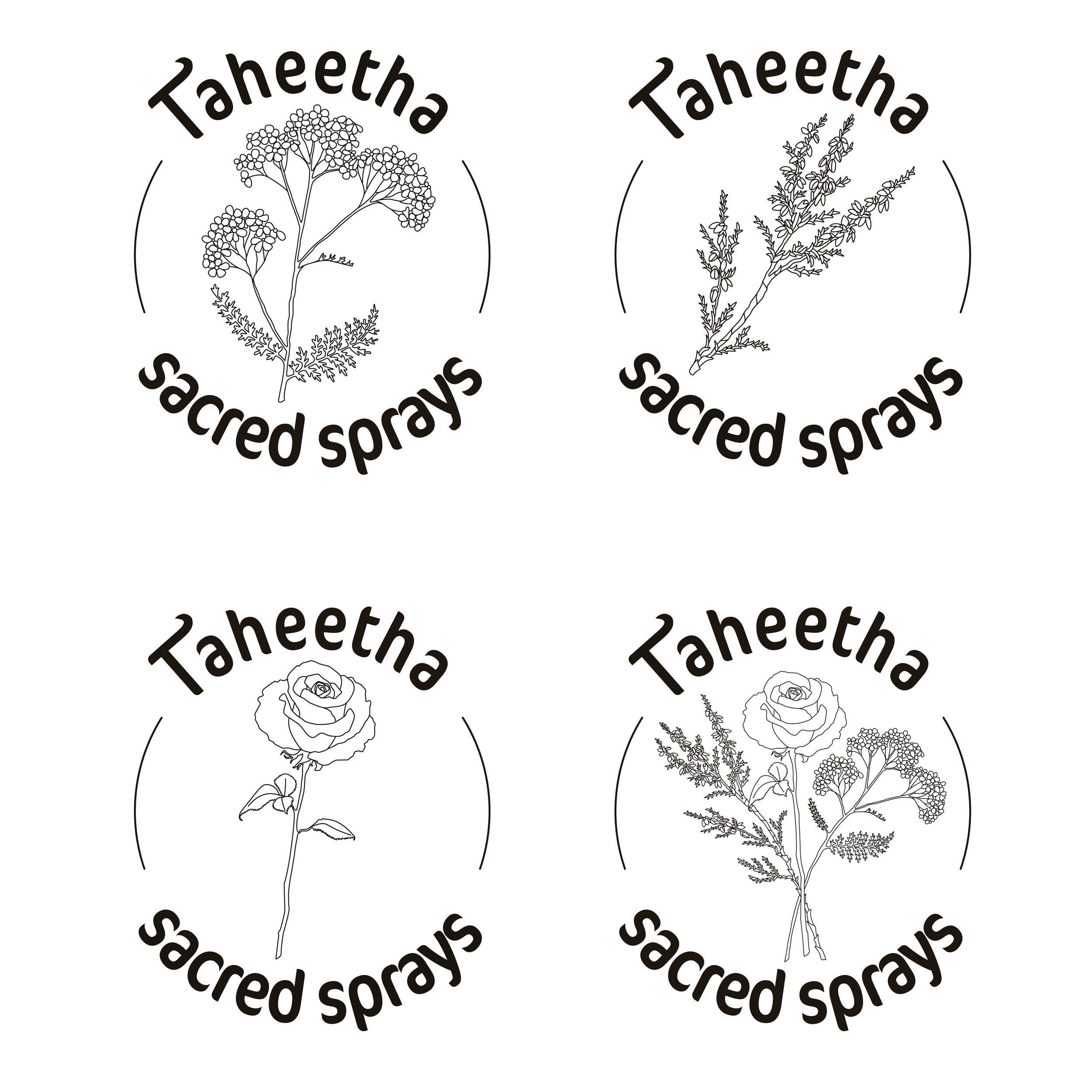
horizontal logo: yarrow
Horizontal logos are for when there is limited vertical space.
The first version of the horizontal logo features yarrow, which is also the illustration shown on the labels themselves.
I initially offered this as the horizontal logo, but during one of our meetings, Hev and I decided that we didn’t have to restrict ourselves to just one; we could lean into the abundance of all of the ingredients and illustrations. Why limit ourselves? Who’s making these “rules,” anyway?!
-
![]()
horizontal logo: heather
The second version of the horizontal logo has heather, which is an ingredient in many of the sprays, as well as the name of the creator of the sprays.
-
![]()
horizontal logo: rose
The third of the horizontal logo versions has a rose. Rose is another commonly-used ingredient in the sprays.
-
![]()
horizontal logo: bundle
The fourth and final version of the horizontal logo displays a bundle of yarrow, heather, and rose, all together now.
-
![]()
"square" logo: with text
The “square” logo (more of a circle, really, isn’t it?) is the variation to use when you have equal vertical & horizontal space.
Just like we didn’t limit ourselves to one version of the horizontal logo, we didn’t limit ourselves to just one version of the “square” logo, either.
We used the variety that was available to us, with my illustrations of the ingredients.
-
![]()
"square" logo: without text
Here’s where we really went wild. I had presented Hev with options for the square logo with or without text, and at the same time, we had a simultaneous epiphany that we could make the same choice that we had made for all of the other logo variations: abundance. Why not … both? Both is good!
I see these living in the real world as stickers, perhaps sealing patterned tissue paper in gift boxes or putting that finishing touch on packaging that holds all of the sprays in a set.
-
![]()
logo: favicon
This favicon logo has the same coloured radial gradient as on the labels, with the brand’s “T” in the forefront.
The heather illustration has been placed over the T and cut out of it, leaving an impression that strongly reminds me of cyanotype.
I chose purple because heather found in nature is often purple, the “clean slate” spray (which has been assigned the purple colour shown here) was the first one that Hev and I worked on, and purple is often associated with calm, thoughtfulness, and regalness — all qualities that we want associated with the brand.
This would be used in the context of a socia media or email profile image. The overall graphic is simple — the brand’s T in a circle — but the complexity of the cyanotype-like heather adds some natural interest. This logo variation is not intended for print.
-
![]()
illustration: yarrow
This was the first illustration I did for this project for use on the labels. It is a common ingredient in Hev’s sprays so we chose it as a kind of representative.
There is a pleasingly organic imbalance to it that draws the viewer’s eyes in a circle around the form. It stands tall and proud, like a protector on a sigil.
-
![]()
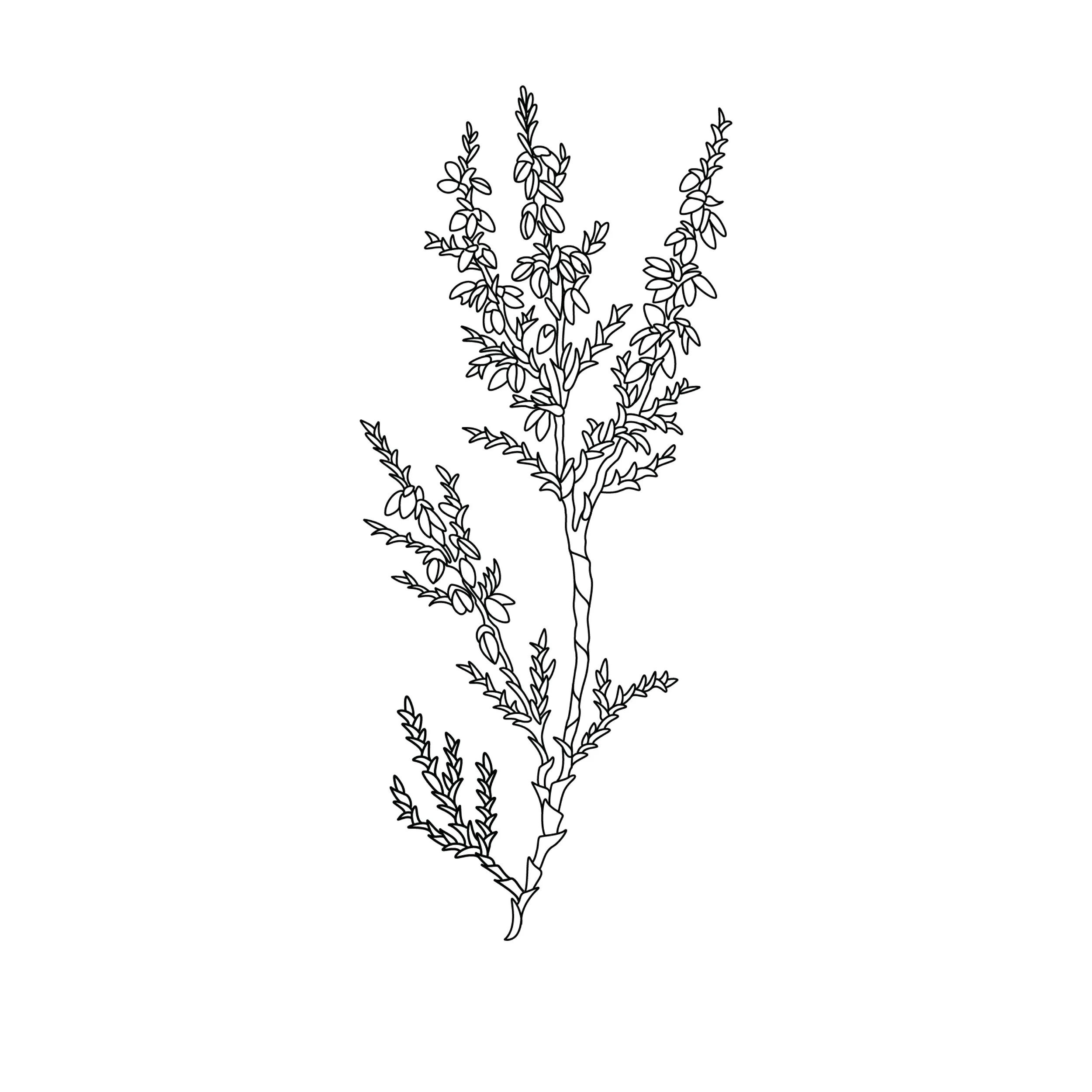
illustration: heather
I loved the balance of simplicity and complexity of the initial yarrow illustration, and it took a few tries to replicate that same balance here in the heather.
Hev (short for Heather) had proposed using a bundle of flowers (like yarrow, heather, and rose) instead of just the singular yarrow on the labels, so I illustrated the rest of the desired flowers to use in that context, but I also wanted her to be able to use them individually elsewhere in her branding.
-
![]()
illustration: rose
The rose illustration, like the heather, took a few tries to emulate that balance of simplicity and complexity that I had managed to capture in the yarrow illustration.
Again, like the heather, I illustrated the rose to be included in the bundle — but I also wanted the rose to stand on its own.
-
![]()
illustration: bundle
Okay, okay, here’s the bundle everyone’s been talking about.
I wanted the flowers to give the impression of having been gathered and thrown together, held by earnest and intentional hands. While the design remains organic, there is also a sense of overall balance.
-
![]()
spray label: all loved up
Hev and I were between pink and green for the spray colour for “All Loved Up”: pink is commonly culturally associated with love, while green is associated with the heart chakra (compassion, kindness), and we ultimately went for pink.
This was a tricky colour for me because, especially with the radial colour, I didn’t want it to look like anything related to unhappy skin (pimple, etc.). We wanted it to be a little spicy, have a little depth (but not be too red or aggressive), and play nicely with the other colours we chose.
Hev came up with the name for this spray, and we worked together to collaborate on the other names.
-
![]()
spray label: clean slate
“Clean Slate” was the first spray that Hev and I worked on, and we initially looked to colours of the chakras to align with each spray’s properties. This purple is associated with the chakra that is aligned with our third eye, where we are in touch with imagination and intuition.
We realized that wasn’t sustainable since her brand will grown to include more sprays, but we both still liked the purple we had chosen for “Clean Slate.”
-
![]()
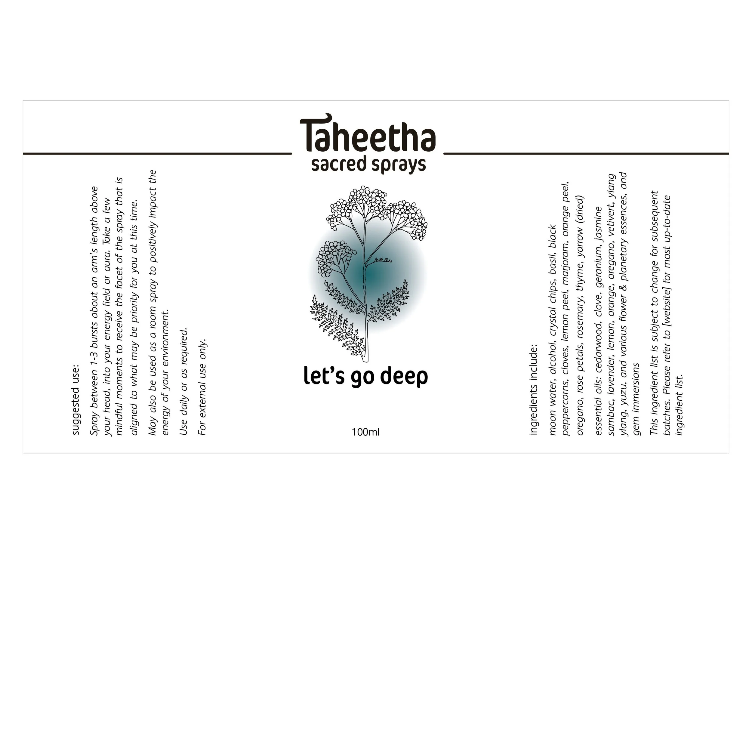
spray label: let's go deep
I chose this deep teal for the “Let’s Go Deep” spray, and Hev experienced a resounding full-bodied “yes” when she saw this colour paired with this spray.
-
![]()
spray label: all together now
This fresh green for the “All Together Now” spray is a little lighter than the others that currently exist, but we wanted it to be easily differentiated from the teal, and it will help bridge the gap between the existing deeper colours and the other colours to come (which [SPOILER ALERT!] will include a golden yellow). Even though it’s green, and so technically on the cooler side of the colour spectrum, it’s a bright, warm, welcoming green — perfect for the spray that embodies integration.
-
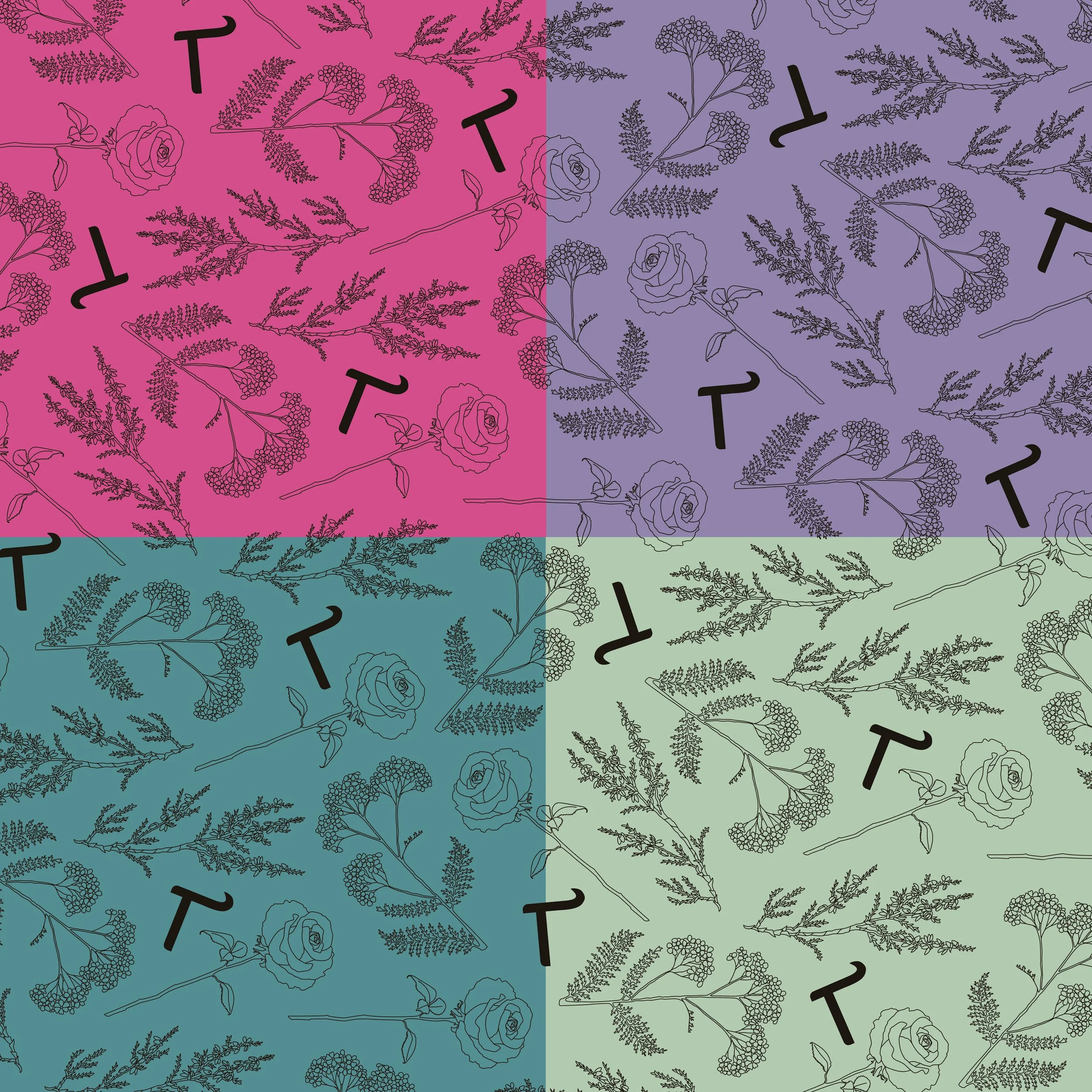
![]()
pattern
I created my first pattern, throwing together the illustrations I had done of the yarrow, heather, and rose — as though I had held the bundle in my hand and then let them fall where they may — mixed in with the brand’s “T” that I had designed.
The pattern is shown here, with the brand’s supporting colours at a transparency level of 75% to keep in line with the branding guideline’s approved high-contrast colour pairings.
-
![]()
images: photography
A common theme while working on this brand was options. While I think that the illustrations I did can live in a lot of different ways, I also wanted to provide Hev with some photographic images that allow the brand to come to life in a different way.
I chose dreamy shots of white yarrow, purple heather, and pink roses — all found on Unsplash.